Benvenuto nelle Font Più Popolari — dove popolarità e qualità si incontrano. Qui trovi i font più scaricati e usati dell'anno. Se cerchi scelte sicure per logo, web o social, inizia da qui.
Ogni font top si distingue per equilibrio, leggibilità e versatilità. Troverai sans serif moderne, script eleganti, serif vintage e display minimalisti.
-
( Fonts by Peter Wiegel - www.peter-wiegel.de - Personal-use only. For commercial use please contact owner. )
A bold, stencil-style font with a strong industrial aesthetic.
 Scaricare 384 Downloads@WebFont
 -
![What The FUN font caratteri gratis]() Scaricare 384 Downloads@WebFont
Scaricare 384 Downloads@WebFont -
( Fonts by Octotype - www.foundmyfont.com - Personal-use only. For commercial use please contact owner. )
A bold, flowing script font with elegant cursive letterforms.
![Callatic Edition font caratteri gratis]() Scaricare 384 Downloads@WebFont
Scaricare 384 Downloads@WebFont -
( Fonts by Bud White. Personal-use only. For commercial use please contact owner. )
A sleek, modern font with elongated, narrow characters and clean lines.
![Chinger font caratteri gratis]() Scaricare 384 Downloads@WebFont
Scaricare 384 Downloads@WebFont -
( Fonts by Skiiller Studio )
Bold, playful handwritten font.
![Sphones font caratteri gratis]() Scaricare 384 Downloads@WebFont
Scaricare 384 Downloads@WebFont -
-
( Fonts by Kong Font - https://fontkong.com/ - Personal-use only. For commercial use please contact owner. )
A playful and elegant handwritten script font with dynamic strokes.
![Faster Bottom font caratteri gratis]() Scaricare 384 Downloads@WebFont
Scaricare 384 Downloads@WebFont -
( Fonts by Din Studio - Donis Miftahudin - Personal-use only. For commercial use please contact owner. )
A modern serif font with elegant, slightly condensed letterforms and subtle serifs.
![Lovera Personal Use font caratteri gratis]() Scaricare 384 Downloads@WebFont
Scaricare 384 Downloads@WebFont -
( www.angrydubs.com )
An artistic and angular font with a bold, geometric style.
![Rolinho font caratteri gratis]() Scaricare 384 Downloads@WebFont
Scaricare 384 Downloads@WebFont -
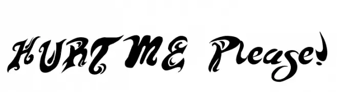
![HURT ME Please! font caratteri gratis]() Scaricare 384 Downloads@WebFont
Scaricare 384 Downloads@WebFont -
( ankepanke.nl )
A bold, playful font with a 3D striped effect and strong outlines.
![stripe3D font caratteri gratis]() Scaricare 384 Downloads@WebFont
Scaricare 384 Downloads@WebFont


Quali sono i font più popolari adesso?
Poppins, Roboto, Montserrat, Open Sans e Lato sono molto usati per le forme pulite e l'ampia applicabilità — dall'identità di marca alle landing page e ai poster.
Quali font si usano spesso nei loghi?
Le sans serif geometriche (es. Poppins, famiglie in stile Gotham) sono scelte comuni per un branding pulito e scalabile. Per un tocco personale restano valide script e stili manoscritti. Abbina un display deciso per i titoli a un corpo testo neutro per riconoscibilità ed equilibrio.
Ogni quanto si aggiorna la lista?
Con regolarità, in base ai download e all'attività reale. Torna spesso per scoprire in anticipo le nuove preferite.
💡 Consiglio: aggiungi ai preferiti — le tendenze cambiano in fretta e i font top di oggi possono ispirare il rebranding di domani.