Benvenuto nelle Font Più Popolari — dove popolarità e qualità si incontrano. Qui trovi i font più scaricati e usati dell'anno. Se cerchi scelte sicure per logo, web o social, inizia da qui.
Ogni font top si distingue per equilibrio, leggibilità e versatilità. Troverai sans serif moderne, script eleganti, serif vintage e display minimalisti.
-
( Zetafonts - www.zetafonts.com )
A classic serif font with medium weight, offering a traditional and readable design.
 Scaricare 369 Downloads@WebFont
 -
( Free )
A Gothic-inspired decorative font with ornate, playful letterforms and high contrast.
![Gothic Birthday Cake font caratteri gratis]() Scaricare 369 Downloads@WebFont
Scaricare 369 Downloads@WebFont -
( Fonts by Peter Wiegel - www.peter-wiegel.de - Personal-use only. For commercial use please contact owner. )
A modern, geometric sans-serif font with clean lines and uniform strokes.
![FabrikNormal font caratteri gratis]() Scaricare 369 Downloads@WebFont
Scaricare 369 Downloads@WebFont -
( Fonts by Manfred Klein. Free for private and charity use. Free for commercial with donation to organizations )
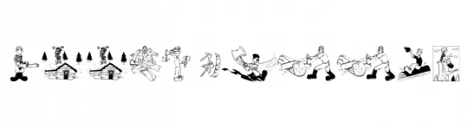
Cartoonish, woodcutter-themed pictorial font with unique illustrations for each character.
![Woodcutter font caratteri gratis]() Scaricare 369 Downloads@WebFont
Scaricare 369 Downloads@WebFont -
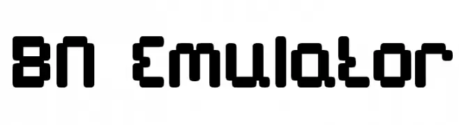
( Font by Ben Nathan - www.hafontia.com )
A bold, pixelated font with a retro digital aesthetic.
![BN Emulator font caratteri gratis]() Scaricare 369 Downloads@WebFont
Scaricare 369 Downloads@WebFont -
-
![AnatoleFranceiFNormal font caratteri gratis]() Scaricare 369 Downloads@WebFont
Scaricare 369 Downloads@WebFont -
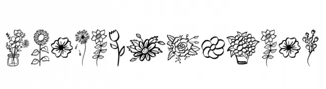
( Fonts by Jonathan S. Harris )
Hand-drawn floral illustrations with a whimsical, decorative style.
![Garden Flowers font caratteri gratis]() Scaricare 369 Downloads@WebFont
Scaricare 369 Downloads@WebFont -
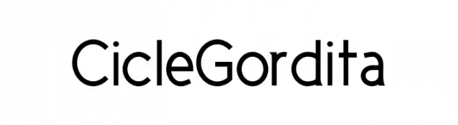
( Fonts by La Tipomatika )
A modern, geometric sans-serif font with a clean and professional look.
![CicleGordita font caratteri gratis]() Scaricare 369 Downloads@WebFont
Scaricare 369 Downloads@WebFont -
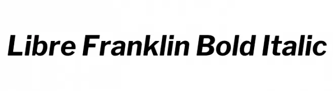
( Copyright (c) 2015, Impallari Type (www.impallari.com) )
A bold, italicized modern sans-serif font with clean lines and a dynamic slant.
![Libre Franklin Bold Italic font caratteri gratis]() Scaricare 369 Downloads@WebFont
Scaricare 369 Downloads@WebFont -
( Fonts by www.DigitalDreamDesign.net )
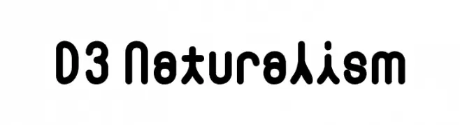
A bold, rounded font with a modern and playful style.
![D3 Naturalism font caratteri gratis]() Scaricare 369 Downloads@WebFont
Scaricare 369 Downloads@WebFont

Quali sono i font più popolari adesso?
Poppins, Roboto, Montserrat, Open Sans e Lato sono molto usati per le forme pulite e l'ampia applicabilità — dall'identità di marca alle landing page e ai poster.
Quali font si usano spesso nei loghi?
Le sans serif geometriche (es. Poppins, famiglie in stile Gotham) sono scelte comuni per un branding pulito e scalabile. Per un tocco personale restano valide script e stili manoscritti. Abbina un display deciso per i titoli a un corpo testo neutro per riconoscibilità ed equilibrio.
Ogni quanto si aggiorna la lista?
Con regolarità, in base ai download e all'attività reale. Torna spesso per scoprire in anticipo le nuove preferite.
💡 Consiglio: aggiungi ai preferiti — le tendenze cambiano in fretta e i font top di oggi possono ispirare il rebranding di domani.