Benvenuto nelle Font Più Popolari — dove popolarità e qualità si incontrano. Qui trovi i font più scaricati e usati dell'anno. Se cerchi scelte sicure per logo, web o social, inizia da qui.
Ogni font top si distingue per equilibrio, leggibilità e versatilità. Troverai sans serif moderne, script eleganti, serif vintage e display minimalisti.
-
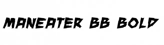
( Fonts by www.blambot.com )
A bold, jagged, and dynamic font with sharp, angular edges.
 Scaricare 363 Downloads@WebFont
 -
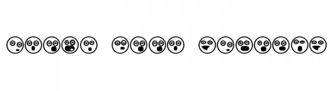
( Fonts by Vladimir Nikolic )
A playful set of emoji-like symbols with bold outlines and expressive faces.
![Emoji Boom Regular font caratteri gratis]() Scaricare 363 Downloads@WebFont
Scaricare 363 Downloads@WebFont -
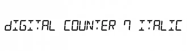
( Fonts by Style-7 - www.styleseven.com - Personal-use only. For commercial use please contact owner. )
A digital-style, italic font resembling a seven-segment display.
![Digital Counter 7 Italic font caratteri gratis]() Scaricare 363 Downloads@WebFont
Scaricare 363 Downloads@WebFont -
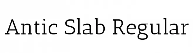
( Copyright (c) 2011, Santiago Orozco (hi@typemade.mx), with Reserved Font Name "Antic Slab". )
A robust slab serif font with prominent squared serifs and moderate contrast.
![Antic Slab Regular font caratteri gratis]() Scaricare 363 Downloads@WebFont
Scaricare 363 Downloads@WebFont -
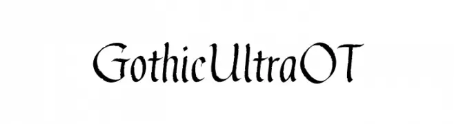
( Fonts by Blue Vinyl - Jess Latham - www.bvfonts.com )
A bold Gothic-style font with sharp, angular strokes and medieval influences.
![GothicUltraOT font caratteri gratis]() Scaricare 363 Downloads@WebFont
Scaricare 363 Downloads@WebFont -
-
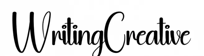
( Fonts by Andi Moz )
A playful, handwritten-style font with dynamic uppercase and bold lowercase letters.
![Writing Creative font caratteri gratis]() Scaricare 363 Downloads@WebFont
Scaricare 363 Downloads@WebFont -
![NIBIRU font caratteri gratis]() Scaricare 363 Downloads@WebFont
Scaricare 363 Downloads@WebFont -
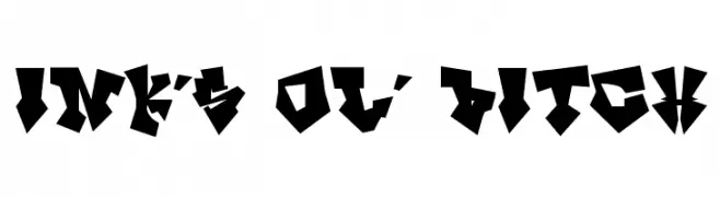
( Fonts by Rob Dobi - Toxic Type - www.dobi.nu )
A bold, angular font with a geometric, edgy style reminiscent of graffiti.
![InK's ol' Bitch font caratteri gratis]() Scaricare 363 Downloads@WebFont
Scaricare 363 Downloads@WebFont -
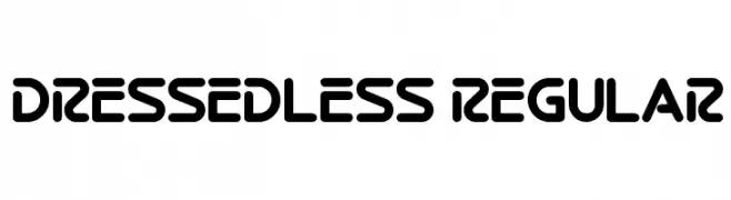
( Fonts by Dan P. Lyons - Personal-use only. For commercial use please contact owner. )
A bold, modern font with rounded edges and a geometric structure.
![Dressedless Regular font caratteri gratis]() Scaricare 363 Downloads@WebFont
Scaricare 363 Downloads@WebFont -
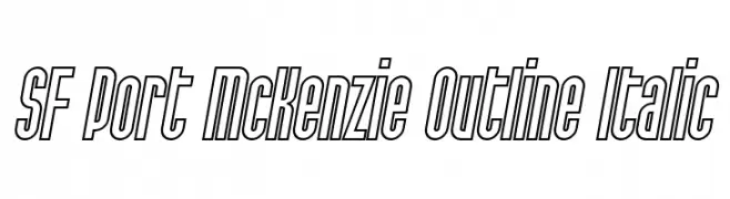
( Fonts by ShyFonts )
A bold, outlined, italic font with a modern and dynamic style.
![SF Port McKenzie Outline Italic font caratteri gratis]() Scaricare 363 Downloads@WebFont
Scaricare 363 Downloads@WebFont

Quali sono i font più popolari adesso?
Poppins, Roboto, Montserrat, Open Sans e Lato sono molto usati per le forme pulite e l'ampia applicabilità — dall'identità di marca alle landing page e ai poster.
Quali font si usano spesso nei loghi?
Le sans serif geometriche (es. Poppins, famiglie in stile Gotham) sono scelte comuni per un branding pulito e scalabile. Per un tocco personale restano valide script e stili manoscritti. Abbina un display deciso per i titoli a un corpo testo neutro per riconoscibilità ed equilibrio.
Ogni quanto si aggiorna la lista?
Con regolarità, in base ai download e all'attività reale. Torna spesso per scoprire in anticipo le nuove preferite.
💡 Consiglio: aggiungi ai preferiti — le tendenze cambiano in fretta e i font top di oggi possono ispirare il rebranding di domani.