Benvenuto nelle Font Più Popolari — dove popolarità e qualità si incontrano. Qui trovi i font più scaricati e usati dell'anno. Se cerchi scelte sicure per logo, web o social, inizia da qui.
Ogni font top si distingue per equilibrio, leggibilità e versatilità. Troverai sans serif moderne, script eleganti, serif vintage e display minimalisti.
-
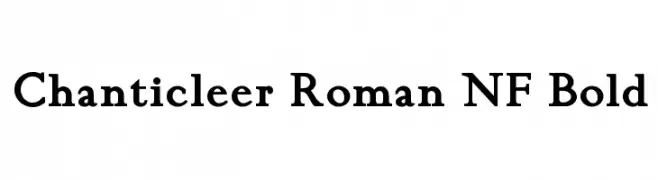
( Fonts by Nick Curtis - www.nicksfonts.com )
A bold, classic serif font with strong, pronounced strokes.
 Scaricare 1323 Downloads@WebFont
 -
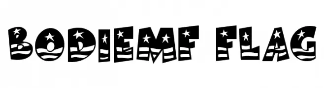
( Fonts by Rick Mueller )
A bold, patriotic-themed font with stars and stripes, ideal for decorative use.
![BodieMF Flag font caratteri gratis]() Scaricare 1323 Downloads@WebFont
Scaricare 1323 Downloads@WebFont -
( Khurasan - Syaf Rizal - creativemarket.com/khurasan?u=khurasan )
A graceful script font with fluid, handwritten-style characters.
![Reman font caratteri gratis]() Scaricare 1322 Downloads@WebFont
Scaricare 1322 Downloads@WebFont -
![Toxico font caratteri gratis]() Scaricare 1322 Downloads@WebFont
Scaricare 1322 Downloads@WebFont -
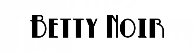
( Fonts by www.blambot.com )
A bold, high-contrast font with dramatic angles and curves.
![Betty Noir font caratteri gratis]() Scaricare 1322 Downloads@WebFont
Scaricare 1322 Downloads@WebFont -
-
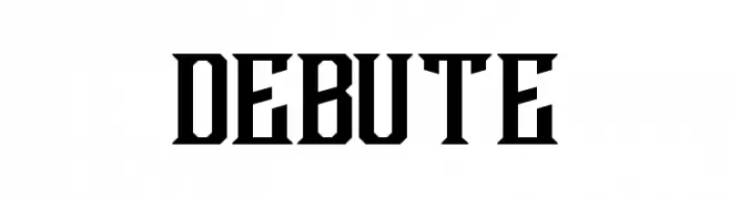
( Fonts by twicolabs.com - Twicolabs Typefoundry )
A bold, geometric font with sharp angles and consistent stroke width.
![Debute font caratteri gratis]() Scaricare 1322 Downloads@WebFont
Scaricare 1322 Downloads@WebFont -
![SF Fourche SC Italic font caratteri gratis]() Scaricare 1322 Downloads@WebFont
Scaricare 1322 Downloads@WebFont -
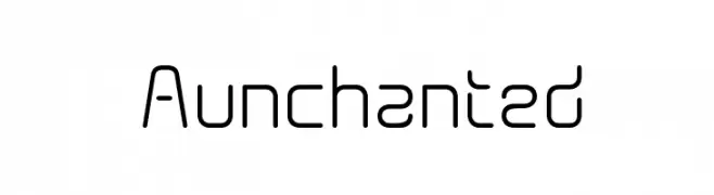
( Fonts by Graham Meade - GemFonts )
A modern, geometric font with a sleek, futuristic design.
![Aunchanted font caratteri gratis]() Scaricare 1322 Downloads@WebFont
Scaricare 1322 Downloads@WebFont -
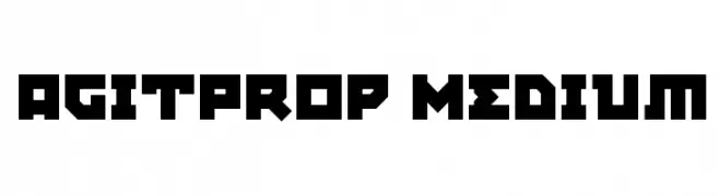
![AgitProp Medium font caratteri gratis]() Scaricare 1322 Downloads@WebFont
Scaricare 1322 Downloads@WebFont -
![Devil inside font caratteri gratis]() Scaricare 1322 Downloads@WebFont
Scaricare 1322 Downloads@WebFont -
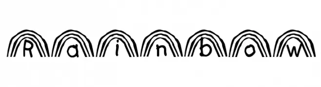
( Personal-use only. For commercial use please contact owner. )
A decorative font with rainbow-like arches formed by parallel lines.
![Rainbow font caratteri gratis]() Scaricare 1322 Downloads@WebFont
Scaricare 1322 Downloads@WebFont -
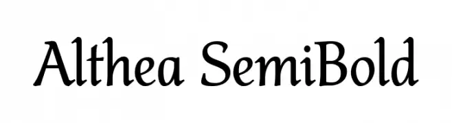
( Fonts by Pawel Burgiel - Personal-use only. For commercial use please contact owner. )
A semi-bold serif font with elegant curves and classic style.
![Althea SemiBold font caratteri gratis]() Scaricare 1321 Downloads@WebFont
Scaricare 1321 Downloads@WebFont -
( Fonts by Woodcutter Manero - www.woodcutter.es - Personal-use only. For commercial use please contact owner. )
A bold, playful font with a hand-drawn, whimsical style.
![Simulacro font caratteri gratis]() Scaricare 1321 Downloads@WebFont
Scaricare 1321 Downloads@WebFont -
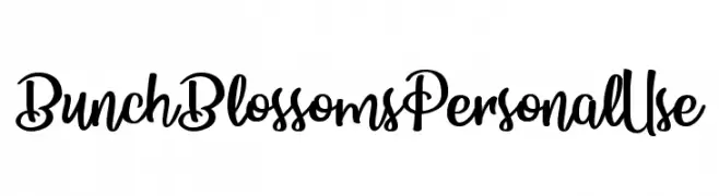
( Billy Argel - billyargel.com/ )
A bold, playful script font with dynamic and flowing letterforms.
![Bunch Blossoms Personal Use font caratteri gratis]() Scaricare 1321 Downloads@WebFont
Scaricare 1321 Downloads@WebFont -
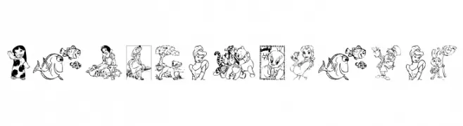
![Disney family 1 font caratteri gratis]() Scaricare 1321 Downloads@WebFont
Scaricare 1321 Downloads@WebFont -
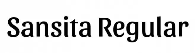
( Copyright 2016 The Sansita Project Authors (omnibus.type@gmail.com) )
A modern, bold font with a playful yet professional style.
![Sansita Regular font caratteri gratis]() Scaricare 1321 Downloads@WebFont
Scaricare 1321 Downloads@WebFont -
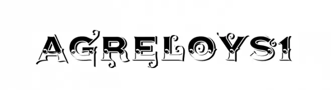
( Fonts by gluk )
An ornate, vintage-style decorative font with intricate details and high contrast.
![AgreloyS1 font caratteri gratis]() Scaricare 1321 Downloads@WebFont
Scaricare 1321 Downloads@WebFont -
( www.behance.net/rasdesign )
A bold, playful font with a hand-drawn, dynamic style.
![PINTANINA font caratteri gratis]() Scaricare 1321 Downloads@WebFont
Scaricare 1321 Downloads@WebFont -
![Agero! font caratteri gratis]() Scaricare 1321 Downloads@WebFont
Scaricare 1321 Downloads@WebFont -
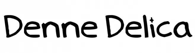
( Fonts by Denise Bentulan - douxiegirl.com. Personal-use only. For commercial use please contact owner. )
A playful, handwritten font with rounded, irregular letterforms.
![Denne Delica font caratteri gratis]() Scaricare 1321 Downloads@WebFont
Scaricare 1321 Downloads@WebFont -
![CorpusCare font caratteri gratis]() Scaricare 1321 Downloads@WebFont
Scaricare 1321 Downloads@WebFont -
Caratteri di gatype. For commercial use please contact the owner.
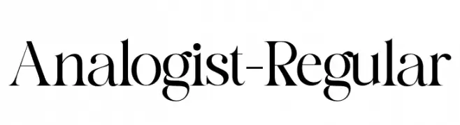
( Free for personal use )
A high-contrast, elegant serif typeface with sharp serifs and a classic style.
![Analogist-Regular font caratteri gratis]() Scaricare 1320 Downloads@WebFont
Scaricare 1320 Downloads@WebFont -
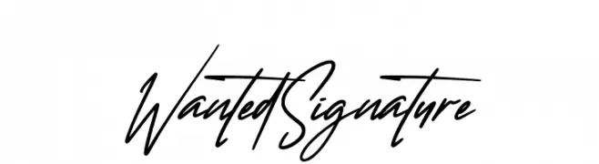
![Wanted Signature font caratteri gratis]() Scaricare 1320 Downloads@WebFont
Scaricare 1320 Downloads@WebFont -
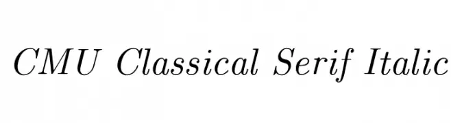
( Fonts by Donald E. Knuth - Personal-use only. For commercial use please contact owner. )
A classic, elegant italic serif font with graceful curves and refined structure.
![CMU Classical Serif Italic font caratteri gratis]() Scaricare 1320 Downloads@WebFont
Scaricare 1320 Downloads@WebFont -
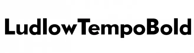
![LudlowTempoBold font caratteri gratis]() Scaricare 1320 Downloads@WebFont
Scaricare 1320 Downloads@WebFont -
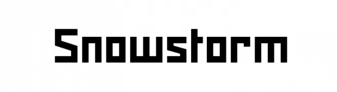
( Denis Sherbak - yavlenie.com )
A bold, geometric font with sharp, angular edges and a strong presence.
![Snowstorm font caratteri gratis]() Scaricare 1320 Downloads@WebFont
Scaricare 1320 Downloads@WebFont -
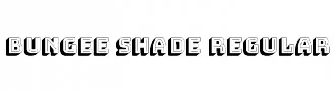
( Copyright 2008 The Bungee Project Authors (david@djr.com) )
A bold, 3D shadowed font with a playful, retro style.
![Bungee Shade Regular font caratteri gratis]() Scaricare 1320 Downloads@WebFont
Scaricare 1320 Downloads@WebFont -
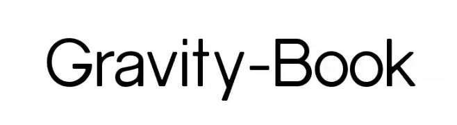
![Gravity-Book font caratteri gratis]() Scaricare 1320 Downloads@WebFont
Scaricare 1320 Downloads@WebFont -
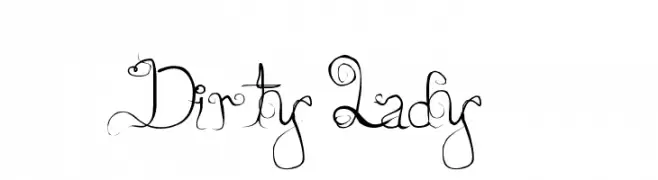
![Dirty Lady font caratteri gratis]() Scaricare 1320 Downloads@WebFont
Scaricare 1320 Downloads@WebFont -
( Fonts by www.kimberlygeswein.com - Kimberly Geswein )
A lively, handwritten-style font with bold, expressive strokes.
![Celebrate the Day font caratteri gratis]() Scaricare 1320 Downloads@WebFont
Scaricare 1320 Downloads@WebFont -
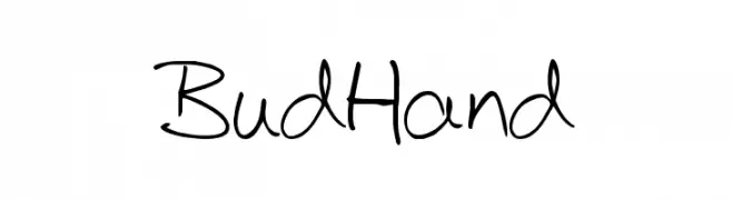
( Fonts by John David www.easywriter.com/fonts/ )
A playful, handwritten font with dynamic strokes and a casual style.
![BudHand font caratteri gratis]() Scaricare 1320 Downloads@WebFont
Scaricare 1320 Downloads@WebFont -
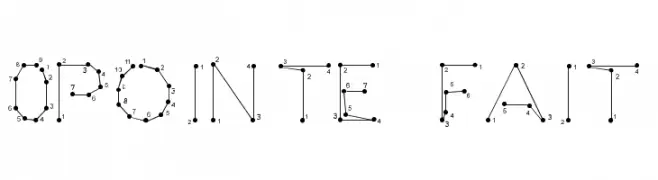
![0Pointe-Fait font caratteri gratis]() Scaricare 1320 Downloads@WebFont
Scaricare 1320 Downloads@WebFont -
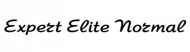
![Expert Elite Normal font caratteri gratis]() Scaricare 1320 Downloads
Scaricare 1320 Downloads -
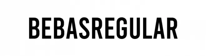
( Fonts by Dharma Type - Ryoichi Tsunekawa - Personal-use only. For commercial use please contact owner. )
A bold, modern sans-serif font with a condensed and geometric style.
![Bebas Regular font caratteri gratis]() Scaricare 1319 Downloads@WebFont
Scaricare 1319 Downloads@WebFont -
( Fonts by Uwe Borchert - Personal-use only. For commercial use please contact owner. )
A bold, condensed font with high contrast and elongated letterforms.
![BStyle-Bold font caratteri gratis]() Scaricare 1319 Downloads@WebFont
Scaricare 1319 Downloads@WebFont


Quali sono i font più popolari adesso?
Poppins, Roboto, Montserrat, Open Sans e Lato sono molto usati per le forme pulite e l'ampia applicabilità — dall'identità di marca alle landing page e ai poster.
Quali font si usano spesso nei loghi?
Le sans serif geometriche (es. Poppins, famiglie in stile Gotham) sono scelte comuni per un branding pulito e scalabile. Per un tocco personale restano valide script e stili manoscritti. Abbina un display deciso per i titoli a un corpo testo neutro per riconoscibilità ed equilibrio.
Ogni quanto si aggiorna la lista?
Con regolarità, in base ai download e all'attività reale. Torna spesso per scoprire in anticipo le nuove preferite.
💡 Consiglio: aggiungi ai preferiti — le tendenze cambiano in fretta e i font top di oggi possono ispirare il rebranding di domani.