Benvenuto nelle Font Più Popolari — dove popolarità e qualità si incontrano. Qui trovi i font più scaricati e usati dell'anno. Se cerchi scelte sicure per logo, web o social, inizia da qui.
Ogni font top si distingue per equilibrio, leggibilità e versatilità. Troverai sans serif moderne, script eleganti, serif vintage e display minimalisti.
-
( Fonts by Syaf Rizal - www.creativefabrica.com/ref/53/ - Personal-use only. For commercial use please contact owner. )
A lively, handwritten font with fluid, connected letters and a playful style.
 Scaricare 352 Downloads@WebFont
 -
( Fonts by Manfred Klein - manfred-klein.ina-mar.com )
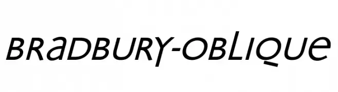
A modern, oblique font with a sleek and dynamic style.
![Bradbury-Oblique font caratteri gratis]() Scaricare 352 Downloads@WebFont
Scaricare 352 Downloads@WebFont -
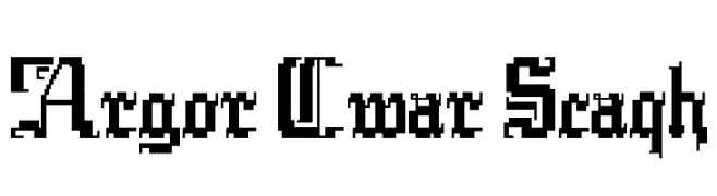
![Argor Cwar Scaqh font caratteri gratis]() Scaricare 352 Downloads@WebFont
Scaricare 352 Downloads@WebFont -
( Fonts by DumadiStyle )
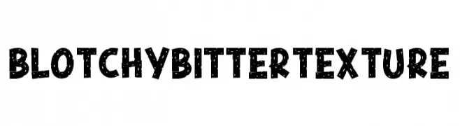
A bold, playful font with a blotchy texture and a dynamic, handcrafted feel.
![Blotchy Bitter Texture font caratteri gratis]() Scaricare 352 Downloads@WebFont
Scaricare 352 Downloads@WebFont -
( Twicolabs Fontdation - Fahrizal Tawakkal - fontdation.com )
A tall, narrow serif font with high contrast and sharp serifs.
![Highwind font caratteri gratis]() Scaricare 352 Downloads@WebFont
Scaricare 352 Downloads@WebFont -
-
( Roger White - web.archive.org/web/20120416090521/www.rogersfonts.org.uk/ )
A bold, condensed font with high contrast and a strong vertical emphasis.
![Tiverton font caratteri gratis]() Scaricare 352 Downloads@WebFont
Scaricare 352 Downloads@WebFont -
( Fonts by www.houseoflime.com )
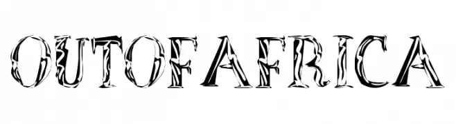
A bold, decorative font with intricate, nature-inspired patterns.
![OutOfAfrica font caratteri gratis]() Scaricare 352 Downloads@WebFont
Scaricare 352 Downloads@WebFont -
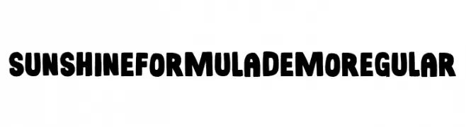
( Fonts by Pizzadude )
A bold, rounded font with a playful and friendly style.
![Sunshine Formula DEMO Regular font caratteri gratis]() Scaricare 352 Downloads@WebFont
Scaricare 352 Downloads@WebFont -
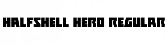
( Fonts by Daniel Zadorozny - www.iconian.com )
A bold, angular font with a strong geometric and modern aesthetic.
![Halfshell Hero Regular font caratteri gratis]() Scaricare 352 Downloads@WebFont
Scaricare 352 Downloads@WebFont -
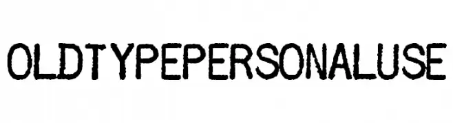
( Fonts by Billy Argel - www.billyargel.com - Personal-use only. For commercial use please contact owner. )
A bold, distressed font with a hand-drawn, grunge aesthetic.
![OLDTYPEPERSONALUSE font caratteri gratis]() Scaricare 352 Downloads@WebFont
Scaricare 352 Downloads@WebFont


Quali sono i font più popolari adesso?
Poppins, Roboto, Montserrat, Open Sans e Lato sono molto usati per le forme pulite e l'ampia applicabilità — dall'identità di marca alle landing page e ai poster.
Quali font si usano spesso nei loghi?
Le sans serif geometriche (es. Poppins, famiglie in stile Gotham) sono scelte comuni per un branding pulito e scalabile. Per un tocco personale restano valide script e stili manoscritti. Abbina un display deciso per i titoli a un corpo testo neutro per riconoscibilità ed equilibrio.
Ogni quanto si aggiorna la lista?
Con regolarità, in base ai download e all'attività reale. Torna spesso per scoprire in anticipo le nuove preferite.
💡 Consiglio: aggiungi ai preferiti — le tendenze cambiano in fretta e i font top di oggi possono ispirare il rebranding di domani.