Benvenuto nelle Font Più Popolari — dove popolarità e qualità si incontrano. Qui trovi i font più scaricati e usati dell'anno. Se cerchi scelte sicure per logo, web o social, inizia da qui.
Ogni font top si distingue per equilibrio, leggibilità e versatilità. Troverai sans serif moderne, script eleganti, serif vintage e display minimalisti.
-
( Fonts by NDISCOVER )
A bold, playful typeface with rounded edges and a friendly appearance.
 Scaricare 351 Downloads@WebFont
 -
( Josen Tan - www.roblox.com )
A bold, geometric font with a modern, futuristic style.
![Square Regular font caratteri gratis]() Scaricare 351 Downloads@WebFont
Scaricare 351 Downloads@WebFont -
( Fonts by Maulana Creative - Gilang Maulana - Personal-use only. For commercial use please contact owner. )
A clean, modern sans-serif font with excellent readability and uniform appearance.
![Bergman Sans Free Regular font caratteri gratis]() Scaricare 351 Downloads@WebFont
Scaricare 351 Downloads@WebFont -
![Star-Down font caratteri gratis]() Scaricare 351 Downloads@WebFont
Scaricare 351 Downloads@WebFont -
( Fonts by Adien Gunarta - fontasticindonesia.blogspot.com )
A modern, geometric font with a futuristic and technical style.
![Nurkholis font caratteri gratis]() Scaricare 351 Downloads@WebFont
Scaricare 351 Downloads@WebFont -
-
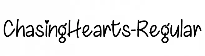
( Fonts by Misti Hammers - mistifonts.com - Personal-use only. For commercial use please contact owner. )
A playful handwritten font with heart accents, perfect for romantic and casual designs.
![ChasingHearts-Regular font caratteri gratis]() Scaricare 351 Downloads@WebFont
Scaricare 351 Downloads@WebFont -
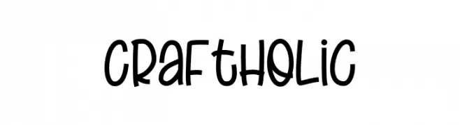
( Fonts by Nirmana Visual )
A playful, hand-drawn font with a whimsical and friendly style.
![Craft Holic font caratteri gratis]() Scaricare 351 Downloads@WebFont
Scaricare 351 Downloads@WebFont -
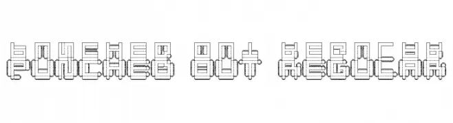
( Fonts by Tobias Sommer - mentalmenthol.blogspot.com )
A bold, industrial font with a punched-out, geometric design.
![Punched Out Regular font caratteri gratis]() Scaricare 351 Downloads@WebFont
Scaricare 351 Downloads@WebFont -
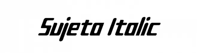
( Fonts by www.tepidmonkey.net )
A bold, italic font with a modern and dynamic style.
![Sujeta Italic font caratteri gratis]() Scaricare 351 Downloads@WebFont
Scaricare 351 Downloads@WebFont -
![Koln Messe-Deutz font caratteri gratis]() Scaricare 351 Downloads@WebFont
Scaricare 351 Downloads@WebFont

Quali sono i font più popolari adesso?
Poppins, Roboto, Montserrat, Open Sans e Lato sono molto usati per le forme pulite e l'ampia applicabilità — dall'identità di marca alle landing page e ai poster.
Quali font si usano spesso nei loghi?
Le sans serif geometriche (es. Poppins, famiglie in stile Gotham) sono scelte comuni per un branding pulito e scalabile. Per un tocco personale restano valide script e stili manoscritti. Abbina un display deciso per i titoli a un corpo testo neutro per riconoscibilità ed equilibrio.
Ogni quanto si aggiorna la lista?
Con regolarità, in base ai download e all'attività reale. Torna spesso per scoprire in anticipo le nuove preferite.
💡 Consiglio: aggiungi ai preferiti — le tendenze cambiano in fretta e i font top di oggi possono ispirare il rebranding di domani.