Benvenuto nelle Font Più Popolari — dove popolarità e qualità si incontrano. Qui trovi i font più scaricati e usati dell'anno. Se cerchi scelte sicure per logo, web o social, inizia da qui.
Ogni font top si distingue per equilibrio, leggibilità e versatilità. Troverai sans serif moderne, script eleganti, serif vintage e display minimalisti.
-
( Fonts by http://ar.photoshop.3abber.com - Personal-use only. For commercial use please contact owner. )
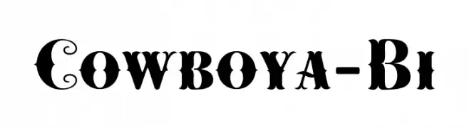
A bold and impactful font with thick strokes, perfect for headlines.
 Scaricare 347 Downloads
 -
![Cowboya-Bi font caratteri gratis]() Scaricare 347 Downloads@WebFont
Scaricare 347 Downloads@WebFont -
( Fonts by Zarma Type Foundry - Azzam Ridhamalik - Personal-use only. For commercial use please contact owner. )
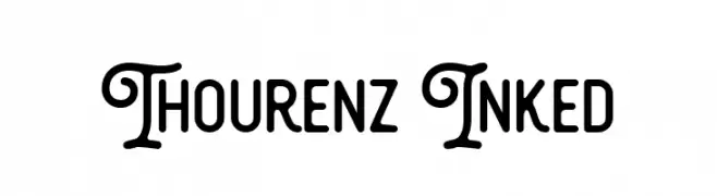
A versatile font combining decorative elegance with modern sans-serif clarity.
![Thourenz Inked font caratteri gratis]() Scaricare 347 Downloads@WebFont
Scaricare 347 Downloads@WebFont -
( Fonts by Christophe Feray - www.wcfonts.com )
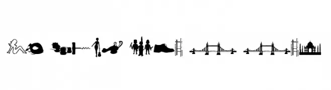
A pictogram dingbat font with assorted object silhouettes and sale tags.
![WC Sold Out B Bta font caratteri gratis]() Scaricare 347 Downloads@WebFont
Scaricare 347 Downloads@WebFont -
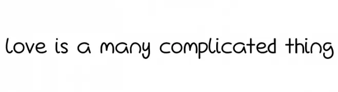
![Love Is A Many Complicated Thing font caratteri gratis]() Scaricare 347 Downloads@WebFont
Scaricare 347 Downloads@WebFont -
-
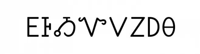
( Fonts by Kenneth Hirst )
A script representing the Cherokee syllabary with rounded, uniform characters.
![Sequoyah font caratteri gratis]() Scaricare 347 Downloads@WebFont
Scaricare 347 Downloads@WebFont -
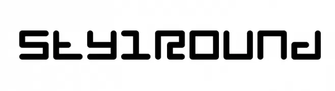
( Fonts by www.feorag.com )
A modern, rounded font with a geometric and futuristic style.
![StylRound font caratteri gratis]() Scaricare 347 Downloads@WebFont
Scaricare 347 Downloads@WebFont -
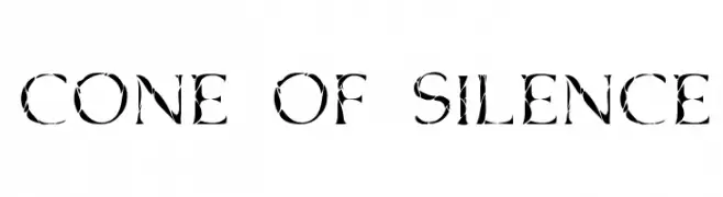
![Cone Of Silence font caratteri gratis]() Scaricare 347 Downloads@WebFont
Scaricare 347 Downloads@WebFont -
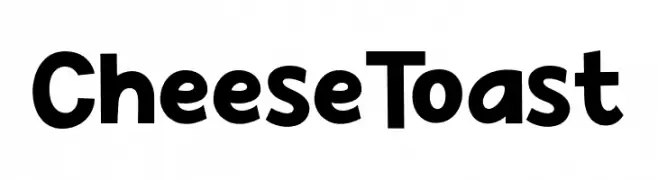
( Fonts by Khurasan )
A bold, playful font with rounded, hand-drawn characteristics.
![Cheese Toast font caratteri gratis]() Scaricare 347 Downloads@WebFont
Scaricare 347 Downloads@WebFont -
( Fonts by Nirmala Creative - Personal-use only. For commercial use please contact owner. )
Playful handwritten font with bold strokes.
![Spring Time font caratteri gratis]() Scaricare 347 Downloads@WebFont
Scaricare 347 Downloads@WebFont
Quali sono i font più popolari adesso?
Poppins, Roboto, Montserrat, Open Sans e Lato sono molto usati per le forme pulite e l'ampia applicabilità — dall'identità di marca alle landing page e ai poster.
Quali font si usano spesso nei loghi?
Le sans serif geometriche (es. Poppins, famiglie in stile Gotham) sono scelte comuni per un branding pulito e scalabile. Per un tocco personale restano valide script e stili manoscritti. Abbina un display deciso per i titoli a un corpo testo neutro per riconoscibilità ed equilibrio.
Ogni quanto si aggiorna la lista?
Con regolarità, in base ai download e all'attività reale. Torna spesso per scoprire in anticipo le nuove preferite.
💡 Consiglio: aggiungi ai preferiti — le tendenze cambiano in fretta e i font top di oggi possono ispirare il rebranding di domani.