Benvenuto nelle Font Più Popolari — dove popolarità e qualità si incontrano. Qui trovi i font più scaricati e usati dell'anno. Se cerchi scelte sicure per logo, web o social, inizia da qui.
Ogni font top si distingue per equilibrio, leggibilità e versatilità. Troverai sans serif moderne, script eleganti, serif vintage e display minimalisti.
-
( Fonts by RaffaSyad Studio - www.creativefabrica.com/designer/r-studio/ - Personal-use only. For commercial use please contact owner. )
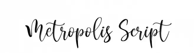
A lively and elegant script font with fluid, cursive strokes.
 Scaricare 321 Downloads@WebFont
 -
( Fonts by Letterhend Studio )
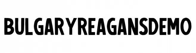
Bold, decorative font with a playful style.
![BulgaryReagansDemo font caratteri gratis]() Scaricare 321 Downloads@WebFont
Scaricare 321 Downloads@WebFont -
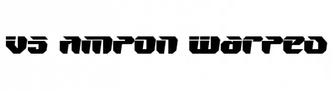
![V5 Ampon Warped font caratteri gratis]() Scaricare 321 Downloads@WebFont
Scaricare 321 Downloads@WebFont -
( Fonts by Daniel Zadorozny - www.iconian.com - Free for personal use )
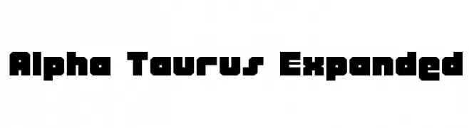
A bold, geometric font with expanded width and a modern, industrial style.
![Alpha Taurus Expanded font caratteri gratis]() Scaricare 321 Downloads@WebFont
Scaricare 321 Downloads@WebFont -
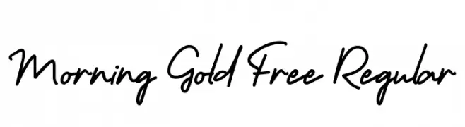
( Craft Supply Co. - creativemarket.com/craftsupplyco )
A fluid and dynamic handwritten font with a natural cursive style.
![Morning Gold Free Regular font caratteri gratis]() Scaricare 321 Downloads@WebFont
Scaricare 321 Downloads@WebFont -
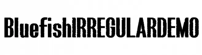
-
![Bluefish IRREGULAR DEMO font caratteri gratis]() Scaricare 321 Downloads@WebFont
Scaricare 321 Downloads@WebFont -
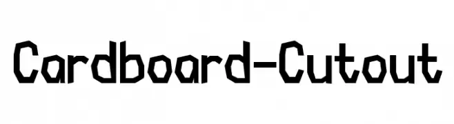
( Thor Christopher Arisland - www.tcarisland.com )
A bold, geometric font with a cutout, handmade appearance.
![Cardboard-Cutout font caratteri gratis]() Scaricare 321 Downloads@WebFont
Scaricare 321 Downloads@WebFont -
( Michael Gaines )
A modern, geometric font with rounded edges and circular cutouts, offering a playful yet clean aesthetic.
![Lou Gramm font caratteri gratis]() Scaricare 321 Downloads@WebFont
Scaricare 321 Downloads@WebFont -
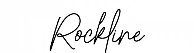
( Fonts by Ramli Setiadi - Personal-use only. For commercial use please contact owner. )
A lively handwritten font with fluid, dynamic strokes and a playful, informal style.
![Rockline font caratteri gratis]() Scaricare 321 Downloads@WebFont
Scaricare 321 Downloads@WebFont -
( Fonts by Insanitype )
A playful, energetic font with tall, narrow letters and a slight slant.
![Shoestore font caratteri gratis]() Scaricare 321 Downloads@WebFont
Scaricare 321 Downloads@WebFont


Quali sono i font più popolari adesso?
Poppins, Roboto, Montserrat, Open Sans e Lato sono molto usati per le forme pulite e l'ampia applicabilità — dall'identità di marca alle landing page e ai poster.
Quali font si usano spesso nei loghi?
Le sans serif geometriche (es. Poppins, famiglie in stile Gotham) sono scelte comuni per un branding pulito e scalabile. Per un tocco personale restano valide script e stili manoscritti. Abbina un display deciso per i titoli a un corpo testo neutro per riconoscibilità ed equilibrio.
Ogni quanto si aggiorna la lista?
Con regolarità, in base ai download e all'attività reale. Torna spesso per scoprire in anticipo le nuove preferite.
💡 Consiglio: aggiungi ai preferiti — le tendenze cambiano in fretta e i font top di oggi possono ispirare il rebranding di domani.