Benvenuto nelle Font Più Popolari — dove popolarità e qualità si incontrano. Qui trovi i font più scaricati e usati dell'anno. Se cerchi scelte sicure per logo, web o social, inizia da qui.
Ogni font top si distingue per equilibrio, leggibilità e versatilità. Troverai sans serif moderne, script eleganti, serif vintage e display minimalisti.
-
 Scaricare 1156 Downloads@WebFont
 -
![Tabatha Bold font caratteri gratis]() Scaricare 1156 Downloads
Scaricare 1156 Downloads -
( Fonts by Creakokun Studio )
A bold, playful handwritten font with a casual, friendly style.
![Daily Keisha font caratteri gratis]() Scaricare 1155 Downloads@WebFont
Scaricare 1155 Downloads@WebFont -
( Fonts by Vladimir Nikolic - www.creativefabrica.com/designer/vladimirnikolic/ - Personal-use only. For commercial use please contact owner. )
A bold, geometric font with sharp angles and a modern, dynamic style.
![Erotica Light font caratteri gratis]() Scaricare 1155 Downloads@WebFont
Scaricare 1155 Downloads@WebFont -
( Fonts by www.chequered.ink - Chequered Ink - Personal-use only. For commercial use please contact owner. )
A bold, jagged font with a distressed, horror-themed style.
![The Macabre font caratteri gratis]() Scaricare 1155 Downloads@WebFont
Scaricare 1155 Downloads@WebFont -
( Fonts by www.gliphmaker.com. Personal-use only. For commercial use please contact owner. )
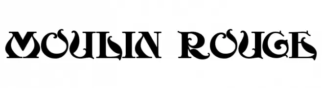
A bold, decorative font with intricate serifs and vintage flair.
![Moulin Rouge font caratteri gratis]() Scaricare 1155 Downloads@WebFont
Scaricare 1155 Downloads@WebFont -
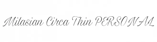
![Milasian Circa Thin PERSONAL font caratteri gratis]() Scaricare 1155 Downloads@WebFont
Scaricare 1155 Downloads@WebFont -
( Fonts by Galdino Otten - galdinootten.com )
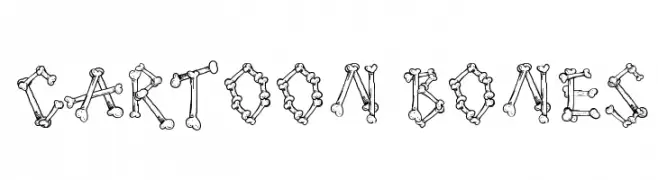
A playful, bone-themed font perfect for creative and themed projects.
![Cartoon Bones font caratteri gratis]() Scaricare 1155 Downloads@WebFont
Scaricare 1155 Downloads@WebFont -
( Fonts by Castcraft Software - opti.netii.net - check the website before use )
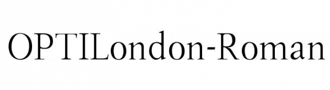
A classic serif font with elegant proportions and moderate contrast.
![OPTILondon-Roman font caratteri gratis]() Scaricare 1155 Downloads@WebFont
Scaricare 1155 Downloads@WebFont -
( Copyright (c) 2012, Brian J. Bonislawsky DBA Astigmatic (AOETI) (astigma@astigmatic.com), with Reserved Font Names "Eagle Lake" )
A calligraphic font with elegant, flowing lines and moderate contrast.
![EagleLake-Regular font caratteri gratis]() Scaricare 1155 Downloads@WebFont
Scaricare 1155 Downloads@WebFont -
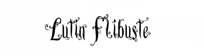
![Lutin Flibuste font caratteri gratis]() Scaricare 1155 Downloads@WebFont
Scaricare 1155 Downloads@WebFont -
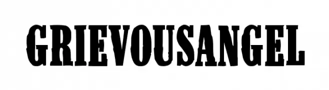
![GrievousAngel font caratteri gratis]() Scaricare 1155 Downloads@WebFont
Scaricare 1155 Downloads@WebFont -
( Fonts by Apostrophic Lab )
A modern, clean font with excellent readability and balanced design.
![Steinem font caratteri gratis]() Scaricare 1155 Downloads@WebFont
Scaricare 1155 Downloads@WebFont -
( Fonts by Casady & Greene )
A tall, narrow, and bold typeface ideal for impactful headlines.
![GiottoFLF-Bold font caratteri gratis]() Scaricare 1155 Downloads@WebFont
Scaricare 1155 Downloads@WebFont -
![Bulgarian Palatia font caratteri gratis]() Scaricare 1155 Downloads@WebFont
Scaricare 1155 Downloads@WebFont -
![AnmolUniBani font caratteri gratis]() Scaricare 1155 Downloads@WebFont
Scaricare 1155 Downloads@WebFont -
( Fonts by Hanoded )
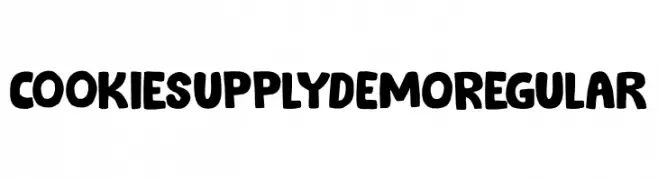
A bold, playful font with a chunky, hand-drawn style and textured details.
![Cookie Supply DEMO Regular font caratteri gratis]() Scaricare 1154 Downloads@WebFont
Scaricare 1154 Downloads@WebFont -
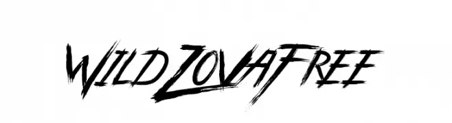
![Wild Zova Free font caratteri gratis]() Scaricare 1154 Downloads@WebFont
Scaricare 1154 Downloads@WebFont -
( imagex - www.imagex-fonts.com )
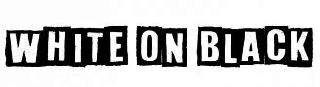
A bold, distressed stencil font with a vintage, industrial feel.
![White On Black font caratteri gratis]() Scaricare 1154 Downloads@WebFont
Scaricare 1154 Downloads@WebFont -
( Sascha Timplan - blog.stereotypes.de )
A tall, elegant font with high contrast and elongated strokes.
![Flenja font caratteri gratis]() Scaricare 1154 Downloads@WebFont
Scaricare 1154 Downloads@WebFont -
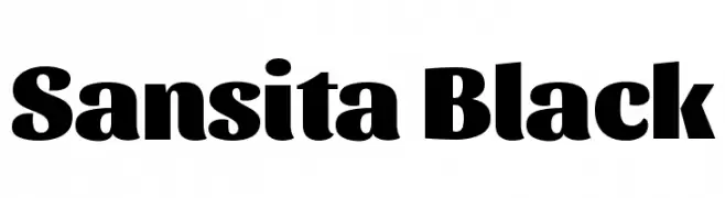
( Copyright 2016 The Sansita Project Authors (omnibus.type@gmail.com) )
A bold and robust font with thick strokes and a modern yet classic style.
![Sansita Black font caratteri gratis]() Scaricare 1154 Downloads@WebFont
Scaricare 1154 Downloads@WebFont -
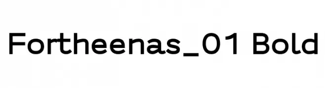
( Fonts by a Situjuh Nazara - c7n1.wordpress.com. Personal-use only. For commercial use please contact owner. )
A bold, modern sans-serif font with clean lines and excellent readability.
![Fortheenas_01 Bold font caratteri gratis]() Scaricare 1154 Downloads@WebFont
Scaricare 1154 Downloads@WebFont -
( Fonts by Daniel Zadorozny - www.iconian.com )
Bold, geometric font with sharp angles and a modern look.
![Grand National font caratteri gratis]() Scaricare 1154 Downloads@WebFont
Scaricare 1154 Downloads@WebFont -
( Fonts by a Neale Davidson - www.pixelsagas.com. Personal-use only. For commercial use please contact owner. )
A bold, italic font with a dynamic and futuristic style.
![Jhiaxus Italic font caratteri gratis]() Scaricare 1154 Downloads@WebFont
Scaricare 1154 Downloads@WebFont -
( Fonts by Vanessa Bays - bythebutterfly.com )
A playful, rounded font with whimsical paw print accents.
![PuppyBellies font caratteri gratis]() Scaricare 1154 Downloads@WebFont
Scaricare 1154 Downloads@WebFont -
( Fonts by Apostrophic Lab )
A bold, decorative font with a shadow effect, ideal for striking designs.
![Extrano - Sombra font caratteri gratis]() Scaricare 1154 Downloads@WebFont
Scaricare 1154 Downloads@WebFont -
( Fonts by Christophe Feray - www.wcfonts.com )
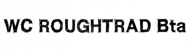
A bold, distressed font with a rugged, hand-drawn appearance.
![WC ROUGHTRAD Bta font caratteri gratis]() Scaricare 1154 Downloads@WebFont
Scaricare 1154 Downloads@WebFont -
( Fonts by www.junkohanhero.com )
A distressed, typewriter-style font with a grunge aesthetic.
![Type-Ra font caratteri gratis]() Scaricare 1154 Downloads@WebFont
Scaricare 1154 Downloads@WebFont -
( Fonts by Steve Ferrera )
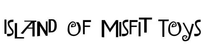
A playful and whimsical font with quirky, bold letterforms and unique character designs.
![Island of Misfit Toys font caratteri gratis]() Scaricare 1154 Downloads@WebFont
Scaricare 1154 Downloads@WebFont -
( Fonts by Daniel Gauthier )
A playful, hand-drawn font with a bold and energetic style.
![FantasticFont font caratteri gratis]() Scaricare 1154 Downloads@WebFont
Scaricare 1154 Downloads@WebFont -
( Fonts by Jacob Fisher - www.pizzadude.dk )
A bold, geometric font with a modern, futuristic style.
![Xray Ted font caratteri gratis]() Scaricare 1154 Downloads@WebFont
Scaricare 1154 Downloads@WebFont -
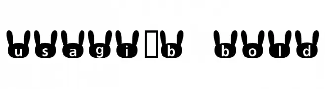
![usagi_b Bold font caratteri gratis]() Scaricare 1154 Downloads@WebFont
Scaricare 1154 Downloads@WebFont -
( Fonts by Paul Lloyd )
A serif font with a unique shadow effect, offering a classic and bold appearance.
![GranthamShadow font caratteri gratis]() Scaricare 1154 Downloads
Scaricare 1154 Downloads -
( Fonts by wep )
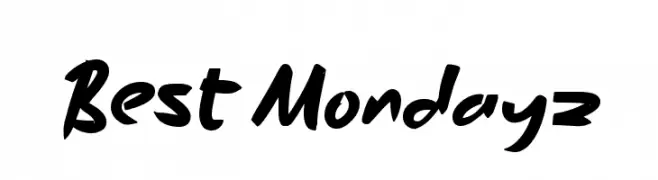
A bold, brush-style handwritten font with a playful and dynamic appearance.
![Best Mondayz font caratteri gratis]() Scaricare 1153 Downloads@WebFont
Scaricare 1153 Downloads@WebFont -
( Syntetype Studio )
A bold, geometric sans-serif font with a modern and clean design.
![Neozoic Trial font caratteri gratis]() Scaricare 1153 Downloads@WebFont
Scaricare 1153 Downloads@WebFont


Quali sono i font più popolari adesso?
Poppins, Roboto, Montserrat, Open Sans e Lato sono molto usati per le forme pulite e l'ampia applicabilità — dall'identità di marca alle landing page e ai poster.
Quali font si usano spesso nei loghi?
Le sans serif geometriche (es. Poppins, famiglie in stile Gotham) sono scelte comuni per un branding pulito e scalabile. Per un tocco personale restano valide script e stili manoscritti. Abbina un display deciso per i titoli a un corpo testo neutro per riconoscibilità ed equilibrio.
Ogni quanto si aggiorna la lista?
Con regolarità, in base ai download e all'attività reale. Torna spesso per scoprire in anticipo le nuove preferite.
💡 Consiglio: aggiungi ai preferiti — le tendenze cambiano in fretta e i font top di oggi possono ispirare il rebranding di domani.