Benvenuto nelle Font Più Popolari — dove popolarità e qualità si incontrano. Qui trovi i font più scaricati e usati dell'anno. Se cerchi scelte sicure per logo, web o social, inizia da qui.
Ogni font top si distingue per equilibrio, leggibilità e versatilità. Troverai sans serif moderne, script eleganti, serif vintage e display minimalisti.
-
 Scaricare 286 Downloads@WebFont
 -
( Fonts by Peter Wiegel - www.peter-wiegel.de )
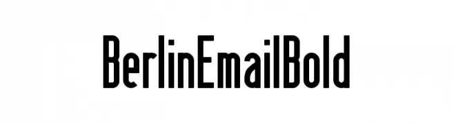
A bold, condensed sans-serif font with a modern and sleek appearance.
![BerlinEmailBold font caratteri gratis]() Scaricare 286 Downloads@WebFont
Scaricare 286 Downloads@WebFont -
( Fonts by fsuarez913 )
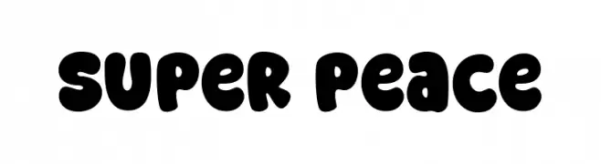
A playful, bold font with rounded, bubbly characters ideal for fun and approachable designs.
![Super Peace font caratteri gratis]() Scaricare 286 Downloads@WebFont
Scaricare 286 Downloads@WebFont -
![Slashman Regular font caratteri gratis]() Scaricare 286 Downloads@WebFont
Scaricare 286 Downloads@WebFont -
![Newfie font caratteri gratis]() Scaricare 286 Downloads@WebFont
Scaricare 286 Downloads@WebFont -
-
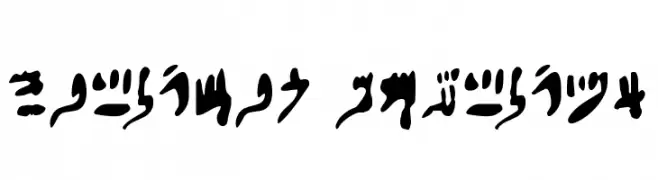
( Fonts by David Kerkhoff - www.hanodedphotography.com )
A flowing, cursive script representing ancient Egyptian hieratic numerals.
![Hieratic Numerals font caratteri gratis]() Scaricare 286 Downloads@WebFont
Scaricare 286 Downloads@WebFont -
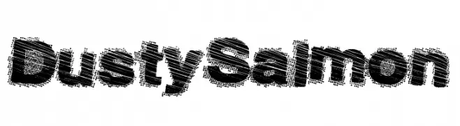
( Fonts by a Max Infeld - XEROGRAPHER FONTS - xerographer.blogspot.com . Personal-use only. For commercial use please contact owner. )
A bold, textured font with a distressed, vintage appearance.
![DustySalmon font caratteri gratis]() Scaricare 286 Downloads@WebFont
Scaricare 286 Downloads@WebFont -
( Fonts by Kong Font )
A playful, bold font with rounded edges and a hand-drawn feel.
![Baimbo font caratteri gratis]() Scaricare 286 Downloads@WebFont
Scaricare 286 Downloads@WebFont -
( Fonts by Darcy Baldwin - darcybaldwin.com. Free for personal use only )
A playful, handwritten font with a casual and informal style.
![DJB Ms Rachel font caratteri gratis]() Scaricare 286 Downloads@WebFont
Scaricare 286 Downloads@WebFont -
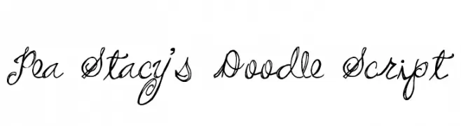
( Free for a personal use. For a commercial use please visit www.kevinandamanda.com )
A playful, whimsical cursive script with intricate swirls and loops.
![Pea Stacy's Doodle Script font caratteri gratis]() Scaricare 285 Downloads@WebFont
Scaricare 285 Downloads@WebFont


Quali sono i font più popolari adesso?
Poppins, Roboto, Montserrat, Open Sans e Lato sono molto usati per le forme pulite e l'ampia applicabilità — dall'identità di marca alle landing page e ai poster.
Quali font si usano spesso nei loghi?
Le sans serif geometriche (es. Poppins, famiglie in stile Gotham) sono scelte comuni per un branding pulito e scalabile. Per un tocco personale restano valide script e stili manoscritti. Abbina un display deciso per i titoli a un corpo testo neutro per riconoscibilità ed equilibrio.
Ogni quanto si aggiorna la lista?
Con regolarità, in base ai download e all'attività reale. Torna spesso per scoprire in anticipo le nuove preferite.
💡 Consiglio: aggiungi ai preferiti — le tendenze cambiano in fretta e i font top di oggi possono ispirare il rebranding di domani.