Benvenuto nelle Font Più Popolari — dove popolarità e qualità si incontrano. Qui trovi i font più scaricati e usati dell'anno. Se cerchi scelte sicure per logo, web o social, inizia da qui.
Ogni font top si distingue per equilibrio, leggibilità e versatilità. Troverai sans serif moderne, script eleganti, serif vintage e display minimalisti.
-
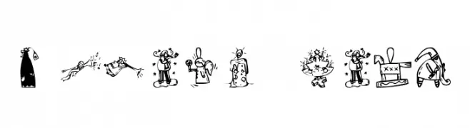
( Fonts by Kat`s Fun Fonts - Personal-use only. For commercial use please contact owner. )
A decorative font with playful Christmas-themed illustrations.
 Scaricare 288 Downloads@WebFont
 -
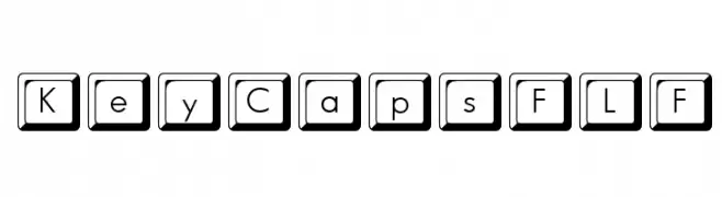
( Fonts by Casady & Greene )
A bold, sans-serif font with characters enclosed in square keycap-like frames.
![KeyCapsFLF font caratteri gratis]() Scaricare 288 Downloads@WebFont
Scaricare 288 Downloads@WebFont -
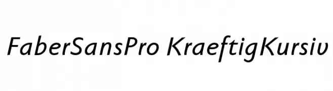
( Fonts by Ingo Zimmermann - www.ingofonts.com )
A modern, italic sans-serif font with smooth curves and consistent stroke width.
![FaberSansPro-KraeftigKursiv font caratteri gratis]() Scaricare 288 Downloads@WebFont
Scaricare 288 Downloads@WebFont -
![Anti-School font caratteri gratis]() Scaricare 288 Downloads@WebFont
Scaricare 288 Downloads@WebFont -
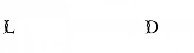
( Fonts by The Scriptorium - Dave Nalle )
A decorative, gothic-style font with thorn-like extensions and high contrast strokes.
![Linthicum Demo font caratteri gratis]() Scaricare 288 Downloads@WebFont
Scaricare 288 Downloads@WebFont -
-
![Mistwetter font caratteri gratis]() Scaricare 288 Downloads@WebFont
Scaricare 288 Downloads@WebFont -
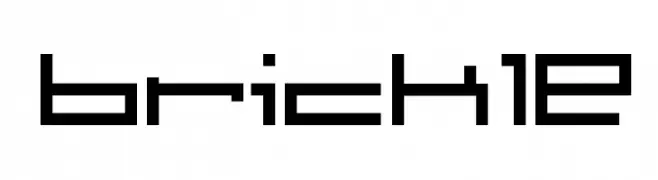
![brickle font caratteri gratis]() Scaricare 288 Downloads@WebFont
Scaricare 288 Downloads@WebFont -
( Art Vibes - www.etsy.com/shop/brittanysartvibes )
A playful, bold font with rounded uppercase and whimsical lowercase letters.
![Poppies font caratteri gratis]() Scaricare 288 Downloads@WebFont
Scaricare 288 Downloads@WebFont -
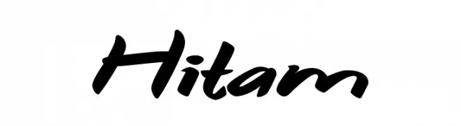
( Fonts by Syaf Rizal - https://creativemarket.com/khurasan - Personal-use only. For commercial use please contact owner. )
A bold, dynamic script font with a handwritten, energetic style.
![Hitam font caratteri gratis]() Scaricare 288 Downloads@WebFont
Scaricare 288 Downloads@WebFont -
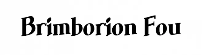
( www.pleine-page.fr )
A bold, classic serif font with playful yet elegant characteristics.
![Brimborion Fou font caratteri gratis]() Scaricare 288 Downloads@WebFont
Scaricare 288 Downloads@WebFont


Quali sono i font più popolari adesso?
Poppins, Roboto, Montserrat, Open Sans e Lato sono molto usati per le forme pulite e l'ampia applicabilità — dall'identità di marca alle landing page e ai poster.
Quali font si usano spesso nei loghi?
Le sans serif geometriche (es. Poppins, famiglie in stile Gotham) sono scelte comuni per un branding pulito e scalabile. Per un tocco personale restano valide script e stili manoscritti. Abbina un display deciso per i titoli a un corpo testo neutro per riconoscibilità ed equilibrio.
Ogni quanto si aggiorna la lista?
Con regolarità, in base ai download e all'attività reale. Torna spesso per scoprire in anticipo le nuove preferite.
💡 Consiglio: aggiungi ai preferiti — le tendenze cambiano in fretta e i font top di oggi possono ispirare il rebranding di domani.