Benvenuto nelle Font Più Popolari — dove popolarità e qualità si incontrano. Qui trovi i font più scaricati e usati dell'anno. Se cerchi scelte sicure per logo, web o social, inizia da qui.
Ogni font top si distingue per equilibrio, leggibilità e versatilità. Troverai sans serif moderne, script eleganti, serif vintage e display minimalisti.
-
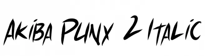
( Fonts by Press Gang Studios - Andeh Pinkard - www.pressgang-studios.com )
A bold, italicized font with a dynamic, graffiti-inspired style.
 Scaricare 276 Downloads@WebFont
 -
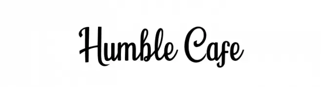
( Fonts by Fenny Wiryani - Personal-use only. For commercial use please contact owner. )
A playful and elegant script font with a handwritten feel.
![Humble Cafe font caratteri gratis]() Scaricare 276 Downloads@WebFont
Scaricare 276 Downloads@WebFont -
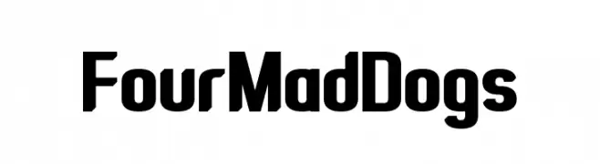
( Fonts by www.chequered.ink - Chequered Ink - Personal-use only. For commercial use please contact owner. )
A bold, modern font with a strong, compact design.
![Four Mad Dogs font caratteri gratis]() Scaricare 276 Downloads@WebFont
Scaricare 276 Downloads@WebFont -
( Fonts by Apostrophic Lab )
A modern outline font with geometric and uniform letterforms.
![Street Variation - Outline Exp font caratteri gratis]() Scaricare 276 Downloads@WebFont
Scaricare 276 Downloads@WebFont -
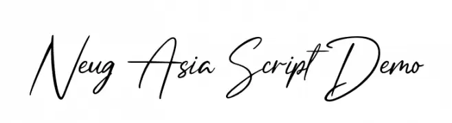
( Fonts by Allouse Studio - Personal-use only. For commercial use please contact owner. )
A graceful, cursive script font with elegant, flowing lines.
![Neug Asia Script Demo font caratteri gratis]() Scaricare 276 Downloads@WebFont
Scaricare 276 Downloads@WebFont -
-
( Fonts by Typodermic Fonts )
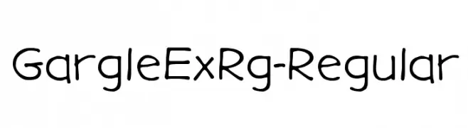
A playful, hand-drawn font with rounded edges and a whimsical style.
![GargleExRg-Regular font caratteri gratis]() Scaricare 276 Downloads@WebFont
Scaricare 276 Downloads@WebFont -
( Fonts by www.aka-acid.com )
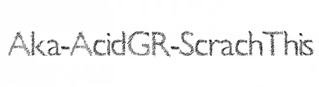
A scratchy, hand-drawn font with an energetic and edgy style.
![Aka-AcidGR-ScrachThis font caratteri gratis]() Scaricare 276 Downloads@WebFont
Scaricare 276 Downloads@WebFont -
( Fonts by Peax Webdesign - www.peax-webdesign.com. Personal-use only. For commercial use please contact owner. )
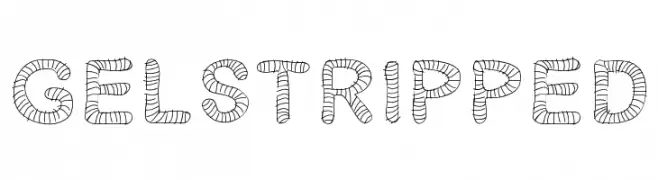
A decorative font with characters wrapped in horizontal stripes, offering a playful and whimsical style.
![Gelstripped font caratteri gratis]() Scaricare 276 Downloads@WebFont
Scaricare 276 Downloads@WebFont -
![Bohem font caratteri gratis]() Scaricare 276 Downloads@WebFont
Scaricare 276 Downloads@WebFont -
( Fonts by or from www.graffitifonts.net )
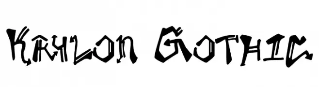
A bold, graffiti-inspired font with sharp, angular lines and high contrast.
![Krylon Gothic font caratteri gratis]() Scaricare 276 Downloads@WebFont
Scaricare 276 Downloads@WebFont


Quali sono i font più popolari adesso?
Poppins, Roboto, Montserrat, Open Sans e Lato sono molto usati per le forme pulite e l'ampia applicabilità — dall'identità di marca alle landing page e ai poster.
Quali font si usano spesso nei loghi?
Le sans serif geometriche (es. Poppins, famiglie in stile Gotham) sono scelte comuni per un branding pulito e scalabile. Per un tocco personale restano valide script e stili manoscritti. Abbina un display deciso per i titoli a un corpo testo neutro per riconoscibilità ed equilibrio.
Ogni quanto si aggiorna la lista?
Con regolarità, in base ai download e all'attività reale. Torna spesso per scoprire in anticipo le nuove preferite.
💡 Consiglio: aggiungi ai preferiti — le tendenze cambiano in fretta e i font top di oggi possono ispirare il rebranding di domani.