Benvenuto nelle Font Più Popolari — dove popolarità e qualità si incontrano. Qui trovi i font più scaricati e usati dell'anno. Se cerchi scelte sicure per logo, web o social, inizia da qui.
Ogni font top si distingue per equilibrio, leggibilità e versatilità. Troverai sans serif moderne, script eleganti, serif vintage e display minimalisti.
-
( Fonts by Kong Font )
A bold, playful font with thick, rounded strokes and a hand-drawn feel.
 Scaricare 276 Downloads@WebFont
 -
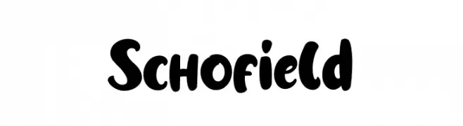
( Fonts by monocotype - Personal-use only. For commercial use please contact owner. )
A lively handwritten font with playful curves and fluid strokes.
![Santuy font caratteri gratis]() Scaricare 276 Downloads@WebFont
Scaricare 276 Downloads@WebFont -
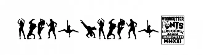
( Fonts by Woodcutter )
![Dance,Dance! font caratteri gratis]() Scaricare 276 Downloads@WebFont
Scaricare 276 Downloads@WebFont -
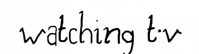
![watching t.v font caratteri gratis]() Scaricare 276 Downloads@WebFont
Scaricare 276 Downloads@WebFont -
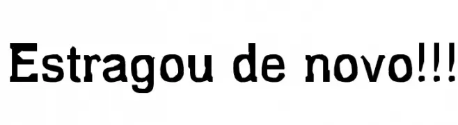
( Fonts by Fabrika De Typos - Marcio Hirosse - fabrikadetypos.blogspot.com )
A bold slab serif font with strong, well-defined characters.
![Estragou de novo!!! font caratteri gratis]() Scaricare 276 Downloads@WebFont
Scaricare 276 Downloads@WebFont -
-
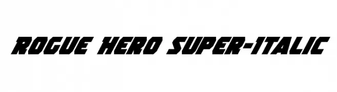
( Fonts by Daniel Zadorozny - www.iconian.com )
A bold, italicized font with angular, dynamic characters.
![Rogue Hero Super-Italic font caratteri gratis]() Scaricare 276 Downloads@WebFont
Scaricare 276 Downloads@WebFont -
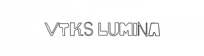
( Fonts by Douglas Vitkauskas - www.vtksdesign.com. Personal-use only. For commercial use please contact owner. )
A bold, artistic font with a mix of solid and outlined characters, perfect for creative projects.
![vtks lumina font caratteri gratis]() Scaricare 276 Downloads@WebFont
Scaricare 276 Downloads@WebFont -
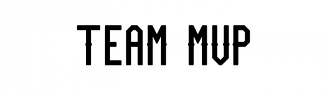
( Fonts by Out of Step Font Company - Dan Steinbok - outofstepfontco.com - Personal-use only. For commercial use please contact owner. )
A bold, geometric font with an industrial and modern aesthetic.
![Team MVP font caratteri gratis]() Scaricare 276 Downloads@WebFont
Scaricare 276 Downloads@WebFont -
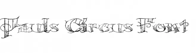
( Fonts by Paul - viciousink.net )
A whimsical, decorative font inspired by vintage circus posters.
![Pauls Circus Font font caratteri gratis]() Scaricare 276 Downloads@WebFont
Scaricare 276 Downloads@WebFont -
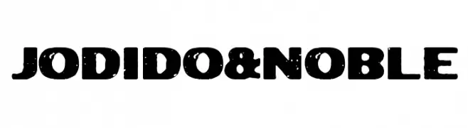
( Woodcutter - woodcutter Manero - www.woodcutter.es )
A bold, distressed font with a vintage, grunge aesthetic.
![Jodido&Noble font caratteri gratis]() Scaricare 276 Downloads@WebFont
Scaricare 276 Downloads@WebFont

Quali sono i font più popolari adesso?
Poppins, Roboto, Montserrat, Open Sans e Lato sono molto usati per le forme pulite e l'ampia applicabilità — dall'identità di marca alle landing page e ai poster.
Quali font si usano spesso nei loghi?
Le sans serif geometriche (es. Poppins, famiglie in stile Gotham) sono scelte comuni per un branding pulito e scalabile. Per un tocco personale restano valide script e stili manoscritti. Abbina un display deciso per i titoli a un corpo testo neutro per riconoscibilità ed equilibrio.
Ogni quanto si aggiorna la lista?
Con regolarità, in base ai download e all'attività reale. Torna spesso per scoprire in anticipo le nuove preferite.
💡 Consiglio: aggiungi ai preferiti — le tendenze cambiano in fretta e i font top di oggi possono ispirare il rebranding di domani.