Benvenuto nelle Font Più Popolari — dove popolarità e qualità si incontrano. Qui trovi i font più scaricati e usati dell'anno. Se cerchi scelte sicure per logo, web o social, inizia da qui.
Ogni font top si distingue per equilibrio, leggibilità e versatilità. Troverai sans serif moderne, script eleganti, serif vintage e display minimalisti.
-
( Fonts by ShyFonts )
A bold, italicized, extended font with high contrast and a modern, dynamic style.
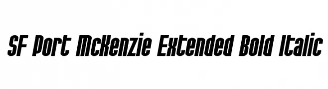 Scaricare 1049 Downloads@WebFont
 -
( Fonts by Gassstype )
A bold, rounded font with a playful and friendly style.
![Soap Opera font caratteri gratis]() Scaricare 1048 Downloads@WebFont
Scaricare 1048 Downloads@WebFont -
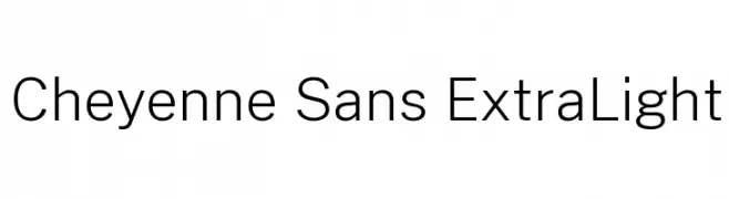
( Fonts by Cristiano Sobral - Personal-use only. For commercial use please contact owner. )
A clean, modern sans-serif font with an extra light weight and high legibility.
![Cheyenne Sans ExtraLight font caratteri gratis]() Scaricare 1048 Downloads@WebFont
Scaricare 1048 Downloads@WebFont -
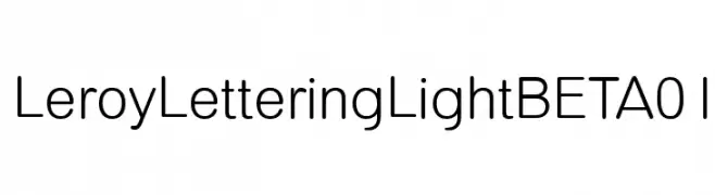
( Character )
A modern, geometric sans-serif font with clean lines and balanced spacing.
![LeroyLetteringLightBETA01 font caratteri gratis]() Scaricare 1048 Downloads@WebFont
Scaricare 1048 Downloads@WebFont -
( Vladimir Nikolic - www.coroflot.com/vladimirnikolic )
A bold, geometric font with a modern and stylish design.
![Better Book Regular font caratteri gratis]() Scaricare 1048 Downloads@WebFont
Scaricare 1048 Downloads@WebFont -
-
![Allema font caratteri gratis]() Scaricare 1048 Downloads@WebFont
Scaricare 1048 Downloads@WebFont -
![SiliwangiEngineering font caratteri gratis]() Scaricare 1048 Downloads@WebFont
Scaricare 1048 Downloads@WebFont -
( charmingcharlie.co.nr/ )
A bold, playful handwritten font with a casual and friendly style.
![Ackident font caratteri gratis]() Scaricare 1048 Downloads@WebFont
Scaricare 1048 Downloads@WebFont -
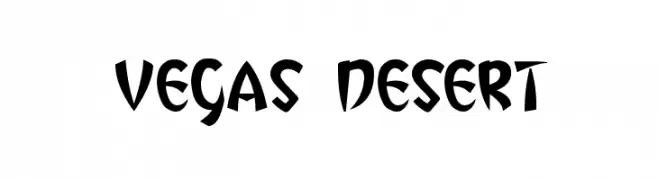
Caratteri di thessalos. For commercial use please contact the owner.
![Vegas Desert font caratteri gratis]() Scaricare 1048 Downloads@WebFont
Scaricare 1048 Downloads@WebFont -
Caratteri di JuanCasco. For commercial use please contact the owner.
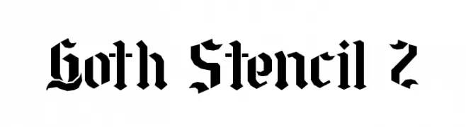
( Fonts by Juan Casco - www.juancasco.net )
A bold, gothic-inspired stencil font with sharp, angular lines and a medieval flair.
![Goth Stencil 2 font caratteri gratis]() Scaricare 1048 Downloads@WebFont
Scaricare 1048 Downloads@WebFont -
( Fonts by Manfred Klein. Free for private and charity use. Free for commercial with donation to organizations )
A geometric, angular font with a futuristic and bold style.
![GreeKish font caratteri gratis]() Scaricare 1048 Downloads@WebFont
Scaricare 1048 Downloads@WebFont -
![Sable font caratteri gratis]() Scaricare 1048 Downloads@WebFont
Scaricare 1048 Downloads@WebFont -
![Arbeka font caratteri gratis]() Scaricare 1048 Downloads@WebFont
Scaricare 1048 Downloads@WebFont -
( Fonts by Khurasan )
A playful, bold font with rounded, hand-drawn characters.
![No Virus font caratteri gratis]() Scaricare 1047 Downloads@WebFont
Scaricare 1047 Downloads@WebFont -
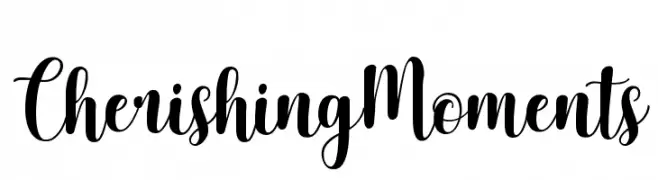
( Cat.B - Agathe M.Joyce - www.foundmyfont.com )
An elegant, flowing script font with smooth, cursive strokes and artistic flair.
![Cherishing Moments font caratteri gratis]() Scaricare 1047 Downloads@WebFont
Scaricare 1047 Downloads@WebFont -
( Fonts by www.graphicartsunit.com - Personal-use only. For commercial use please contact owner. )
A bold, angular font with a futuristic and geometric style.
![GauFontAtomic font caratteri gratis]() Scaricare 1047 Downloads@WebFont
Scaricare 1047 Downloads@WebFont -
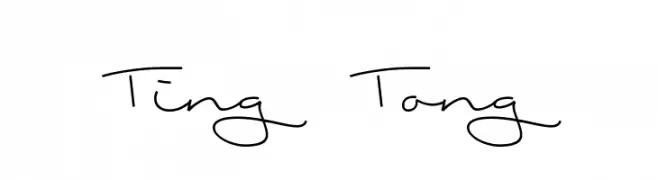
( Fonts by Runes & Fonts )
A playful, handwritten font with fluid strokes and a casual style.
![Ting Tong font caratteri gratis]() Scaricare 1047 Downloads@WebFont
Scaricare 1047 Downloads@WebFont -
( Fonts by twicolabs.com - Twicolabs Typefoundry )
A bold, impactful font with strong, thick strokes and a dynamic slant.
![Nurjan font caratteri gratis]() Scaricare 1047 Downloads@WebFont
Scaricare 1047 Downloads@WebFont -
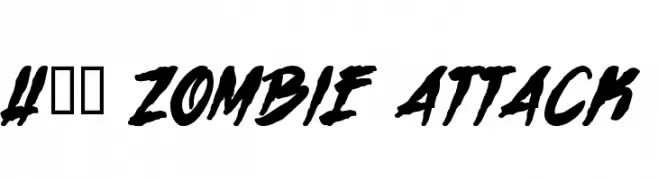
![H74 Zombie Attack font caratteri gratis]() Scaricare 1047 Downloads@WebFont
Scaricare 1047 Downloads@WebFont -
( Fonts by www.girlswhowearglasses.com )
A bold, cursive script with playful, interconnected letters and elegant swashes.
![Saturdays Girl font caratteri gratis]() Scaricare 1047 Downloads@WebFont
Scaricare 1047 Downloads@WebFont -
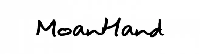
( Fonts by joeBob graff-X )
A casual, handwritten font with fluid and organic strokes.
![MoanHand font caratteri gratis]() Scaricare 1047 Downloads@WebFont
Scaricare 1047 Downloads@WebFont -
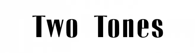
( Fonts by Emeralda Noor Achni Halilintar - emeraldanoorachni.tk )
A bold, two-tone font with striking contrast and modern elegance.
![Two Tones font caratteri gratis]() Scaricare 1047 Downloads@WebFont
Scaricare 1047 Downloads@WebFont -
![game powerRegular font caratteri gratis]() Scaricare 1047 Downloads@WebFont
Scaricare 1047 Downloads@WebFont -
( THESE ARE SHAREWARE FONTS ! NOT FREEWARE ! PLEASE VISIT www.fuelfonts.com )
A bold, geometric font with strong, squared-off edges for impactful display use.
![Veruca Black font caratteri gratis]() Scaricare 1047 Downloads@WebFont
Scaricare 1047 Downloads@WebFont -
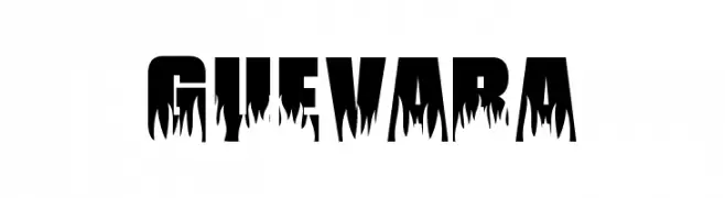
( Fonts by Levi Halmos )
A bold, dripping font with a rebellious, graffiti-inspired style.
![Guevara font caratteri gratis]() Scaricare 1047 Downloads@WebFont
Scaricare 1047 Downloads@WebFont -
( Fonts by David Rakowski )
A bold, jagged font with sharp, dynamic angles and an energetic appearance.
![Aarcover Regular font caratteri gratis]() Scaricare 1047 Downloads@WebFont
Scaricare 1047 Downloads@WebFont -
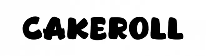
( Fonts by Khurasan )
A playful, bold font with rounded characters and a friendly appearance.
![Cakeroll font caratteri gratis]() Scaricare 1046 Downloads@WebFont
Scaricare 1046 Downloads@WebFont -
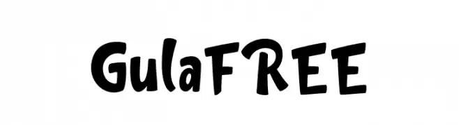
( Fonts by InspiraType )
A playful, bold, and hand-drawn font with a whimsical and energetic style.
![GulaFREE font caratteri gratis]() Scaricare 1046 Downloads@WebFont
Scaricare 1046 Downloads@WebFont -
( kaboom creative )
A bold, handwritten font with a casual and energetic style.
![PEAK font caratteri gratis]() Scaricare 1046 Downloads@WebFont
Scaricare 1046 Downloads@WebFont -
( Nils Kähler - creativevikings.com )
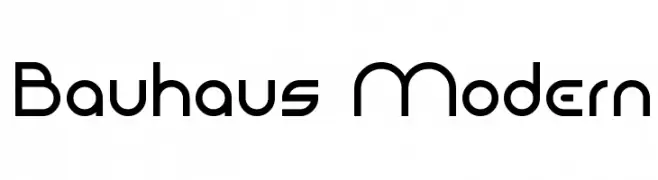
A modern, geometric font with clean lines and a minimalist design.
![Bauhaus Modern font caratteri gratis]() Scaricare 1046 Downloads@WebFont
Scaricare 1046 Downloads@WebFont -
( Fonts by a Emily Spadoni - http://creativemarket.com/emilyspadoni/. Personal-use only. For commercial use please contact owner. )
A playful and elegant handwritten script font with fluid, connected characters.
![Ke Aloha font caratteri gratis]() Scaricare 1046 Downloads@WebFont
Scaricare 1046 Downloads@WebFont -
( Fonts by a The Branded Quotes - https://sellfy.com/thebrandedquotes. Personal-use only. For commercial use please contact owner. )
A bold, handwritten font with a playful and energetic style.
![Shorelines Display font caratteri gratis]() Scaricare 1046 Downloads@WebFont
Scaricare 1046 Downloads@WebFont -
( Copyright (c) 2015 Indian Type Foundry (info@indiantypefoundry.com) )
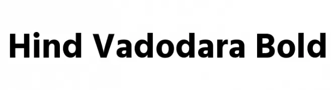
A bold, modern sans-serif font with clean lines and strong visual impact.
![Hind Vadodara Bold font caratteri gratis]() Scaricare 1046 Downloads@WebFont
Scaricare 1046 Downloads@WebFont -
![HP Slant Regular font caratteri gratis]() Scaricare 1046 Downloads@WebFont
Scaricare 1046 Downloads@WebFont -
( Copyright (c) 2012, Font Diner (www.fontdiner.com) )
A whimsical, hand-drawn font with playful curls and swirls.
![Griffy font caratteri gratis]() Scaricare 1046 Downloads@WebFont
Scaricare 1046 Downloads@WebFont


Quali sono i font più popolari adesso?
Poppins, Roboto, Montserrat, Open Sans e Lato sono molto usati per le forme pulite e l'ampia applicabilità — dall'identità di marca alle landing page e ai poster.
Quali font si usano spesso nei loghi?
Le sans serif geometriche (es. Poppins, famiglie in stile Gotham) sono scelte comuni per un branding pulito e scalabile. Per un tocco personale restano valide script e stili manoscritti. Abbina un display deciso per i titoli a un corpo testo neutro per riconoscibilità ed equilibrio.
Ogni quanto si aggiorna la lista?
Con regolarità, in base ai download e all'attività reale. Torna spesso per scoprire in anticipo le nuove preferite.
💡 Consiglio: aggiungi ai preferiti — le tendenze cambiano in fretta e i font top di oggi possono ispirare il rebranding di domani.