Benvenuto nelle Font Più Popolari — dove popolarità e qualità si incontrano. Qui trovi i font più scaricati e usati dell'anno. Se cerchi scelte sicure per logo, web o social, inizia da qui.
Ogni font top si distingue per equilibrio, leggibilità e versatilità. Troverai sans serif moderne, script eleganti, serif vintage e display minimalisti.
-
Caratteri di defharo. For commercial use please contact the owner.
 Scaricare 1020 Downloads@WebFont
 -
( Fonts by Arkandis Digital Foundry )
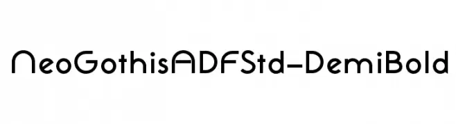
A bold, modern font with clean, geometric lines and uniform stroke width.
![NeoGothisADFStd-DemiBold font caratteri gratis]() Scaricare 1020 Downloads@WebFont
Scaricare 1020 Downloads@WebFont -
( Copyright (c) 2011 by Sorkin Type Co (www.sorkintype.com) )
A classic serif font with elegant strokes and moderate contrast, ideal for refined and sophisticated designs.
![Stoke font caratteri gratis]() Scaricare 1020 Downloads@WebFont
Scaricare 1020 Downloads@WebFont -
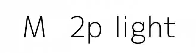
![M+ 2p light font caratteri gratis]() Scaricare 1020 Downloads@WebFont
Scaricare 1020 Downloads@WebFont -
( Fonts by www.typodermicfonts.com - Ray Larabie )
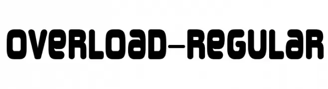
A bold, rounded font with a modern and playful style.
![Overload-Regular font caratteri gratis]() Scaricare 1020 Downloads@WebFont
Scaricare 1020 Downloads@WebFont -
-
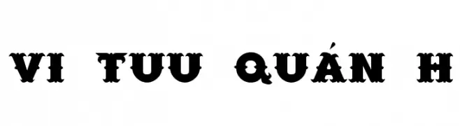
![VI Tuu Quán H font caratteri gratis]() Scaricare 1020 Downloads
Scaricare 1020 Downloads -
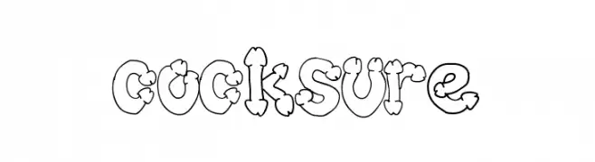
![cocksure font caratteri gratis]() Scaricare 1020 Downloads@WebFont
Scaricare 1020 Downloads@WebFont -
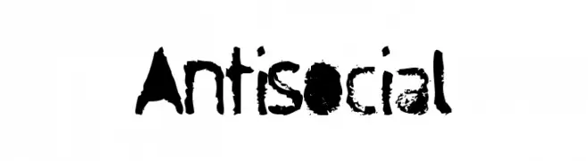
![Antisocial font caratteri gratis]() Scaricare 1020 Downloads@WebFont
Scaricare 1020 Downloads@WebFont -
( Fonts by Steve Ferrera )
An elaborate and decorative font with intricate swashes and flourishes.
![Aero Font One Swash font caratteri gratis]() Scaricare 1020 Downloads@WebFont
Scaricare 1020 Downloads@WebFont -
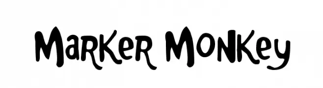
( Fonts by www.fontdiner.com )
A playful, hand-drawn font with a bold, marker-like style.
![Marker Monkey font caratteri gratis]() Scaricare 1020 Downloads@WebFont
Scaricare 1020 Downloads@WebFont -
( Fonts by Nick Curtis - www.nicksfonts.com )
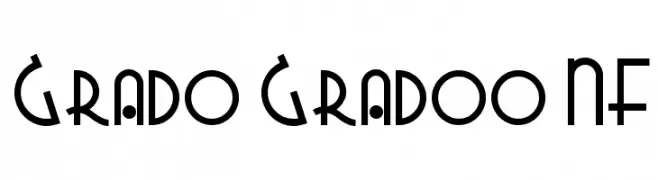
A playful, geometric font with bold, rounded shapes and dynamic cutouts.
![Grado Gradoo NF font caratteri gratis]() Scaricare 1020 Downloads@WebFont
Scaricare 1020 Downloads@WebFont -
( Fonts by Apostrophic Lab )
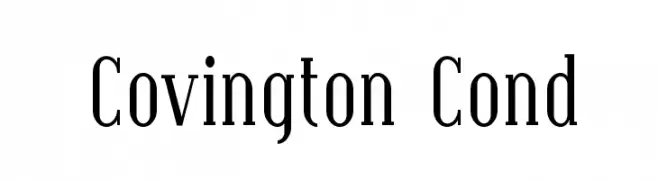
A classic serif font with a condensed style and medium contrast, ideal for elegant designs.
![Covington Cond font caratteri gratis]() Scaricare 1020 Downloads@WebFont
Scaricare 1020 Downloads@WebFont -
( Fonts by Nuun Creatype )
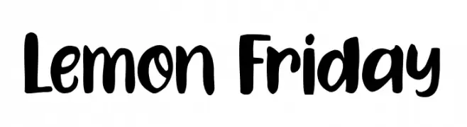
A bold, playful handwritten font with a lively and energetic style.
![Lemon Friday font caratteri gratis]() Scaricare 1019 Downloads@WebFont
Scaricare 1019 Downloads@WebFont -
( Fonts by Pentagram / MCKL - Personal-use only. For commercial use please contact owner. )
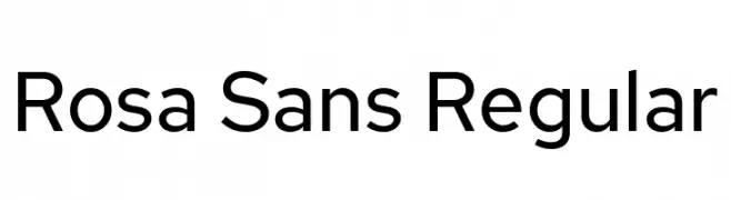
A modern sans-serif font with geometric letterforms and uniform stroke width.
![Rosa Sans Regular font caratteri gratis]() Scaricare 1019 Downloads@WebFont
Scaricare 1019 Downloads@WebFont -
( Fonts by Bringtype Studio )
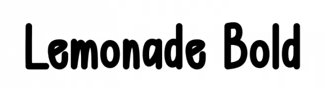
A playful, bold font with rounded edges and a slightly condensed form.
![Lemonade Bold font caratteri gratis]() Scaricare 1019 Downloads@WebFont
Scaricare 1019 Downloads@WebFont -
( Fonts by Peter Wiegel - Personal-use only. For commercial use please contact owner. )
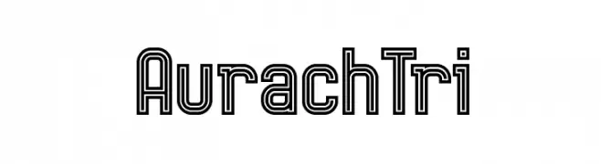
A bold, geometric font with a double-line outline for a modern look.
![AurachTri font caratteri gratis]() Scaricare 1019 Downloads@WebFont
Scaricare 1019 Downloads@WebFont -
( imagex - www.imagex-fonts.com )
A bold, dripping font with a playful, eerie vibe perfect for spooky themes.
![Lethal Slime font caratteri gratis]() Scaricare 1019 Downloads@WebFont
Scaricare 1019 Downloads@WebFont -
( Måns Grebäck - www.mansgreback.com )
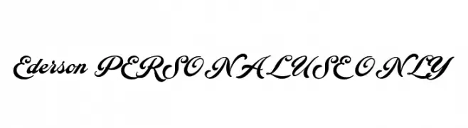
A bold, modern cursive font with high contrast and tight spacing.
![Ederson PERSONAL USE ONLY font caratteri gratis]() Scaricare 1019 Downloads@WebFont
Scaricare 1019 Downloads@WebFont -
( Fonts by Iconian Fonts )
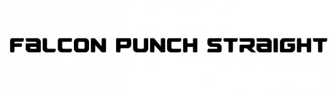
A bold, geometric font with rounded edges and a modern, futuristic style.
![Falcon Punch Straight font caratteri gratis]() Scaricare 1019 Downloads@WebFont
Scaricare 1019 Downloads@WebFont -
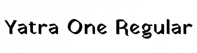
( Copyright 2014 The Yatra Project Authors. )
A bold, playful font with geometric and organic shapes.
![Yatra One Regular font caratteri gratis]() Scaricare 1019 Downloads@WebFont
Scaricare 1019 Downloads@WebFont -
( Free )
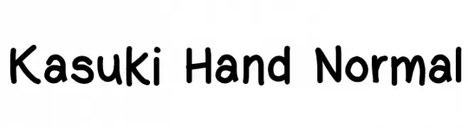
A playful, handwritten font with rounded, consistent strokes and a casual vibe.
![Kasuki Hand Normal font caratteri gratis]() Scaricare 1019 Downloads@WebFont
Scaricare 1019 Downloads@WebFont -
( Fonts by Mikrojihad Inc - www.behance.net/mikrojihad - Personal-use only. For commercial use please contact owner. )
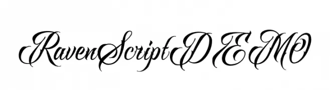
An elegant and flowing script font with ornate, decorative letterforms.
![RavenScriptDEMO font caratteri gratis]() Scaricare 1019 Downloads@WebFont
Scaricare 1019 Downloads@WebFont -
![RofiTaste font caratteri gratis]() Scaricare 1019 Downloads@WebFont
Scaricare 1019 Downloads@WebFont -
( Fonts by junkohanhero )
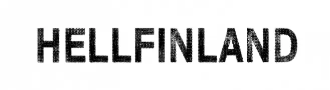
Bold, textured font with a distressed, vintage appearance.
![Hell Finland font caratteri gratis]() Scaricare 1019 Downloads@WebFont
Scaricare 1019 Downloads@WebFont -
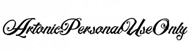
![ArtonicPersonalUseOnly font caratteri gratis]() Scaricare 1019 Downloads@WebFont
Scaricare 1019 Downloads@WebFont -
( Fonts by Teresa Liu )
A playful, bold handwritten font with rounded, irregular letterforms.
![good font caratteri gratis]() Scaricare 1019 Downloads@WebFont
Scaricare 1019 Downloads@WebFont -
( Demo font. To purchase the full version, you can order it online at www.schoolhousefonts.com )
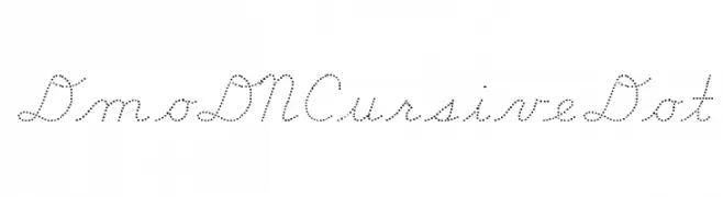
A dotted cursive font with a playful and elegant style.
![DmoDNCursiveDot font caratteri gratis]() Scaricare 1019 Downloads@WebFont
Scaricare 1019 Downloads@WebFont -
( Free for a personal use. For a commercial use please visit www.kevinandamanda.com )
A playful, hand-drawn font with a whimsical and informal style.
![Pea Mystie font caratteri gratis]() Scaricare 1019 Downloads@WebFont
Scaricare 1019 Downloads@WebFont -
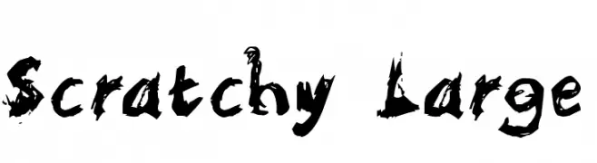
![Scratchy Large font caratteri gratis]() Scaricare 1019 Downloads@WebFont
Scaricare 1019 Downloads@WebFont -
( Fonts by Sinister Visions - Chad Savage - www.sinisterfonts.com )
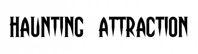
A bold, gothic-style font with sharp, elongated serifs for a dramatic effect.
![Haunting Attraction font caratteri gratis]() Scaricare 1019 Downloads@WebFont
Scaricare 1019 Downloads@WebFont -
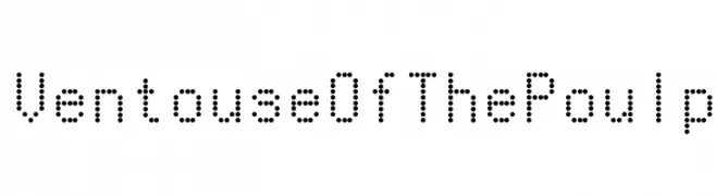
![VentouseOfThePoulp font caratteri gratis]() Scaricare 1019 Downloads@WebFont
Scaricare 1019 Downloads@WebFont -
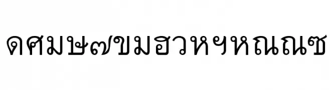
![Thai7BangkokSSK font caratteri gratis]() Scaricare 1019 Downloads@WebFont
Scaricare 1019 Downloads@WebFont -
![HourPhoto font caratteri gratis]() Scaricare 1019 Downloads@WebFont
Scaricare 1019 Downloads@WebFont -
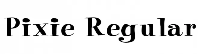
![Pixie Regular font caratteri gratis]() Scaricare 1019 Downloads@WebFont
Scaricare 1019 Downloads@WebFont -
( Fonts by Alan Carr )
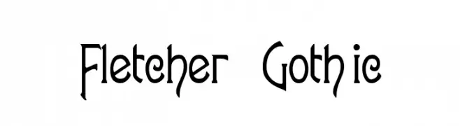
A gothic-inspired font with elongated, angular letterforms and sharp serifs.
![Fletcher-Gothic font caratteri gratis]() Scaricare 1019 Downloads@WebFont
Scaricare 1019 Downloads@WebFont


Quali sono i font più popolari adesso?
Poppins, Roboto, Montserrat, Open Sans e Lato sono molto usati per le forme pulite e l'ampia applicabilità — dall'identità di marca alle landing page e ai poster.
Quali font si usano spesso nei loghi?
Le sans serif geometriche (es. Poppins, famiglie in stile Gotham) sono scelte comuni per un branding pulito e scalabile. Per un tocco personale restano valide script e stili manoscritti. Abbina un display deciso per i titoli a un corpo testo neutro per riconoscibilità ed equilibrio.
Ogni quanto si aggiorna la lista?
Con regolarità, in base ai download e all'attività reale. Torna spesso per scoprire in anticipo le nuove preferite.
💡 Consiglio: aggiungi ai preferiti — le tendenze cambiano in fretta e i font top di oggi possono ispirare il rebranding di domani.