Benvenuto nelle Font Più Popolari — dove popolarità e qualità si incontrano. Qui trovi i font più scaricati e usati dell'anno. Se cerchi scelte sicure per logo, web o social, inizia da qui.
Ogni font top si distingue per equilibrio, leggibilità e versatilità. Troverai sans serif moderne, script eleganti, serif vintage e display minimalisti.
-
( Fonts by Philipp H. Poll - Personal-use only. For commercial use please contact owner. )
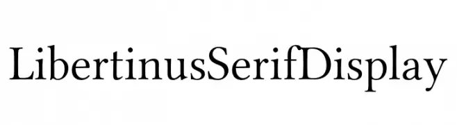
A classic serif font with elegant strokes and balanced proportions.
 Scaricare 1018 Downloads@WebFont
 -
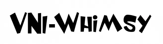
![VNI-Whimsy font caratteri gratis]() Scaricare 1018 Downloads
Scaricare 1018 Downloads -
( Copyright 2012 The Caladea Project Authors (https://github.com/huertatipografica/Caladea) )
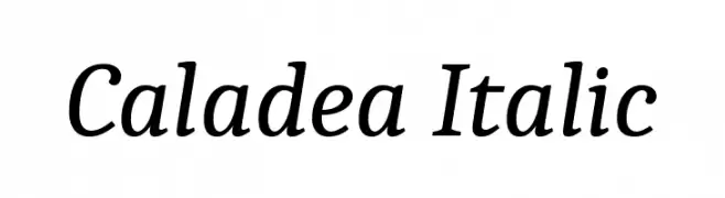
An elegant italic serif font with smooth curves and sharp serifs.
![Caladea Italic font caratteri gratis]() Scaricare 1018 Downloads@WebFont
Scaricare 1018 Downloads@WebFont -
( Copyright 2011 The Alegreya Project Authors (https://github.com/huertatipografica/Alegreya) )
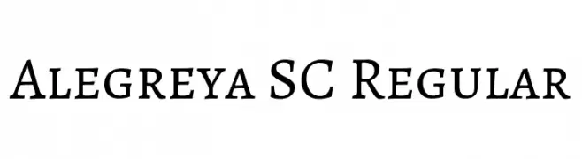
A classic serif typeface with modern elegance and readability.
![Alegreya SC Regular font caratteri gratis]() Scaricare 1018 Downloads@WebFont
Scaricare 1018 Downloads@WebFont -
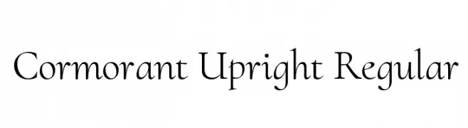
( Copyright (c) 2015, Christian Thalmann and the Cormorant Project Authors (github.com/CatharsisFonts/Cormorant) )
An elegant and sophisticated serif typeface with classic proportions.
![Cormorant Upright Regular font caratteri gratis]() Scaricare 1018 Downloads@WebFont
Scaricare 1018 Downloads@WebFont -
-
![Upon A Dream [Maleficent] font caratteri gratis]() Scaricare 1018 Downloads@WebFont
Scaricare 1018 Downloads@WebFont -
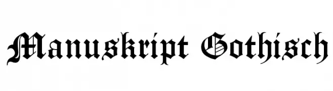
( Fonts by www.peter-wiegel.de. Personal-use only. For commercial use please contact owner. )
A classic blackletter font with ornate, gothic letterforms and high contrast.
![Manuskript Gothisch font caratteri gratis]() Scaricare 1018 Downloads@WebFont
Scaricare 1018 Downloads@WebFont -
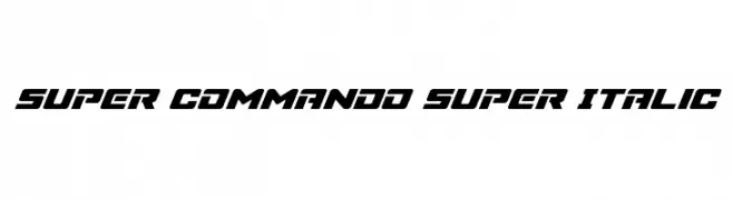
( Fonts by Daniel Zadorozny - www.iconian.com )
A bold, italicized font with a futuristic and dynamic style.
![Super Commando Super Italic font caratteri gratis]() Scaricare 1018 Downloads@WebFont
Scaricare 1018 Downloads@WebFont -
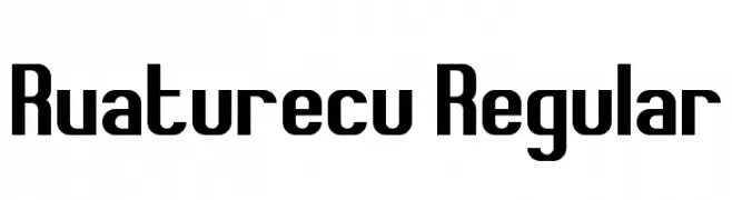
( Fonts by Andrew McCluskey - nalgames.com )
A bold, geometric font with a modern and strong presence.
![Rvaturecu Regular font caratteri gratis]() Scaricare 1018 Downloads@WebFont
Scaricare 1018 Downloads@WebFont -
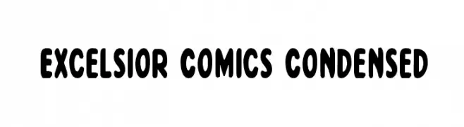
( Fonts by Daniel Zadorozny - www.iconian.com - Free for personal use )
A playful, bold, and slightly condensed font with rounded edges.
![Excelsior Comics Condensed font caratteri gratis]() Scaricare 1018 Downloads@WebFont
Scaricare 1018 Downloads@WebFont -
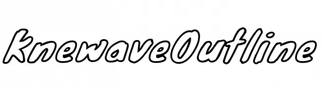
( Fonts by The League of Moveable Type - theleagueofmoveabletype.com )
A playful, outlined font with a cartoonish, dynamic style.
![KnewaveOutline font caratteri gratis]() Scaricare 1018 Downloads@WebFont
Scaricare 1018 Downloads@WebFont -
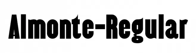
( Fonts by www.typodermicfonts.com - Ray Larabie )
A bold, impactful font with thick strokes and tight spacing.
![Almonte-Regular font caratteri gratis]() Scaricare 1018 Downloads@WebFont
Scaricare 1018 Downloads@WebFont -
![hans hand font caratteri gratis]() Scaricare 1018 Downloads@WebFont
Scaricare 1018 Downloads@WebFont -
( Fonts by Nick Curtis - www.nicksfonts.com )
A bold, geometric font with high contrast and modern appeal.
![Herald Square NF font caratteri gratis]() Scaricare 1018 Downloads@WebFont
Scaricare 1018 Downloads@WebFont -
![Pixie Regular font caratteri gratis]() Scaricare 1018 Downloads@WebFont
Scaricare 1018 Downloads@WebFont -
( Fonts by dartcanada.tripod.com - Darren Rigby )
A modern, geometric sans-serif font with uniform stroke width and clear readability.
![Meridiana Regular font caratteri gratis]() Scaricare 1018 Downloads@WebFont
Scaricare 1018 Downloads@WebFont -
![Savage Sausage font caratteri gratis]() Scaricare 1018 Downloads@WebFont
Scaricare 1018 Downloads@WebFont -
( Fonts by Hubert & Fischer - Personal-use only. For commercial use please contact owner. )
A clean, modern sans-serif font with consistent stroke width and balanced spacing.
![Hezaedrus Light font caratteri gratis]() Scaricare 1017 Downloads@WebFont
Scaricare 1017 Downloads@WebFont -
( Fonts by Faris Graphic Art )
A playful, bold font with rounded edges and a smooth, dynamic flow.
![Honey font caratteri gratis]() Scaricare 1017 Downloads@WebFont
Scaricare 1017 Downloads@WebFont -
( Fonts by Chris Simpson - Personal-use only. For commercial use please contact owner. )
A modern, geometric italic typeface with clean lines and consistent stroke width.
![Metropolis Medium Italic font caratteri gratis]() Scaricare 1017 Downloads@WebFont
Scaricare 1017 Downloads@WebFont -
( Fonts by Hanken Design Co. - Personal-use only. For commercial use please contact owner. )
A modern, semi-bold sans-serif font with clean lines and strong legibility.
![Decalotype SemiBold font caratteri gratis]() Scaricare 1017 Downloads@WebFont
Scaricare 1017 Downloads@WebFont -
( Fonts by Cristiano Sobral - Personal-use only. For commercial use please contact owner. )
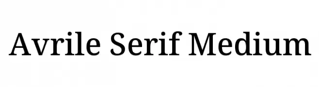
A classic serif font with medium weight and balanced readability.
![Avrile Serif Medium font caratteri gratis]() Scaricare 1017 Downloads@WebFont
Scaricare 1017 Downloads@WebFont -
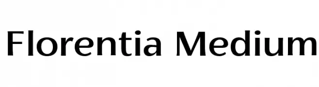
( Zetafonts - www.zetafonts.com )
A modern, versatile font with balanced structure and medium contrast.
![Florentia Medium font caratteri gratis]() Scaricare 1017 Downloads@WebFont
Scaricare 1017 Downloads@WebFont -
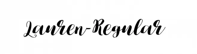
( Fonts by Dmitriy Chirkov )
A sophisticated script font with elegant, flowing letters and high contrast strokes.
![Lauren-Regular font caratteri gratis]() Scaricare 1017 Downloads@WebFont
Scaricare 1017 Downloads@WebFont -
( Fonts by prescottdesignshop.com - Personal-use only. For commercial use please contact owner. )
A modern, semi-bold font with clean lines and slight stroke contrast.
![PassionSansPDbi-SemiBoldSmallCaps font caratteri gratis]() Scaricare 1017 Downloads@WebFont
Scaricare 1017 Downloads@WebFont -
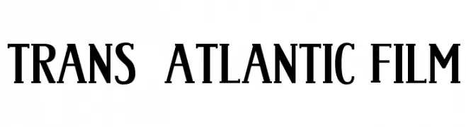
![Trans-Atlantic Film font caratteri gratis]() Scaricare 1017 Downloads@WebFont
Scaricare 1017 Downloads@WebFont -
( Fonts by fopifopi )
A playful, handwritten font with tall, narrow letterforms and medium contrast.
![NANDA font caratteri gratis]() Scaricare 1017 Downloads@WebFont
Scaricare 1017 Downloads@WebFont -
( Fonts by Mikrojihad Inc - www.behance.net/mikrojihad - Personal-use only. For commercial use please contact owner. )
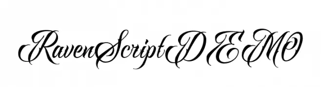
An elegant and flowing script font with ornate, decorative letterforms.
![RavenScriptDEMO font caratteri gratis]() Scaricare 1017 Downloads@WebFont
Scaricare 1017 Downloads@WebFont -
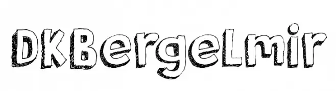
![DKBergelmir font caratteri gratis]() Scaricare 1017 Downloads@WebFont
Scaricare 1017 Downloads@WebFont -
( www.hypefonts.com )
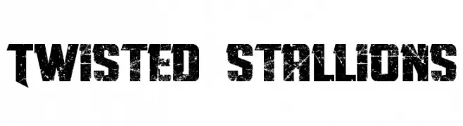
A bold, distressed font with a rugged, vintage appearance.
![Twisted Stallions font caratteri gratis]() Scaricare 1017 Downloads@WebFont
Scaricare 1017 Downloads@WebFont -
( Fonts by www.fenotype.com )
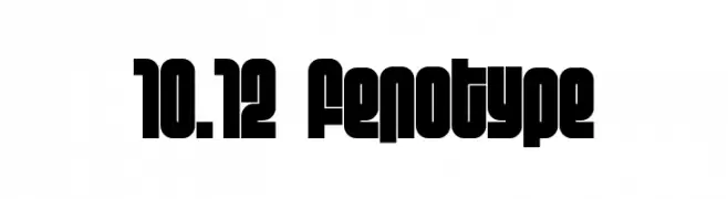
A bold, geometric font with thick strokes and high contrast, perfect for impactful designs.
![10.12 fenotype font caratteri gratis]() Scaricare 1017 Downloads@WebFont
Scaricare 1017 Downloads@WebFont -
( Fonts by Koczman Balint - magiquefonts.gportal.hu )
A classic serif font with a unique halftone texture for a vintage look.
![MGFT Times New Halftone font caratteri gratis]() Scaricare 1017 Downloads@WebFont
Scaricare 1017 Downloads@WebFont -
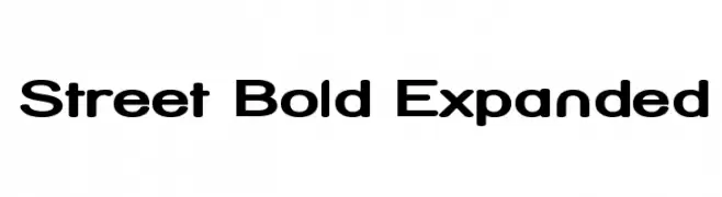
( Fonts by Apostrophic Lab )
A bold, expanded font with modern, clean lines and strong visual impact.
![Street Bold Expanded font caratteri gratis]() Scaricare 1017 Downloads@WebFont
Scaricare 1017 Downloads@WebFont -
![FEMME 2 font caratteri gratis]() Scaricare 1017 Downloads@WebFont
Scaricare 1017 Downloads@WebFont -
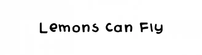
( Fonts by Pi Luo Chiu - thisisallenchiu.tumblr.com )
A playful, hand-drawn font with rounded, irregular letterforms.
![Lemons Can Fly font caratteri gratis]() Scaricare 1017 Downloads@WebFont
Scaricare 1017 Downloads@WebFont
![Upon A Dream [Maleficent] font caratteri gratis](https://d144mzi0q5mijx.cloudfront.net/img/U/P/Upon-A-Dream-Maleficent.webp)


Quali sono i font più popolari adesso?
Poppins, Roboto, Montserrat, Open Sans e Lato sono molto usati per le forme pulite e l'ampia applicabilità — dall'identità di marca alle landing page e ai poster.
Quali font si usano spesso nei loghi?
Le sans serif geometriche (es. Poppins, famiglie in stile Gotham) sono scelte comuni per un branding pulito e scalabile. Per un tocco personale restano valide script e stili manoscritti. Abbina un display deciso per i titoli a un corpo testo neutro per riconoscibilità ed equilibrio.
Ogni quanto si aggiorna la lista?
Con regolarità, in base ai download e all'attività reale. Torna spesso per scoprire in anticipo le nuove preferite.
💡 Consiglio: aggiungi ai preferiti — le tendenze cambiano in fretta e i font top di oggi possono ispirare il rebranding di domani.