Benvenuto nelle Font Più Popolari — dove popolarità e qualità si incontrano. Qui trovi i font più scaricati e usati dell'anno. Se cerchi scelte sicure per logo, web o social, inizia da qui.
Ogni font top si distingue per equilibrio, leggibilità e versatilità. Troverai sans serif moderne, script eleganti, serif vintage e display minimalisti.
-
 Scaricare 255 Downloads@WebFont
 -
![Sanity Bold font caratteri gratis]() Scaricare 255 Downloads@WebFont
Scaricare 255 Downloads@WebFont -
( Fonts by Cumberland Fontworks - http://www222.pair.com/sjohn/fonts.htm - S. John Ross )
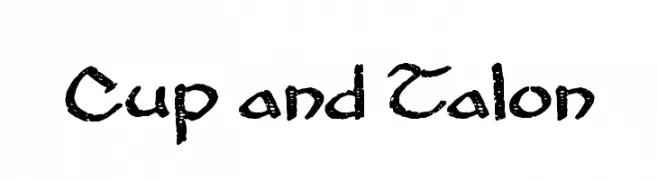
A bold, textured, hand-drawn font with a rugged, organic style.
![Cup and Talon font caratteri gratis]() Scaricare 255 Downloads@WebFont
Scaricare 255 Downloads@WebFont -
( Fonts by Manfred Klein. Free for private and charity use. Free for commercial with donation to organizations )
A modern sans-serif font with geometric shapes and a slightly condensed style.
![HerdeckeSans font caratteri gratis]() Scaricare 255 Downloads@WebFont
Scaricare 255 Downloads@WebFont -
( Fonts by Vladimir Nikolic )
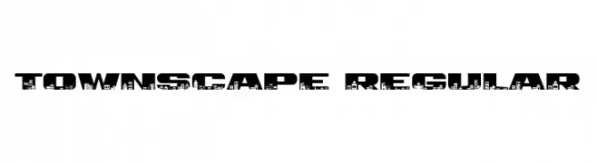
A bold, cityscape-themed font with intricate urban details within each character.
![Townscape Regular font caratteri gratis]() Scaricare 255 Downloads@WebFont
Scaricare 255 Downloads@WebFont -
-
( Fonts by a Max Infeld - XEROGRAPHER FONTS - xerographer.blogspot.com . Personal-use only. For commercial use please contact owner. )
A bold, distressed font with a textured, weathered appearance.
![SummerFestival font caratteri gratis]() Scaricare 255 Downloads@WebFont
Scaricare 255 Downloads@WebFont -
( Please check www.otlab.ru before you use this font! )
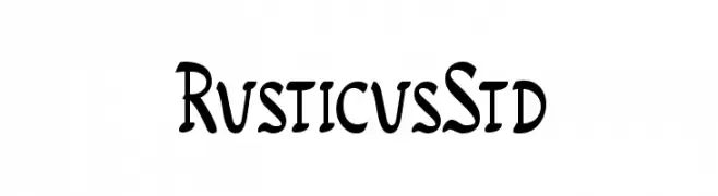
A rustic, handcrafted font with a vintage flair.
![RusticusStd font caratteri gratis]() Scaricare 255 Downloads@WebFont
Scaricare 255 Downloads@WebFont -
( Fonts by Font Monger - Chris Vile - Personal-use only. For commercial use please contact owner. )
A bold, high-contrast font with strong, thick strokes for impactful design.
![LCt50 font caratteri gratis]() Scaricare 255 Downloads@WebFont
Scaricare 255 Downloads@WebFont -
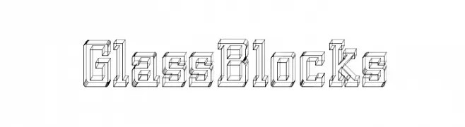
![GlassBlocks font caratteri gratis]() Scaricare 255 Downloads@WebFont
Scaricare 255 Downloads@WebFont -
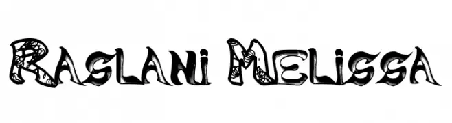
![Raslani Melissa font caratteri gratis]() Scaricare 255 Downloads@WebFont
Scaricare 255 Downloads@WebFont


Quali sono i font più popolari adesso?
Poppins, Roboto, Montserrat, Open Sans e Lato sono molto usati per le forme pulite e l'ampia applicabilità — dall'identità di marca alle landing page e ai poster.
Quali font si usano spesso nei loghi?
Le sans serif geometriche (es. Poppins, famiglie in stile Gotham) sono scelte comuni per un branding pulito e scalabile. Per un tocco personale restano valide script e stili manoscritti. Abbina un display deciso per i titoli a un corpo testo neutro per riconoscibilità ed equilibrio.
Ogni quanto si aggiorna la lista?
Con regolarità, in base ai download e all'attività reale. Torna spesso per scoprire in anticipo le nuove preferite.
💡 Consiglio: aggiungi ai preferiti — le tendenze cambiano in fretta e i font top di oggi possono ispirare il rebranding di domani.