Benvenuto nelle Font Più Popolari — dove popolarità e qualità si incontrano. Qui trovi i font più scaricati e usati dell'anno. Se cerchi scelte sicure per logo, web o social, inizia da qui.
Ogni font top si distingue per equilibrio, leggibilità e versatilità. Troverai sans serif moderne, script eleganti, serif vintage e display minimalisti.
-
( Fonts by Paul Lloyd )
A bold, shadowed font with a decorative and three-dimensional style.
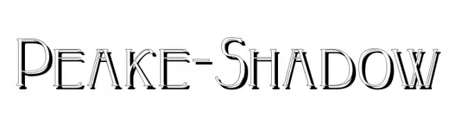 Scaricare 255 Downloads
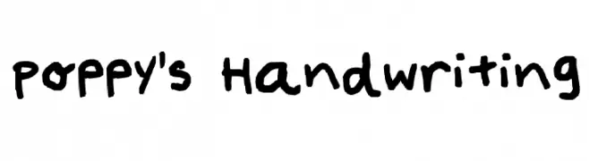
 -
![Poppy's Handwriting font caratteri gratis]() Scaricare 255 Downloads@WebFont
Scaricare 255 Downloads@WebFont -
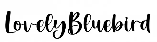
( Fonts by Rastype )
A playful, cursive font with elegant, flowing strokes and a handwritten feel.
![LovelyBluebird font caratteri gratis]() Scaricare 255 Downloads@WebFont
Scaricare 255 Downloads@WebFont -
( Fonts by www.woodcutter.es - woodcutter Manero - Personal-use only. For commercial use please contact owner. )
A bold, decorative icon font themed around DJ and music elements.
![DJ Icons font caratteri gratis]() Scaricare 255 Downloads@WebFont
Scaricare 255 Downloads@WebFont -
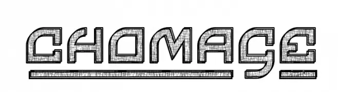
( www.qkila.com/font )
A bold, decorative font with a three-dimensional, maze-like design.
![Chomage font caratteri gratis]() Scaricare 255 Downloads@WebFont
Scaricare 255 Downloads@WebFont -
-
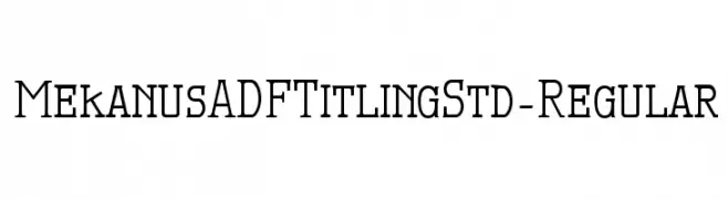
( Fonts by Arkandis Digital Foundry )
A modern serif font with clean lines and elegant curves.
![MekanusADFTitlingStd-Regular font caratteri gratis]() Scaricare 255 Downloads@WebFont
Scaricare 255 Downloads@WebFont -
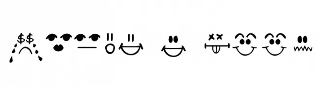
( Fonts by Kimberly Geswein - kimberlygeswein.com )
A playful and expressive font featuring emoticons and words that convey various emotions.
![Today I Feel font caratteri gratis]() Scaricare 255 Downloads@WebFont
Scaricare 255 Downloads@WebFont -
![Fleck font caratteri gratis]() Scaricare 255 Downloads@WebFont
Scaricare 255 Downloads@WebFont -
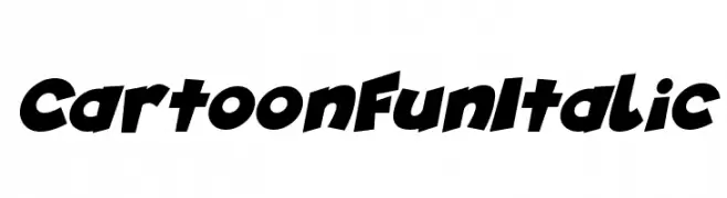
( Fonts by Darrell Flood )
A bold, playful italic font with exaggerated, rounded characters.
![Cartoon Fun Italic font caratteri gratis]() Scaricare 255 Downloads@WebFont
Scaricare 255 Downloads@WebFont -
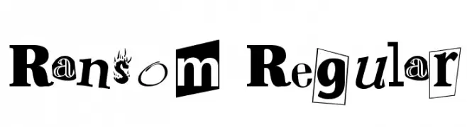
( Fonts by Altsys Metamorphosis )
A playful, eclectic font mimicking a ransom note with varied styles and bold design.
![Ransom Regular font caratteri gratis]() Scaricare 255 Downloads@WebFont
Scaricare 255 Downloads@WebFont

Quali sono i font più popolari adesso?
Poppins, Roboto, Montserrat, Open Sans e Lato sono molto usati per le forme pulite e l'ampia applicabilità — dall'identità di marca alle landing page e ai poster.
Quali font si usano spesso nei loghi?
Le sans serif geometriche (es. Poppins, famiglie in stile Gotham) sono scelte comuni per un branding pulito e scalabile. Per un tocco personale restano valide script e stili manoscritti. Abbina un display deciso per i titoli a un corpo testo neutro per riconoscibilità ed equilibrio.
Ogni quanto si aggiorna la lista?
Con regolarità, in base ai download e all'attività reale. Torna spesso per scoprire in anticipo le nuove preferite.
💡 Consiglio: aggiungi ai preferiti — le tendenze cambiano in fretta e i font top di oggi possono ispirare il rebranding di domani.