Benvenuto nelle Font Più Popolari — dove popolarità e qualità si incontrano. Qui trovi i font più scaricati e usati dell'anno. Se cerchi scelte sicure per logo, web o social, inizia da qui.
Ogni font top si distingue per equilibrio, leggibilità e versatilità. Troverai sans serif moderne, script eleganti, serif vintage e display minimalisti.
-
( Fonts by Des Gomez )
A playful, handwritten font with a whimsical and dynamic style.
 Scaricare 252 Downloads@WebFont
 -
( Fonts by Bumbayo Font Fabrik - bumbayo.blogspot.com )
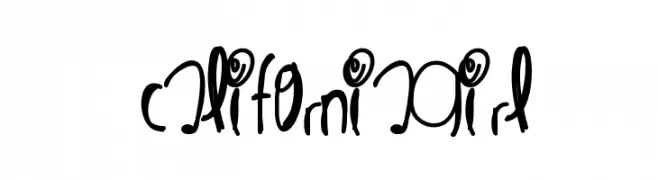
A playful, bold font with irregular strokes and a handcrafted feel.
![Gepetto font caratteri gratis]() Scaricare 252 Downloads@WebFont
Scaricare 252 Downloads@WebFont -
( Fonts by Dan P. Lyons - Personal-use only. For commercial use please contact owner. )
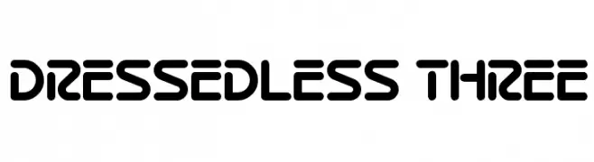
A bold, rounded font with a futuristic and modern design.
![Dressedless Three font caratteri gratis]() Scaricare 252 Downloads@WebFont
Scaricare 252 Downloads@WebFont -
( Boba Fonts - web.archive.org/web/20000823041207/207.153.208.174/multimedia/bobafonts/ )
A bold, futuristic font with rounded edges and a sci-fi aesthetic.
![Star Jedi Rounded font caratteri gratis]() Scaricare 252 Downloads@WebFont
Scaricare 252 Downloads@WebFont -
( Fonts by StudioTypo - Personal-use only. For commercial use please contact owner. )
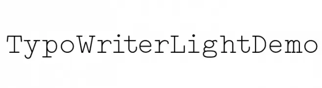
A monospaced font with a classic typewriter style, offering uniform spacing and clear legibility.
![Typo Writer Light Demo font caratteri gratis]() Scaricare 252 Downloads@WebFont
Scaricare 252 Downloads@WebFont -
-
( Fonts by Daniel Zadorozny - www.iconian.com - Free for personal use )
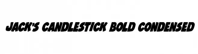
A bold, condensed font with thick strokes and tight spacing, perfect for impactful headlines.
![Jack's Candlestick Bold Condensed font caratteri gratis]() Scaricare 252 Downloads@WebFont
Scaricare 252 Downloads@WebFont -
( Fonts by Vladimir Nikolic )
A bold, geometric font with layered lines and Art Deco influences.
![Rude Regular font caratteri gratis]() Scaricare 252 Downloads@WebFont
Scaricare 252 Downloads@WebFont -
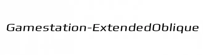
![Gamestation-ExtendedOblique font caratteri gratis]() Scaricare 252 Downloads@WebFont
Scaricare 252 Downloads@WebFont -
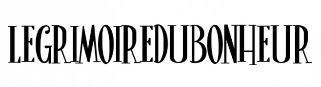
( Fonts by Maelle.K | Thomas Boucherie )
A tall, narrow, and elegant font with a vintage flair.
![LeGrimoireduBonheur font caratteri gratis]() Scaricare 252 Downloads@WebFont
Scaricare 252 Downloads@WebFont -
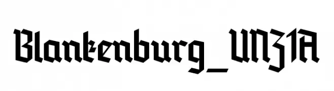
( Fonts by Peter Wiegel - www.peter-wiegel.de )
A bold, angular blackletter font with a Gothic, medieval aesthetic.
![Blankenburg_UNZ1A font caratteri gratis]() Scaricare 252 Downloads@WebFont
Scaricare 252 Downloads@WebFont


Quali sono i font più popolari adesso?
Poppins, Roboto, Montserrat, Open Sans e Lato sono molto usati per le forme pulite e l'ampia applicabilità — dall'identità di marca alle landing page e ai poster.
Quali font si usano spesso nei loghi?
Le sans serif geometriche (es. Poppins, famiglie in stile Gotham) sono scelte comuni per un branding pulito e scalabile. Per un tocco personale restano valide script e stili manoscritti. Abbina un display deciso per i titoli a un corpo testo neutro per riconoscibilità ed equilibrio.
Ogni quanto si aggiorna la lista?
Con regolarità, in base ai download e all'attività reale. Torna spesso per scoprire in anticipo le nuove preferite.
💡 Consiglio: aggiungi ai preferiti — le tendenze cambiano in fretta e i font top di oggi possono ispirare il rebranding di domani.