Benvenuto nelle Font Più Popolari — dove popolarità e qualità si incontrano. Qui trovi i font più scaricati e usati dell'anno. Se cerchi scelte sicure per logo, web o social, inizia da qui.
Ogni font top si distingue per equilibrio, leggibilità e versatilità. Troverai sans serif moderne, script eleganti, serif vintage e display minimalisti.
-
( Copyright (c) 2010, Danh Hong (khmertype.blogspot.com) )
A clean, modern font with balanced spacing and clear characters.
 Scaricare 252 Downloads@WebFont
 -
( Fonts by Olalatype )
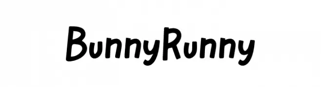
A playful, hand-drawn font with rounded, uneven strokes and a whimsical style.
![Bunny Runny font caratteri gratis]() Scaricare 252 Downloads@WebFont
Scaricare 252 Downloads@WebFont -
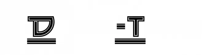
( Fonts by Nick Curtis - www.nicksfonts.com )
A bold, geometric font with a retro-futuristic style and multi-line outlines.
![Drive-Thru font caratteri gratis]() Scaricare 252 Downloads
Scaricare 252 Downloads -
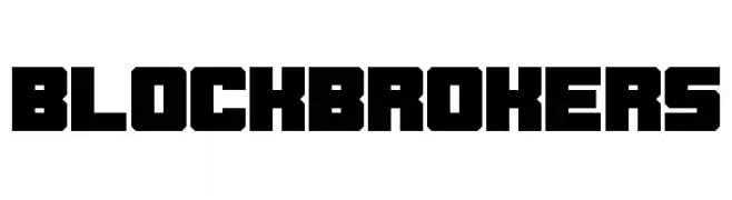
( Chequered Ink - chequered.ink/ )
A bold, geometric font with a modern, industrial style.
![Blockbrokers font caratteri gratis]() Scaricare 252 Downloads@WebFont
Scaricare 252 Downloads@WebFont -
( Fonts by Gunawan - Personal-use only. For commercial use please contact owner. )
A playful, hand-drawn style font with tall, narrow letters and rounded edges.
![Month Flower font caratteri gratis]() Scaricare 252 Downloads@WebFont
Scaricare 252 Downloads@WebFont -
-
( Fonts by www.koenhachmang.com - Glitch )
A modern, geometric font with consistent stroke width and rounded edges.
![Phino Variation font caratteri gratis]() Scaricare 252 Downloads@WebFont
Scaricare 252 Downloads@WebFont -
( Fonts by Joseph Dawson )
A playful, hand-drawn font with bold, rounded characters.
![Digital Squiggle font caratteri gratis]() Scaricare 252 Downloads@WebFont
Scaricare 252 Downloads@WebFont -
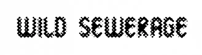
![Wild Sewerage font caratteri gratis]() Scaricare 252 Downloads@WebFont
Scaricare 252 Downloads@WebFont -
( Fonts by FallenGraphic Studio - Vava Aryanto - Personal-use only. For commercial use please contact owner. )
A bold, expressive handwritten font with a brush-like texture.
![Missing font caratteri gratis]() Scaricare 252 Downloads@WebFont
Scaricare 252 Downloads@WebFont -
( Fonts by LyonsType - Daniel Lyons - Personal-use only. For commercial use please contact owner. )
A bold, classic serif typeface with strong, authoritative strokes.
![LT Remark Bold font caratteri gratis]() Scaricare 252 Downloads@WebFont
Scaricare 252 Downloads@WebFont


Quali sono i font più popolari adesso?
Poppins, Roboto, Montserrat, Open Sans e Lato sono molto usati per le forme pulite e l'ampia applicabilità — dall'identità di marca alle landing page e ai poster.
Quali font si usano spesso nei loghi?
Le sans serif geometriche (es. Poppins, famiglie in stile Gotham) sono scelte comuni per un branding pulito e scalabile. Per un tocco personale restano valide script e stili manoscritti. Abbina un display deciso per i titoli a un corpo testo neutro per riconoscibilità ed equilibrio.
Ogni quanto si aggiorna la lista?
Con regolarità, in base ai download e all'attività reale. Torna spesso per scoprire in anticipo le nuove preferite.
💡 Consiglio: aggiungi ai preferiti — le tendenze cambiano in fretta e i font top di oggi possono ispirare il rebranding di domani.