Benvenuto nelle Font Più Popolari — dove popolarità e qualità si incontrano. Qui trovi i font più scaricati e usati dell'anno. Se cerchi scelte sicure per logo, web o social, inizia da qui.
Ogni font top si distingue per equilibrio, leggibilità e versatilità. Troverai sans serif moderne, script eleganti, serif vintage e display minimalisti.
-
( Fonts by Typhoon Type™ )
A playful, bold font with a hand-drawn, whimsical style.
 Scaricare 1002 Downloads@WebFont
 -
( Fonts by Zetafonts - Personal-use only. For commercial use please contact owner. )
A bold, heavy font with tight spacing and uniform stroke thickness, perfect for impactful designs.
![Heading Now Trial 28 Heavy font caratteri gratis]() Scaricare 1002 Downloads@WebFont
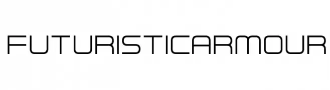
Scaricare 1002 Downloads@WebFont -
![Futuristic Armour font caratteri gratis]() Scaricare 1002 Downloads@WebFont
Scaricare 1002 Downloads@WebFont -
( Zetafonts - www.zetafonts.com )
A modern, narrow sans-serif font with a clean and professional look.
![Cocogoose Narrow Trial Semilight font caratteri gratis]() Scaricare 1002 Downloads@WebFont
Scaricare 1002 Downloads@WebFont -
( Marco Ballarè - www.marcoballare.com )
A bold, modern sans-serif font with geometric lines and consistent stroke width.
![Antraste font caratteri gratis]() Scaricare 1002 Downloads@WebFont
Scaricare 1002 Downloads@WebFont -
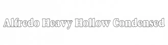
-
![Alfredo Heavy Hollow Condensed font caratteri gratis]() Scaricare 1002 Downloads
Scaricare 1002 Downloads -
( Fonts by Espen Morten Kvalheim - www.unbornchikken.com )
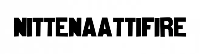
A bold, blocky font with strong, uniform characters ideal for impactful designs.
![nittenaattifire font caratteri gratis]() Scaricare 1002 Downloads@WebFont
Scaricare 1002 Downloads@WebFont -
( Fonts by joeBob graff-X )
A casual, handwritten font with fluid and expressive strokes.
![dearJoe II font caratteri gratis]() Scaricare 1002 Downloads@WebFont
Scaricare 1002 Downloads@WebFont -
![Benevento!]() Scaricare 1002 Downloads@WebFont
Scaricare 1002 Downloads@WebFont -
![KR Super 70's font caratteri gratis]() Scaricare 1002 Downloads@WebFont
Scaricare 1002 Downloads@WebFont -
( Fonts by Khurasan )
A bold, handwritten font with rounded strokes and a playful style.
![CoffeCake font caratteri gratis]() Scaricare 1001 Downloads@WebFont
Scaricare 1001 Downloads@WebFont -
( Fonts by Febryl Arully - Personal-use only. For commercial use please contact owner. )
A bold, dynamic brush script font with energetic and flowing strokes.
![Hallway font caratteri gratis]() Scaricare 1001 Downloads@WebFont
Scaricare 1001 Downloads@WebFont -
( Fonts by Khurasan )
A playful, rounded font with bold, bubbly characters and a casual vibe.
![Milky Boba font caratteri gratis]() Scaricare 1001 Downloads@WebFont
Scaricare 1001 Downloads@WebFont -
( Principal Studios )
A modern, geometric sans-serif font with clean lines and uniform strokes.
![Cursus font caratteri gratis]() Scaricare 1001 Downloads@WebFont
Scaricare 1001 Downloads@WebFont -
( Fonts by Tamavocks )
A bold, angular font with a futuristic and industrial style.
![ClobotFree font caratteri gratis]() Scaricare 1001 Downloads@WebFont
Scaricare 1001 Downloads@WebFont -
( Copyright (c) 2015 Indian Type Foundry (info@indiantypefoundry.com) )
A bold, modern sans-serif font with clean lines and strong readability.
![Hind Madurai Bold font caratteri gratis]() Scaricare 1001 Downloads@WebFont
Scaricare 1001 Downloads@WebFont -
( Fonts by a Max Infeld - XEROGRAPHER FONTS - xerographer.blogspot.com . Personal-use only. For commercial use please contact owner. )
A bold, decorative font with circular cutout patterns for a playful, artistic look.
![Boulevard font caratteri gratis]() Scaricare 1001 Downloads@WebFont
Scaricare 1001 Downloads@WebFont -
( Copyright 2014 Pria Ravichandran (pria.ravichandran@gmail.com) )
A modern, geometric sans-serif font with balanced proportions and clear legibility.
![Palanquin Medium font caratteri gratis]() Scaricare 1001 Downloads@WebFont
Scaricare 1001 Downloads@WebFont -
![Orient Express font caratteri gratis]() Scaricare 1001 Downloads@WebFont
Scaricare 1001 Downloads@WebFont -
![wreck it ralph Regular font caratteri gratis]() Scaricare 1001 Downloads@WebFont
Scaricare 1001 Downloads@WebFont -
( Copyright (c) 2014, Indian Type Foundry (info@indiantypefoundry.com). )
A casual, handwritten font with smooth, flowing strokes and a friendly appearance.
![Kalam Light font caratteri gratis]() Scaricare 1001 Downloads@WebFont
Scaricare 1001 Downloads@WebFont -
( Fonts by Andrew McCluskey - nalgames.com. Personal-use only. For commercial use please contact owner. )
A bold, modern sans-serif font with geometric shapes and consistent stroke widths.
![PrimarySchool font caratteri gratis]() Scaricare 1001 Downloads@WebFont
Scaricare 1001 Downloads@WebFont -
( Fonts by Have Fun with Fonts )
A whimsical, tall, and narrow font with a modern-vintage style.
![HFF Ice Bergman font caratteri gratis]() Scaricare 1001 Downloads@WebFont
Scaricare 1001 Downloads@WebFont -
![NHL Edge Carolina font caratteri gratis]() Scaricare 1001 Downloads@WebFont
Scaricare 1001 Downloads@WebFont -
![cathy font caratteri gratis]() Scaricare 1001 Downloads@WebFont
Scaricare 1001 Downloads@WebFont -
![Mojo Regular font caratteri gratis]() Scaricare 1001 Downloads@WebFont
Scaricare 1001 Downloads@WebFont -
( Fonts by Daniel Zadorozny - www.iconian.com )
A bold, italic font with a dynamic and angular design, perfect for impactful visuals.
![Anitlles Italic font caratteri gratis]() Scaricare 1001 Downloads@WebFont
Scaricare 1001 Downloads@WebFont -
![Bayou Cowboy font caratteri gratis]() Scaricare 1001 Downloads@WebFont
Scaricare 1001 Downloads@WebFont -
![Celticmd Decorative w Drop Caps font caratteri gratis]() Scaricare 1001 Downloads
Scaricare 1001 Downloads -
( Fonts by Cumberland Fontworks - http://www222.pair.com/sjohn/fonts.htm - S. John Ross )
A bold, textured font with a gravel-like appearance, ideal for striking visual designs.
![Gravel font caratteri gratis]() Scaricare 1001 Downloads@WebFont
Scaricare 1001 Downloads@WebFont -
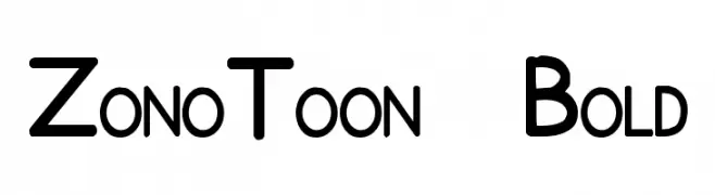
![ZonoToon Bold font caratteri gratis]() Scaricare 1001 Downloads@WebFont
Scaricare 1001 Downloads@WebFont -
![GE Nautica font caratteri gratis]() Scaricare 1001 Downloads@WebFont
Scaricare 1001 Downloads@WebFont -
( Fonts by Guaraldo Fonts - Personal-use only. For commercial use please contact owner. )
A bold, modern font with uniform stroke thickness and clear readability.
![Gin and Soda Personal Use font caratteri gratis]() Scaricare 1000 Downloads@WebFont
Scaricare 1000 Downloads@WebFont -
Caratteri di glyphstyle. For commercial use please contact the owner.
( NOTE: This demo font is for PERSONAL USE ONLY! But any donation are very appreciated. Paypal account for donation : https://www.paypal.me/dimasardhi full version: https://www.glyphstyle.net/trackers/ contact us at styleglyph@gmail.com And follow my i )
A bold, geometric font with a modern and professional style.
![Trackers demo font caratteri gratis]() Scaricare 1000 Downloads@WebFont
Scaricare 1000 Downloads@WebFont -
( Fonts by Subectype & Orenari )
A bold, playful handwritten font with rounded strokes and smooth curves.
![Mique font caratteri gratis]() Scaricare 1000 Downloads@WebFont
Scaricare 1000 Downloads@WebFont


Quali sono i font più popolari adesso?
Poppins, Roboto, Montserrat, Open Sans e Lato sono molto usati per le forme pulite e l'ampia applicabilità — dall'identità di marca alle landing page e ai poster.
Quali font si usano spesso nei loghi?
Le sans serif geometriche (es. Poppins, famiglie in stile Gotham) sono scelte comuni per un branding pulito e scalabile. Per un tocco personale restano valide script e stili manoscritti. Abbina un display deciso per i titoli a un corpo testo neutro per riconoscibilità ed equilibrio.
Ogni quanto si aggiorna la lista?
Con regolarità, in base ai download e all'attività reale. Torna spesso per scoprire in anticipo le nuove preferite.
💡 Consiglio: aggiungi ai preferiti — le tendenze cambiano in fretta e i font top di oggi possono ispirare il rebranding di domani.