Benvenuto nelle Font Più Popolari — dove popolarità e qualità si incontrano. Qui trovi i font più scaricati e usati dell'anno. Se cerchi scelte sicure per logo, web o social, inizia da qui.
Ogni font top si distingue per equilibrio, leggibilità e versatilità. Troverai sans serif moderne, script eleganti, serif vintage e display minimalisti.
-
 Scaricare 993 Downloads@WebFont
 -
( Fonts by Rissyletter Studio )
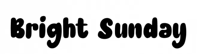
A playful, bold font with rounded edges and a bubbly appearance.
![Bright Sunday font caratteri gratis]() Scaricare 992 Downloads@WebFont
Scaricare 992 Downloads@WebFont -
( Fonts by www.lobbby24.com - Personal-use only. For commercial use please contact owner. )
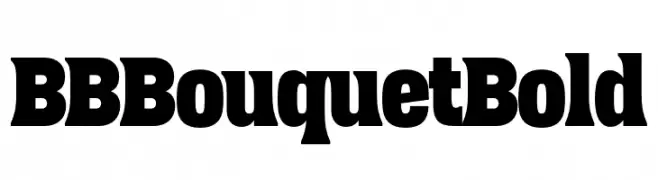
A bold, heavy font with a strong, playful aesthetic.
![BBBouquet Bold font caratteri gratis]() Scaricare 992 Downloads@WebFont
Scaricare 992 Downloads@WebFont -
( Fonts by LyonsType )
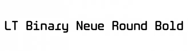
A bold, rounded, and modern font with smooth curves and consistent stroke thickness.
![LT Binary Neue Round Bold font caratteri gratis]() Scaricare 992 Downloads@WebFont
Scaricare 992 Downloads@WebFont -
( Fonts by MJType )
A bold, rounded font with a playful and friendly style.
![DAYSANS font caratteri gratis]() Scaricare 992 Downloads@WebFont
Scaricare 992 Downloads@WebFont -
-
( Fonts by Font People - Personal-use only. For commercial use please contact owner. )
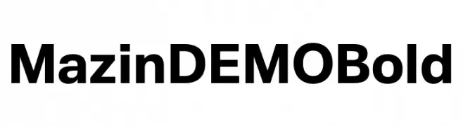
A bold, modern font with clean lines and strong geometric shapes.
![Mazin DEMO Bold font caratteri gratis]() Scaricare 992 Downloads@WebFont
Scaricare 992 Downloads@WebFont -
( Copyright 2017 The Inria Sans Project Authors (https://github.com/BlackFoundryCom/InriaFonts) )
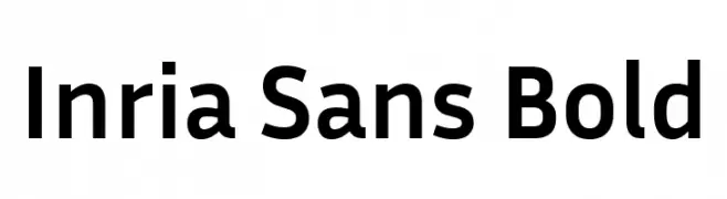
A bold, modern sans-serif font with excellent readability and versatility.
![Inria Sans Bold font caratteri gratis]() Scaricare 992 Downloads@WebFont
Scaricare 992 Downloads@WebFont -
( Typia Nesia - www.myfonts.com/foundry/Typia_Nesia/ )
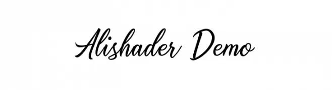
A classic and elegant script font with flowing, connected letterforms.
![Alishader Demo font caratteri gratis]() Scaricare 992 Downloads@WebFont
Scaricare 992 Downloads@WebFont -
![Anitype Journal 3 font caratteri gratis]() Scaricare 992 Downloads@WebFont
Scaricare 992 Downloads@WebFont -
( Copyright 2011 The Montserrat Project Authors (https://github.com/JulietaUla/Montserrat) )
A thin, geometric font with a modern and minimalist design.
![Montserrat Alternates Thin font caratteri gratis]() Scaricare 992 Downloads@WebFont
Scaricare 992 Downloads@WebFont -
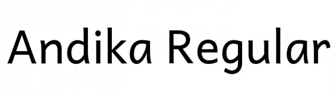
( Copyright (c) 2004-2011, SIL International (http://scripts.sil.org) )
A clean, modern sans-serif font with excellent readability and uniform stroke width.
![Andika Regular font caratteri gratis]() Scaricare 992 Downloads@WebFont
Scaricare 992 Downloads@WebFont -
![Means font caratteri gratis]() Scaricare 992 Downloads@WebFont
Scaricare 992 Downloads@WebFont -
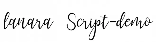
( Fonts by aqr typeface )
A modern, elegant script font with flowing, cursive lines and a sophisticated style.
![lanara Script-demo font caratteri gratis]() Scaricare 992 Downloads@WebFont
Scaricare 992 Downloads@WebFont -
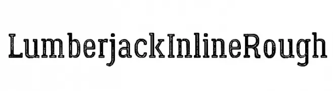
( Fonts by Jovanny Lemonad - typetype.ru - Personal-use only. For commercial use please contact owner. )
A rugged, textured font with an inline style and vintage appeal.
![LumberjackInlineRough font caratteri gratis]() Scaricare 992 Downloads@WebFont
Scaricare 992 Downloads@WebFont -
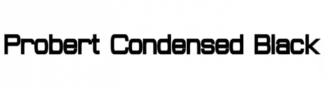
( Fonts by a Neale Davidson - www.pixelsagas.com. Personal-use only. For commercial use please contact owner. )
A bold, condensed font with a modern, geometric style.
![Probert Condensed Black font caratteri gratis]() Scaricare 992 Downloads@WebFont
Scaricare 992 Downloads@WebFont -
( Free - www.alphabetype.it )
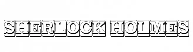
A bold, three-dimensional font with a shadowed effect, ideal for vintage-themed projects.
![SHERLOCK HOLMES font caratteri gratis]() Scaricare 992 Downloads@WebFont
Scaricare 992 Downloads@WebFont -
( Fonts by Peax Webdesign - www.peax-webdesign.com. Personal-use only. For commercial use please contact owner. )
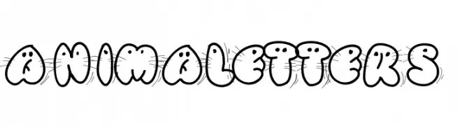
A playful, animal-themed decorative font with bold outlines.
![Animaletters font caratteri gratis]() Scaricare 992 Downloads@WebFont
Scaricare 992 Downloads@WebFont -
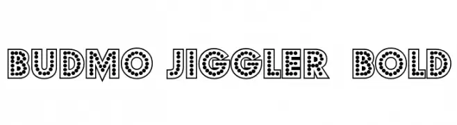
![Budmo Jiggler Bold font caratteri gratis]() Scaricare 992 Downloads@WebFont
Scaricare 992 Downloads@WebFont -
( Fonts by Emerald City Fontwerks )
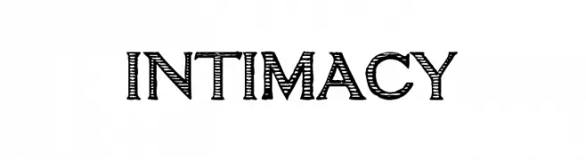
A playful, hand-drawn font with a sketch-like, whimsical appearance.
![intimacy font caratteri gratis]() Scaricare 992 Downloads@WebFont
Scaricare 992 Downloads@WebFont -
( Fonts by Digital Graphics Labs - www.digitalgraphiclabs.com )
A bold, strong font with thick strokes and rounded edges.
![Incite font caratteri gratis]() Scaricare 992 Downloads@WebFont
Scaricare 992 Downloads@WebFont -
![Pabloco font caratteri gratis]() Scaricare 992 Downloads@WebFont
Scaricare 992 Downloads@WebFont -
( Fonts by Kong Font )
A bold, geometric font with sharp angles and a strong, modern presence.
![Ice Land font caratteri gratis]() Scaricare 991 Downloads@WebFont
Scaricare 991 Downloads@WebFont -
( Fonts by Florian Karsten )
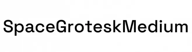
A modern, geometric sans-serif font with a clean and balanced design.
![Space Grotesk Medium font caratteri gratis]() Scaricare 991 Downloads@WebFont
Scaricare 991 Downloads@WebFont -
( Fonts by Astigmatic )
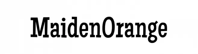
A bold, playful font with vintage charm and approachable characters.
![Maiden Orange font caratteri gratis]() Scaricare 991 Downloads@WebFont
Scaricare 991 Downloads@WebFont -
( Fonts by Fikry Alif - Fikryal studio - https://www.creativefabrica.com/designer/mfikryalif/ref/222304/ - Personal-use only. For commercial use please contact owner. )
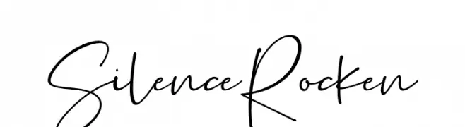
A lively handwritten font with fluid strokes and playful loops.
![Silence Rocken font caratteri gratis]() Scaricare 991 Downloads@WebFont
Scaricare 991 Downloads@WebFont -
( Copyright (c) 2015 Ek Type (www.ektype.in) )
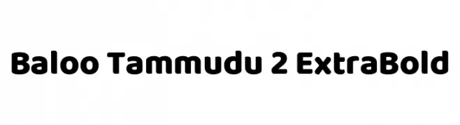
A bold, rounded, and playful font with a modern and friendly appearance.
![Baloo Tammudu 2 ExtraBold font caratteri gratis]() Scaricare 991 Downloads@WebFont
Scaricare 991 Downloads@WebFont -
( Roger White - web.archive.org/web/20120416090521/www.rogersfonts.org.uk/ )
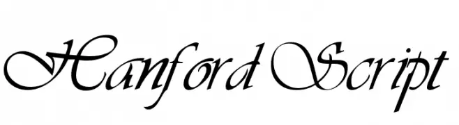
An elegant script font with intricate loops and flourishes.
![Hanford Script font caratteri gratis]() Scaricare 991 Downloads@WebFont
Scaricare 991 Downloads@WebFont -
( Hassan sardar )
A geometric, futuristic font with linear and angular design.
![ff font caratteri gratis]() Scaricare 991 Downloads@WebFont
Scaricare 991 Downloads@WebFont -
( Mr Letters - fontbundles.net/mrletters/rel=mur3FT )
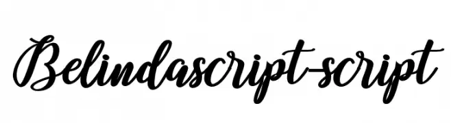
A flowing, cursive script font with elegant loops and flourishes.
![Belindascript-script font caratteri gratis]() Scaricare 991 Downloads@WebFont
Scaricare 991 Downloads@WebFont -
( 7NTypes - Situjuh Nazara - 7ntypes.com )
A playful and elegant script font with flowing, connected letters.
![Byby font caratteri gratis]() Scaricare 991 Downloads@WebFont
Scaricare 991 Downloads@WebFont -
![RolleteQaku-Regular font caratteri gratis]() Scaricare 991 Downloads@WebFont
Scaricare 991 Downloads@WebFont -
( Copyright (c) 2015, Impallari Type (www.impallari.com) )
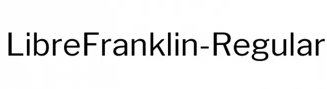
A modern, geometric sans-serif font with balanced proportions and clear legibility.
![LibreFranklin-Regular font caratteri gratis]() Scaricare 991 Downloads@WebFont
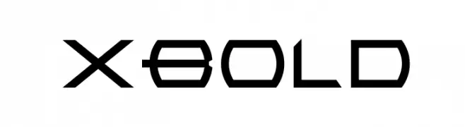
Scaricare 991 Downloads@WebFont -
![XBold font caratteri gratis]() Scaricare 991 Downloads@WebFont
Scaricare 991 Downloads@WebFont -
( Fonts by a Situjuh Nazara - c7n1.wordpress.com. Personal-use only. For commercial use please contact owner. )
A modern, geometric font with clean, rounded edges and consistent stroke width.
![gpkn font caratteri gratis]() Scaricare 991 Downloads@WebFont
Scaricare 991 Downloads@WebFont -
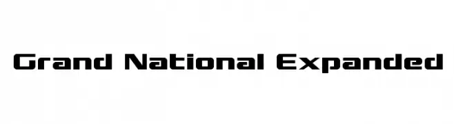
( Fonts by Daniel Zadorozny - www.iconian.com )
A bold, geometric font with an expanded width and modern style.
![Grand National Expanded font caratteri gratis]() Scaricare 991 Downloads@WebFont
Scaricare 991 Downloads@WebFont


Quali sono i font più popolari adesso?
Poppins, Roboto, Montserrat, Open Sans e Lato sono molto usati per le forme pulite e l'ampia applicabilità — dall'identità di marca alle landing page e ai poster.
Quali font si usano spesso nei loghi?
Le sans serif geometriche (es. Poppins, famiglie in stile Gotham) sono scelte comuni per un branding pulito e scalabile. Per un tocco personale restano valide script e stili manoscritti. Abbina un display deciso per i titoli a un corpo testo neutro per riconoscibilità ed equilibrio.
Ogni quanto si aggiorna la lista?
Con regolarità, in base ai download e all'attività reale. Torna spesso per scoprire in anticipo le nuove preferite.
💡 Consiglio: aggiungi ai preferiti — le tendenze cambiano in fretta e i font top di oggi possono ispirare il rebranding di domani.