Benvenuto nelle Font Più Popolari — dove popolarità e qualità si incontrano. Qui trovi i font più scaricati e usati dell'anno. Se cerchi scelte sicure per logo, web o social, inizia da qui.
Ogni font top si distingue per equilibrio, leggibilità e versatilità. Troverai sans serif moderne, script eleganti, serif vintage e display minimalisti.
-
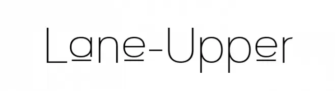
( Fonts by Apostrophic Labs )
A modern, geometric sans-serif font with clean lines and balanced proportions.
 Scaricare 246 Downloads@WebFont
 -
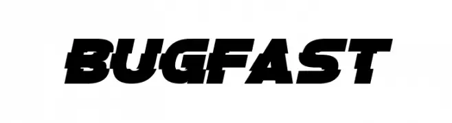
( Fonts by Chequered Ink )
A bold, slanted font with a dynamic and modern style.
![Bugfast font caratteri gratis]() Scaricare 246 Downloads@WebFont
Scaricare 246 Downloads@WebFont -
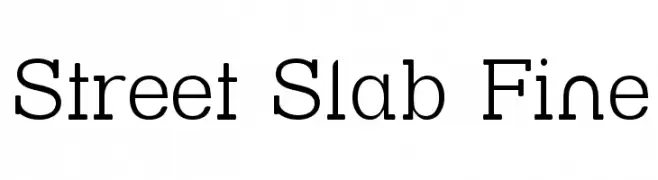
( Fonts by Apostrophic Lab )
A modern slab serif font with a clean, structured design.
![Street Slab Fine font caratteri gratis]() Scaricare 246 Downloads@WebFont
Scaricare 246 Downloads@WebFont -
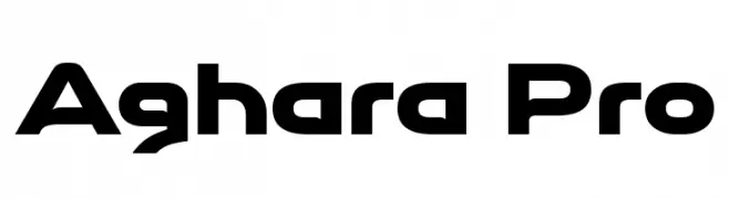
( Typopey - Reand Aghara - facebook.com/typopey )
A bold, futuristic font with sharp angles and geometric shapes.
![Aghara Pro font caratteri gratis]() Scaricare 246 Downloads@WebFont
Scaricare 246 Downloads@WebFont -
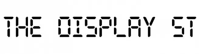
( Fonts by Southype )
A segmented, digital display-style font with a bold, geometric appearance.
![The Display St font caratteri gratis]() Scaricare 246 Downloads@WebFont
Scaricare 246 Downloads@WebFont -
-
![Win Pets 2 font caratteri gratis]() Scaricare 246 Downloads@WebFont
Scaricare 246 Downloads@WebFont -
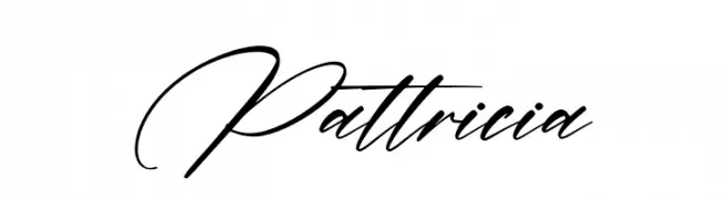
( Fonts by Letterena Studios )
A flowing, cursive script font with elegant, connected strokes.
![Pattricia font caratteri gratis]() Scaricare 246 Downloads@WebFont
Scaricare 246 Downloads@WebFont -
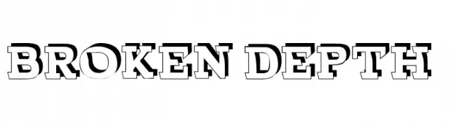
( Fonts by fontsandfashion.com. Personal-use only. For commercial use please contact owner. )
A bold, three-dimensional font with a striking, layered design.
![BROKEN DEPTH demo font caratteri gratis]() Scaricare 246 Downloads@WebFont
Scaricare 246 Downloads@WebFont -
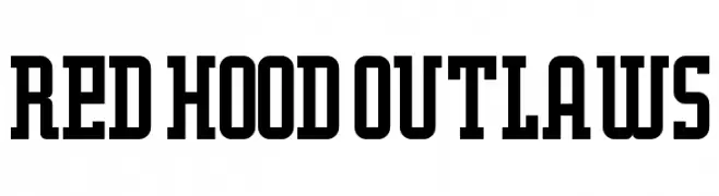
( JK Typeface - hiltonbrasfoot.wixsite.com/jktypeface )
A bold, structured font with block-like serifs and a vintage industrial feel.
![Red Hood Outlaws font caratteri gratis]() Scaricare 246 Downloads@WebFont
Scaricare 246 Downloads@WebFont -
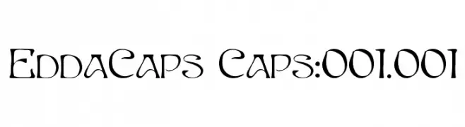
( Fonts by Sam Wang )
An artistic and decorative font with medieval-inspired letterforms and expressive style.
![EddaCaps Caps:001.001 font caratteri gratis]() Scaricare 246 Downloads@WebFont
Scaricare 246 Downloads@WebFont

Quali sono i font più popolari adesso?
Poppins, Roboto, Montserrat, Open Sans e Lato sono molto usati per le forme pulite e l'ampia applicabilità — dall'identità di marca alle landing page e ai poster.
Quali font si usano spesso nei loghi?
Le sans serif geometriche (es. Poppins, famiglie in stile Gotham) sono scelte comuni per un branding pulito e scalabile. Per un tocco personale restano valide script e stili manoscritti. Abbina un display deciso per i titoli a un corpo testo neutro per riconoscibilità ed equilibrio.
Ogni quanto si aggiorna la lista?
Con regolarità, in base ai download e all'attività reale. Torna spesso per scoprire in anticipo le nuove preferite.
💡 Consiglio: aggiungi ai preferiti — le tendenze cambiano in fretta e i font top di oggi possono ispirare il rebranding di domani.