Benvenuto nelle Font Più Popolari — dove popolarità e qualità si incontrano. Qui trovi i font più scaricati e usati dell'anno. Se cerchi scelte sicure per logo, web o social, inizia da qui.
Ogni font top si distingue per equilibrio, leggibilità e versatilità. Troverai sans serif moderne, script eleganti, serif vintage e display minimalisti.
-
( Fonts by Etik Fatimah )
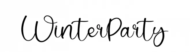
A playful, handwritten cursive font with elegant loops and curves.
 Scaricare 246 Downloads@WebFont
 -
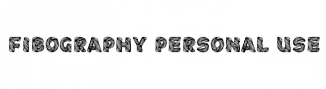
![Fibography Personal Use font caratteri gratis]() Scaricare 246 Downloads@WebFont
Scaricare 246 Downloads@WebFont -
( Fonts by Astigmatic One Eye Typographic Institute - Brian J. Bonislawsky - astigmatic.com )
A playful and dynamic font with jagged, electric outlines.
![Electric Hermes AOE font caratteri gratis]() Scaricare 246 Downloads@WebFont
Scaricare 246 Downloads@WebFont -
![Akalai font caratteri gratis]() Scaricare 246 Downloads@WebFont
Scaricare 246 Downloads@WebFont -
( Fonts by Noah Type - noahtype.com - Personal-use only. For commercial use please contact owner. )
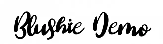
A bold, expressive script font with flowing, cursive letters and dramatic flourishes.
![Blushie Demo font caratteri gratis]() Scaricare 246 Downloads@WebFont
Scaricare 246 Downloads@WebFont -
-
( Fonts by Daniel Zadorozny - www.iconian.com )
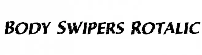
A bold, italicized font with a distressed, grunge texture.
![Body Swipers Rotalic font caratteri gratis]() Scaricare 246 Downloads@WebFont
Scaricare 246 Downloads@WebFont -
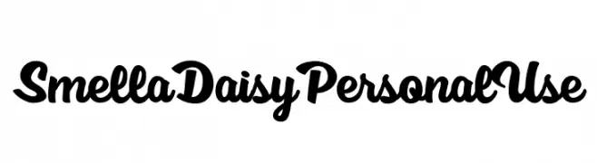
( Fonts by Billy Argel Fonts - www.billyargel.com - Personal-use only. For commercial use please contact owner. )
A bold, playful script font with smooth, flowing curves and thick strokes.
![Smell a Daisy Personal Use font caratteri gratis]() Scaricare 246 Downloads@WebFont
Scaricare 246 Downloads@WebFont -
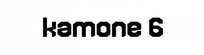
( Fonts by Goma Shin - Shintarou Nakayama www.geocities.jp/gomarice_font/ )
A bold, geometric font with a blocky, industrial style.
![kamone 6 font caratteri gratis]() Scaricare 246 Downloads@WebFont
Scaricare 246 Downloads@WebFont -
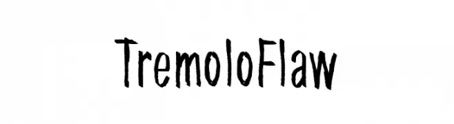
( Fonts by junkohanhero )
A hand-drawn, textured font with a playful and artistic style.
![Tremolo Flaw font caratteri gratis]() Scaricare 246 Downloads@WebFont
Scaricare 246 Downloads@WebFont -
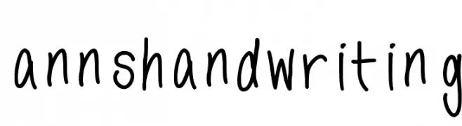
![annshandwriting font caratteri gratis]() Scaricare 246 Downloads@WebFont
Scaricare 246 Downloads@WebFont


Quali sono i font più popolari adesso?
Poppins, Roboto, Montserrat, Open Sans e Lato sono molto usati per le forme pulite e l'ampia applicabilità — dall'identità di marca alle landing page e ai poster.
Quali font si usano spesso nei loghi?
Le sans serif geometriche (es. Poppins, famiglie in stile Gotham) sono scelte comuni per un branding pulito e scalabile. Per un tocco personale restano valide script e stili manoscritti. Abbina un display deciso per i titoli a un corpo testo neutro per riconoscibilità ed equilibrio.
Ogni quanto si aggiorna la lista?
Con regolarità, in base ai download e all'attività reale. Torna spesso per scoprire in anticipo le nuove preferite.
💡 Consiglio: aggiungi ai preferiti — le tendenze cambiano in fretta e i font top di oggi possono ispirare il rebranding di domani.