Benvenuto nelle Font Più Popolari — dove popolarità e qualità si incontrano. Qui trovi i font più scaricati e usati dell'anno. Se cerchi scelte sicure per logo, web o social, inizia da qui.
Ogni font top si distingue per equilibrio, leggibilità e versatilità. Troverai sans serif moderne, script eleganti, serif vintage e display minimalisti.
-
( Fonts by Steve Ferrera )
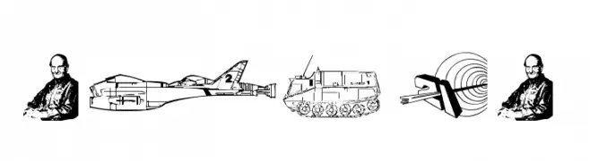
Science fiction-themed pictogram and icon set with technical illustrations.
 Scaricare 240 Downloads@WebFont
 -
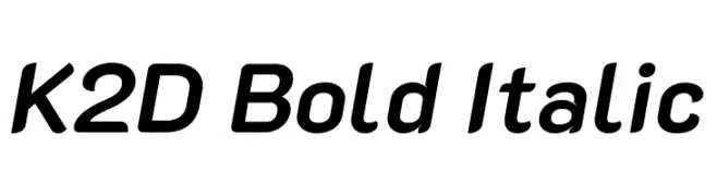
( Copyright 2018 The K2D Project Authors (https://github.com/cadsondemak/K2D) )
A modern, bold, and italicized font with a sleek and dynamic appearance.
![K2D Bold Italic font caratteri gratis]() Scaricare 240 Downloads@WebFont
Scaricare 240 Downloads@WebFont -
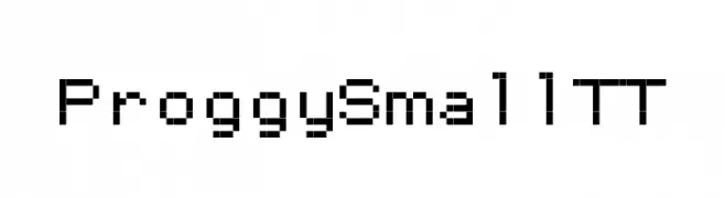
![ProggySmallTT font caratteri gratis]() Scaricare 240 Downloads@WebFont
Scaricare 240 Downloads@WebFont -
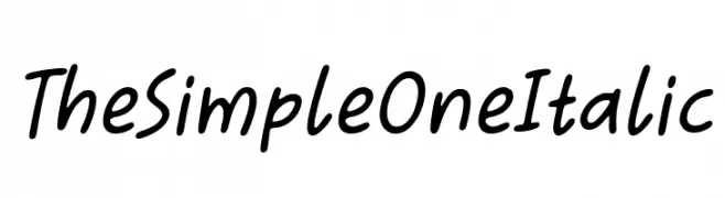
( Fonts by Situjuh Nazara - 7ntypes.com - Personal-use only. For commercial use please contact owner. )
A casual, handwritten italic font with smooth, rounded characters.
![The Simple One Italic font caratteri gratis]() Scaricare 240 Downloads@WebFont
Scaricare 240 Downloads@WebFont -
( Extram Studios - Lewis Bauer )
A playful, hand-drawn font with bold, irregular strokes.
![6 Script font caratteri gratis]() Scaricare 240 Downloads@WebFont
Scaricare 240 Downloads@WebFont -
-
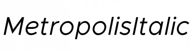
( Fonts by Chris Simpson - Personal-use only. For commercial use please contact owner. )
A sleek, modern italic font with geometric shapes and consistent stroke widths.
![Metropolis Italic font caratteri gratis]() Scaricare 240 Downloads@WebFont
Scaricare 240 Downloads@WebFont -
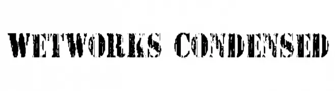
( Fonts by Daniel Zadorozny - www.iconian.com - Free for personal use )
A bold, distressed font with a rugged, urban style and condensed width.
![Wetworks Condensed font caratteri gratis]() Scaricare 240 Downloads@WebFont
Scaricare 240 Downloads@WebFont -
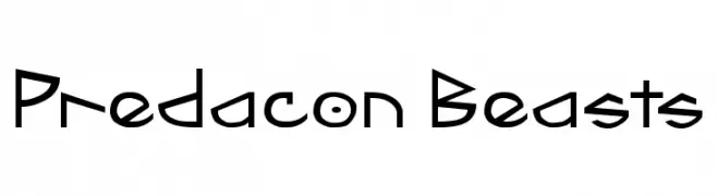
![Predacon Beasts font caratteri gratis]() Scaricare 240 Downloads@WebFont
Scaricare 240 Downloads@WebFont -
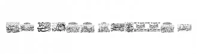
![My Font Quraan 3 font caratteri gratis]() Scaricare 240 Downloads@WebFont
Scaricare 240 Downloads@WebFont -
( Fonts by Gilar Studio )
A playful, bold font with a distinctive shadow effect and cartoonish style.
![The Crafty ! Shadow font caratteri gratis]() Scaricare 240 Downloads@WebFont
Scaricare 240 Downloads@WebFont


Quali sono i font più popolari adesso?
Poppins, Roboto, Montserrat, Open Sans e Lato sono molto usati per le forme pulite e l'ampia applicabilità — dall'identità di marca alle landing page e ai poster.
Quali font si usano spesso nei loghi?
Le sans serif geometriche (es. Poppins, famiglie in stile Gotham) sono scelte comuni per un branding pulito e scalabile. Per un tocco personale restano valide script e stili manoscritti. Abbina un display deciso per i titoli a un corpo testo neutro per riconoscibilità ed equilibrio.
Ogni quanto si aggiorna la lista?
Con regolarità, in base ai download e all'attività reale. Torna spesso per scoprire in anticipo le nuove preferite.
💡 Consiglio: aggiungi ai preferiti — le tendenze cambiano in fretta e i font top di oggi possono ispirare il rebranding di domani.