Benvenuto nelle Font Più Popolari — dove popolarità e qualità si incontrano. Qui trovi i font più scaricati e usati dell'anno. Se cerchi scelte sicure per logo, web o social, inizia da qui.
Ogni font top si distingue per equilibrio, leggibilità e versatilità. Troverai sans serif moderne, script eleganti, serif vintage e display minimalisti.
-
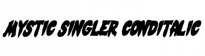
( Fonts by Daniel Zadorozny - www.iconian.com - Free for personal use )
A bold, italicized, and condensed font with dynamic and edgy characteristics.
 Scaricare 240 Downloads@WebFont
 -
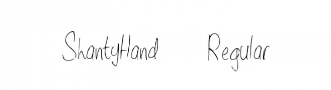
( Fonts by Alex Tomlinson - Skyhaven Fonts - shfonts.com )
A casual, handwritten font with a thin, consistent stroke and slightly slanted characters.
![ShantyHand-Regular font caratteri gratis]() Scaricare 240 Downloads@WebFont
Scaricare 240 Downloads@WebFont -
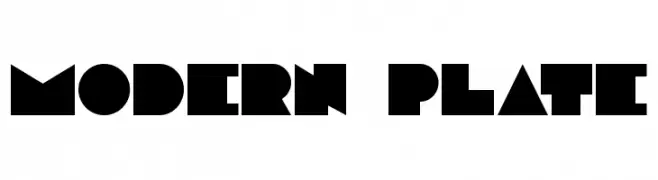
( Fonts by Benoit Champy - www.vnbc.fr - Personal-use only. For commercial use please contact owner. )
A bold, geometric font with sharp angles and a modern aesthetic.
![Modern plate font caratteri gratis]() Scaricare 240 Downloads@WebFont
Scaricare 240 Downloads@WebFont -
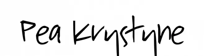
( Free for a personal use. For a commercial use please visit www.kevinandamanda.com )
A playful, casual handwritten font with dynamic strokes.
![Pea Krystyne font caratteri gratis]() Scaricare 240 Downloads@WebFont
Scaricare 240 Downloads@WebFont -
( Fonts by wildtype.design - Personal-use only. For commercial use please contact owner. )
A modern, geometric font with thin lines and a minimalist style.
![THIN font caratteri gratis]() Scaricare 240 Downloads@WebFont
Scaricare 240 Downloads@WebFont -
-
( Fonts by Aveni Letter Type )
A flowing, cursive script font with elegant, connected characters.
![Loves Story font caratteri gratis]() Scaricare 240 Downloads@WebFont
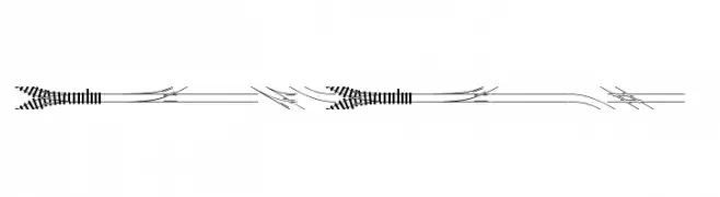
Scaricare 240 Downloads@WebFont -
![TrainTracks font caratteri gratis]() Scaricare 240 Downloads@WebFont
Scaricare 240 Downloads@WebFont -
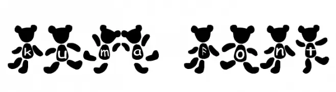
![kuma Font font caratteri gratis]() Scaricare 240 Downloads@WebFont
Scaricare 240 Downloads@WebFont -
( Fonts by Jehoo Creative - Anwar Patihan - Personal-use only. For commercial use please contact owner. )
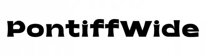
A bold, wide font with geometric shapes and a modern aesthetic.
![Pontiff Wide font caratteri gratis]() Scaricare 240 Downloads@WebFont
Scaricare 240 Downloads@WebFont -
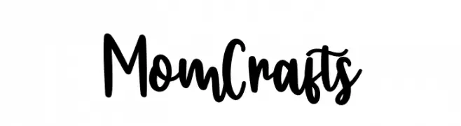
( Fonts by Bearytype )
Playful handwritten script font.
![Mom Crafts font caratteri gratis]() Scaricare 240 Downloads@WebFont
Scaricare 240 Downloads@WebFont


Quali sono i font più popolari adesso?
Poppins, Roboto, Montserrat, Open Sans e Lato sono molto usati per le forme pulite e l'ampia applicabilità — dall'identità di marca alle landing page e ai poster.
Quali font si usano spesso nei loghi?
Le sans serif geometriche (es. Poppins, famiglie in stile Gotham) sono scelte comuni per un branding pulito e scalabile. Per un tocco personale restano valide script e stili manoscritti. Abbina un display deciso per i titoli a un corpo testo neutro per riconoscibilità ed equilibrio.
Ogni quanto si aggiorna la lista?
Con regolarità, in base ai download e all'attività reale. Torna spesso per scoprire in anticipo le nuove preferite.
💡 Consiglio: aggiungi ai preferiti — le tendenze cambiano in fretta e i font top di oggi possono ispirare il rebranding di domani.