Benvenuto nelle Font Più Popolari — dove popolarità e qualità si incontrano. Qui trovi i font più scaricati e usati dell'anno. Se cerchi scelte sicure per logo, web o social, inizia da qui.
Ogni font top si distingue per equilibrio, leggibilità e versatilità. Troverai sans serif moderne, script eleganti, serif vintage e display minimalisti.
-
 Scaricare 967 Downloads@WebFont
 -
( Fonts by Daniel Zadorozny - www.iconian.com - Free for personal use )
A bold, geometric font with a futuristic and industrial style.
![U.S.S. Dallas font caratteri gratis]() Scaricare 967 Downloads@WebFont
Scaricare 967 Downloads@WebFont -
( Fonts by Emerald City Fontwerks )
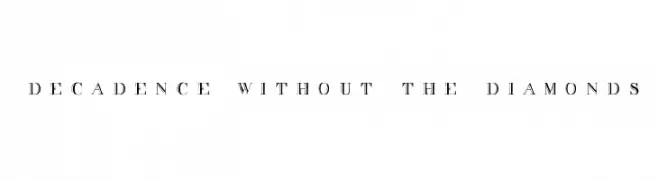
A decorative serif font with intricate detailing and elegant style.
![decadence without the diamonds font caratteri gratis]() Scaricare 967 Downloads@WebFont
Scaricare 967 Downloads@WebFont -
( Fonts by David Rakowski )
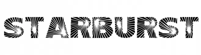
A bold, dynamic font with a starburst pattern radiating from each character.
![Starburst font caratteri gratis]() Scaricare 967 Downloads@WebFont
Scaricare 967 Downloads@WebFont -
( Fonts by Rodrigo German - RASDESIGN )
A bold, distressed font with a grunge texture and rugged appearance.
![DESTRUCCION font caratteri gratis]() Scaricare 967 Downloads@WebFont
Scaricare 967 Downloads@WebFont -
-
( Fonts by ShyFonts )
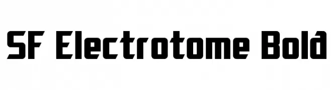
A bold, geometric font with a futuristic and modern aesthetic.
![SF Electrotome Bold font caratteri gratis]() Scaricare 967 Downloads@WebFont
Scaricare 967 Downloads@WebFont -
( Fonts by Jacob Fisher - www.pizzadude.dk )
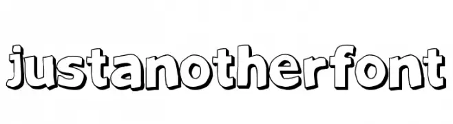
A bold, cartoonish font with thick outlines and a playful style.
![JustAnotherFont font caratteri gratis]() Scaricare 967 Downloads@WebFont
Scaricare 967 Downloads@WebFont -
( Fonts by twinletter )
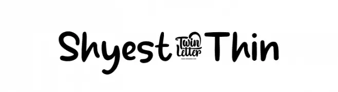
A playful, handwritten font with rounded edges and a casual, friendly style.
![Shyest-Thin font caratteri gratis]() Scaricare 966 Downloads@WebFont
Scaricare 966 Downloads@WebFont -
( Fonts by Pustudio )
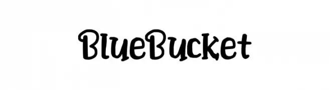
A playful, hand-drawn font with bold, rounded strokes and a whimsical style.
![BlueBucket font caratteri gratis]() Scaricare 966 Downloads@WebFont
Scaricare 966 Downloads@WebFont -
( Fonts by wepfont - Wahyu Eka Prasetya - Personal-use only. For commercial use please contact owner. )
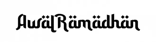
A bold, geometric font with modern and traditional elements.
![Awal Ramadhan font caratteri gratis]() Scaricare 966 Downloads@WebFont
Scaricare 966 Downloads@WebFont -
( Fonts by Levi Szekeres - Personal-use only. For commercial use please contact owner. )
A bold, brushstroke typeface with an energetic, handcrafted style.
![Brush font caratteri gratis]() Scaricare 966 Downloads@WebFont
Scaricare 966 Downloads@WebFont -
( Fonts by Masato Shimojima - Personal-use only. For commercial use please contact owner. )
A modern, rounded sans-serif font with uniform strokes and a friendly appearance.
![Circle20 font caratteri gratis]() Scaricare 966 Downloads@WebFont
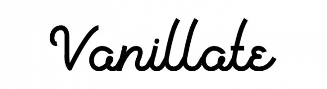
Scaricare 966 Downloads@WebFont -
![Vanillate font caratteri gratis]() Scaricare 966 Downloads@WebFont
Scaricare 966 Downloads@WebFont -
( Fonts by Greg Medina - www.dcoxy.com - Personal-use only. For commercial use please contact owner. )
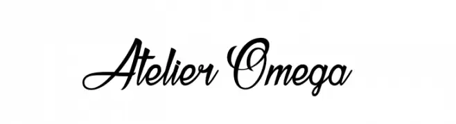
A sophisticated and elegant script font with ornate uppercase letters and smooth, readable lowercase letters.
![Atelier Omega font caratteri gratis]() Scaricare 966 Downloads@WebFont
Scaricare 966 Downloads@WebFont -
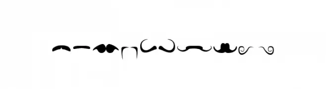
( Fonts by Maelle.K - Thomas Boucherie )
A decorative font made entirely of mustache illustrations.
![mustache font caratteri gratis]() Scaricare 966 Downloads@WebFont
Scaricare 966 Downloads@WebFont -
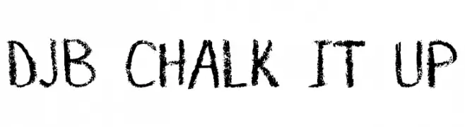
( Fonts by Darcy Baldwin - darcybaldwin.com. Free for personal use only )
A playful, chalkboard-style font with a textured, hand-drawn appearance.
![DJB CHALK IT UP font caratteri gratis]() Scaricare 966 Downloads@WebFont
Scaricare 966 Downloads@WebFont -
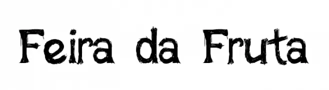
![Feira da Fruta font caratteri gratis]() Scaricare 966 Downloads@WebFont
Scaricare 966 Downloads@WebFont -
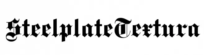
( Fonts by Dieter Steffmann )
A bold, dramatic Blackletter font with intricate, ornate letterforms.
![SteelplateTextura font caratteri gratis]() Scaricare 966 Downloads@WebFont
Scaricare 966 Downloads@WebFont -
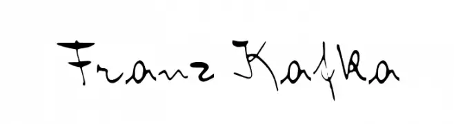
![Franz Kafka font caratteri gratis]() Scaricare 966 Downloads@WebFont
Scaricare 966 Downloads@WebFont -
![Fantastic Pete font caratteri gratis]() Scaricare 966 Downloads@WebFont
Scaricare 966 Downloads@WebFont -
( Fonts by El Stinger )
A bold, decorative font with playful ornamental elements.
![VonFont font caratteri gratis]() Scaricare 966 Downloads@WebFont
Scaricare 966 Downloads@WebFont -
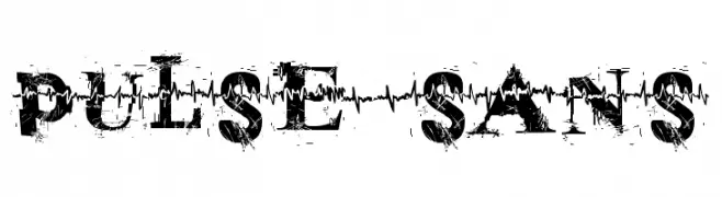
![pulse sans font caratteri gratis]() Scaricare 966 Downloads@WebFont
Scaricare 966 Downloads@WebFont -
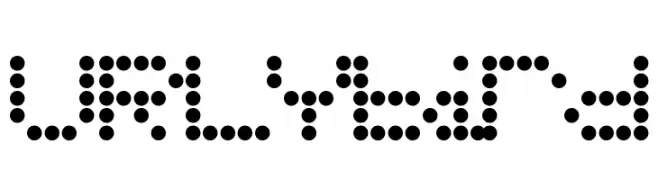
![URLYbird font caratteri gratis]() Scaricare 966 Downloads@WebFont
Scaricare 966 Downloads@WebFont -
![Runic Alt font caratteri gratis]() Scaricare 966 Downloads@WebFont
Scaricare 966 Downloads@WebFont -
( Fonts by Marty Bee - www.martybee.com )
A tall, narrow font with a bold, vintage-inspired design.
![Manzanita font caratteri gratis]() Scaricare 966 Downloads@WebFont
Scaricare 966 Downloads@WebFont -
( Fonts by Jacob Fisher - www.pizzadude.dk )
A playful, hand-drawn font with a whimsical and cartoonish style.
![Hero Of Fools font caratteri gratis]() Scaricare 966 Downloads@WebFont
Scaricare 966 Downloads@WebFont -
( Fonts by Naharstd - Nanda Hardiansyah - Personal-use only. For commercial use please contact owner. )
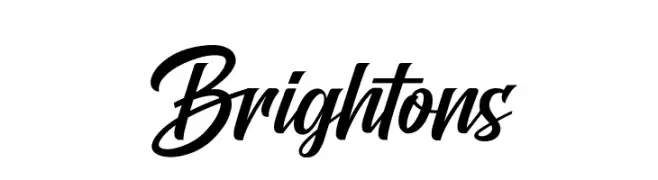
A dynamic and elegant script font with flowing, cursive letterforms.
![Brightons font caratteri gratis]() Scaricare 965 Downloads@WebFont
Scaricare 965 Downloads@WebFont -
( Fonts by Tokopress )
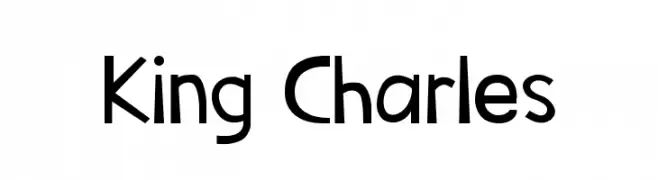
A modern, playful font with geometric and organic elements.
![King Charles font caratteri gratis]() Scaricare 965 Downloads@WebFont
Scaricare 965 Downloads@WebFont -
( Fonts by www.gliphmaker.com. Personal-use only. For commercial use please contact owner. )
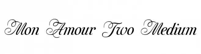
An elegant script and serif blend with ornate uppercase and refined lowercase.
![Mon Amour Two Medium font caratteri gratis]() Scaricare 965 Downloads@WebFont
Scaricare 965 Downloads@WebFont -
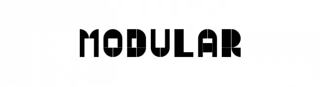
( Fonts by antoniorodriguesjr.com )
A bold, geometric font with a modular, futuristic design.
![Modular font caratteri gratis]() Scaricare 965 Downloads@WebFont
Scaricare 965 Downloads@WebFont -
( mistifonts.com/ )
A playful, rounded, handwritten-style font with smooth curves.
![Are You Freakin' Serious font caratteri gratis]() Scaricare 965 Downloads@WebFont
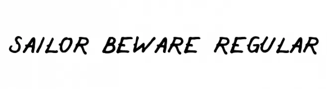
Scaricare 965 Downloads@WebFont -
![Sailor Beware Regular font caratteri gratis]() Scaricare 965 Downloads@WebFont
Scaricare 965 Downloads@WebFont -
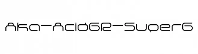
( Fonts by www.aka-acid.com )
A futuristic and geometric font with a sleek, modern design.
![Aka-AcidGR-SuperG font caratteri gratis]() Scaricare 965 Downloads@WebFont
Scaricare 965 Downloads@WebFont -
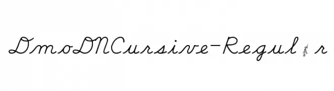
( Demo font. To purchase the full version, you can order it online at www.schoolhousefonts.com )
A graceful cursive font with smooth, flowing lines and elegant curves.
![DmoDNCursive-Regular font caratteri gratis]() Scaricare 965 Downloads@WebFont
Scaricare 965 Downloads@WebFont -
![Procyon font caratteri gratis]() Scaricare 965 Downloads@WebFont
Scaricare 965 Downloads@WebFont


Quali sono i font più popolari adesso?
Poppins, Roboto, Montserrat, Open Sans e Lato sono molto usati per le forme pulite e l'ampia applicabilità — dall'identità di marca alle landing page e ai poster.
Quali font si usano spesso nei loghi?
Le sans serif geometriche (es. Poppins, famiglie in stile Gotham) sono scelte comuni per un branding pulito e scalabile. Per un tocco personale restano valide script e stili manoscritti. Abbina un display deciso per i titoli a un corpo testo neutro per riconoscibilità ed equilibrio.
Ogni quanto si aggiorna la lista?
Con regolarità, in base ai download e all'attività reale. Torna spesso per scoprire in anticipo le nuove preferite.
💡 Consiglio: aggiungi ai preferiti — le tendenze cambiano in fretta e i font top di oggi possono ispirare il rebranding di domani.