Benvenuto nelle Font Più Popolari — dove popolarità e qualità si incontrano. Qui trovi i font più scaricati e usati dell'anno. Se cerchi scelte sicure per logo, web o social, inizia da qui.
Ogni font top si distingue per equilibrio, leggibilità e versatilità. Troverai sans serif moderne, script eleganti, serif vintage e display minimalisti.
-
( Fonts by www.fontalicious.com )
A bold, geometric font with a playful and modern aesthetic.
 Scaricare 957 Downloads@WebFont
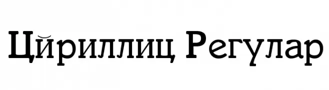
 -
![Cyrillic Regular font caratteri gratis]() Scaricare 957 Downloads@WebFont
Scaricare 957 Downloads@WebFont -
( Fonts by www.lifewithouttaffy.com )
A playful, cactus-inspired font with bold, rounded letters and decorative spikes.
![Cactus Love font caratteri gratis]() Scaricare 957 Downloads@WebFont
Scaricare 957 Downloads@WebFont -
( Fonts by Donald E. Knuth - Personal-use only. For commercial use please contact owner. )
A clean, modern sans-serif font with medium weight and balanced proportions.
![CMU Sans Serif Medium font caratteri gratis]() Scaricare 956 Downloads@WebFont
Scaricare 956 Downloads@WebFont -
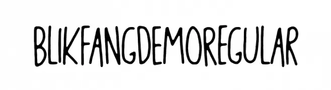
( bogstav - www.bogstav.com )
A playful, handwritten font with tall, narrow letters and smooth, rounded strokes.
![Blikfang DEMO Regular font caratteri gratis]() Scaricare 956 Downloads@WebFont
Scaricare 956 Downloads@WebFont -
-
( Fonts by Jonathan S. Harris - www.tattoowoo.com. Personal-use only. For commercial use please contact owner. )
A bold, brush-style font with dynamic, hand-painted strokes.
![Last Feast font caratteri gratis]() Scaricare 956 Downloads@WebFont
Scaricare 956 Downloads@WebFont -
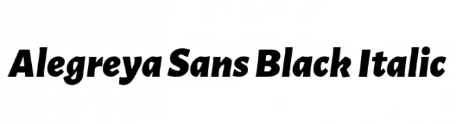
( Copyright 2013 The Alegreya Sans Project Authors (https://github.com/huertatipografica/Alegreya-Sans) )
A bold, italicized sans-serif font with a modern and authoritative style.
![Alegreya Sans Black Italic font caratteri gratis]() Scaricare 956 Downloads@WebFont
Scaricare 956 Downloads@WebFont -
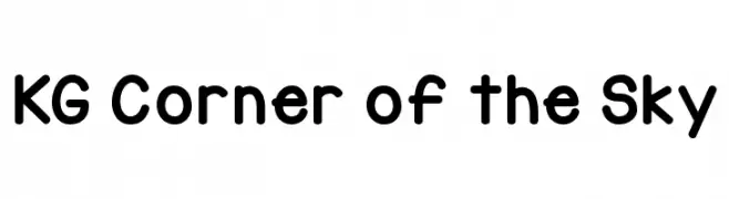
( Fonts by www.kimberlygeswein.com - Kimberly Geswein )
A playful, rounded font with smooth curves and uniform stroke width.
![KG Corner of the Sky font caratteri gratis]() Scaricare 956 Downloads@WebFont
Scaricare 956 Downloads@WebFont -
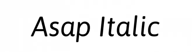
( Copyright 2016 The Asap Project Authors (omnibus.type@gmail.com) )
A modern, italic sans-serif font with clean lines and balanced proportions.
![Asap Italic font caratteri gratis]() Scaricare 956 Downloads@WebFont
Scaricare 956 Downloads@WebFont -
![ElementalEnd Italic font caratteri gratis]() Scaricare 956 Downloads@WebFont
Scaricare 956 Downloads@WebFont -
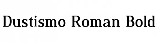
( Fonts by Dustin Norlander - www.cheapskatefonts.com )
A bold, classic serif font with strong, elegant strokes.
![Dustismo Roman Bold font caratteri gratis]() Scaricare 956 Downloads@WebFont
Scaricare 956 Downloads@WebFont -
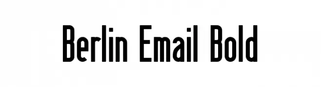
( Fonts by www.peter-wiegel.de. Personal-use only. For commercial use please contact owner. )
A bold, geometric sans-serif font with tall, narrow letterforms.
![Berlin Email Bold font caratteri gratis]() Scaricare 956 Downloads@WebFont
Scaricare 956 Downloads@WebFont -
![Almanaque Outline Italic font caratteri gratis]() Scaricare 956 Downloads@WebFont
Scaricare 956 Downloads@WebFont -
![HandPrinting font caratteri gratis]() Scaricare 956 Downloads@WebFont
Scaricare 956 Downloads@WebFont -
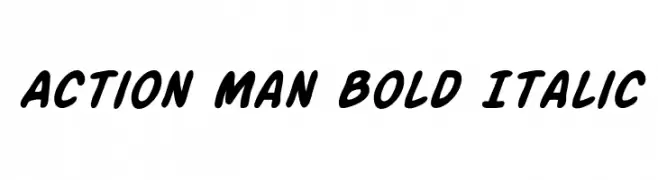
( Fonts by Daniel Zadorozny - www.iconian.com - Free for personal use )
A bold, italicized font with a playful and dynamic style.
![Action Man Bold Italic font caratteri gratis]() Scaricare 956 Downloads@WebFont
Scaricare 956 Downloads@WebFont -
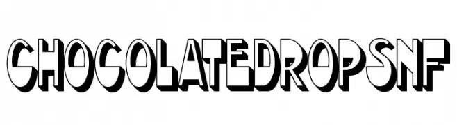
( Fonts by Nick Curtis - www.nicksfonts.com )
A bold, playful font with a 3D shadow effect, perfect for dynamic and fun designs.
![ChocolateDropsNF font caratteri gratis]() Scaricare 956 Downloads@WebFont
Scaricare 956 Downloads@WebFont -
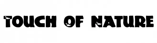
( Fonts by uatype.faithweb.com - UnAuthorized Type )
A bold, nature-inspired font with a playful and organic design.
![Touch Of Nature font caratteri gratis]() Scaricare 956 Downloads@WebFont
Scaricare 956 Downloads@WebFont -
( Fonts by Darrell Flood )
A playful, bubbly font with rounded, thick strokes and a friendly appearance.
![Lovely Bubbles font caratteri gratis]() Scaricare 955 Downloads@WebFont
Scaricare 955 Downloads@WebFont -
( Fonts by Inermedia Studio )
A playful, bold font with rounded edges and a hand-drawn look.
![Sweet Home font caratteri gratis]() Scaricare 955 Downloads@WebFont
Scaricare 955 Downloads@WebFont -
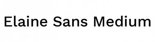
( Fonts by Wei Huang - Personal-use only. For commercial use please contact owner. )
A modern, clean sans-serif typeface with consistent stroke width and balanced spacing.
![Elaine Sans Medium font caratteri gratis]() Scaricare 955 Downloads@WebFont
Scaricare 955 Downloads@WebFont -
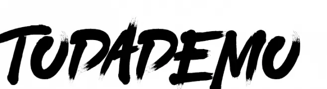
![TODA DEMO font caratteri gratis]() Scaricare 955 Downloads@WebFont
Scaricare 955 Downloads@WebFont -
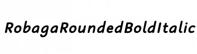
( Fonts by Situjuh Nazara - 7ntypes.com - Personal-use only. For commercial use please contact owner. )
A rounded, bold, italic font with smooth curves and a friendly appearance.
![Robaga Rounded Bold Italic font caratteri gratis]() Scaricare 955 Downloads@WebFont
Scaricare 955 Downloads@WebFont -
( Fonts by Docallisme HAS )
A bold, playful font with a hand-drawn, dynamic style.
![GloryUnited font caratteri gratis]() Scaricare 955 Downloads@WebFont
Scaricare 955 Downloads@WebFont -
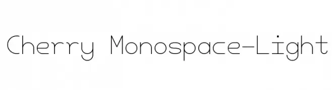
( Fonts by Amin Abedi )
A clean, monospaced font with a light and minimalistic design.
![Cherry Monospace-Light font caratteri gratis]() Scaricare 955 Downloads@WebFont
Scaricare 955 Downloads@WebFont -
( Fonts by Castcraft Software - OPTI Fonts Archive - opti.netii.net - Personal-use only. For commercial use please contact owner. )
A bold, high-contrast serif font with dramatic and elegant features.
![OPTIOcelot font caratteri gratis]() Scaricare 955 Downloads@WebFont
Scaricare 955 Downloads@WebFont -
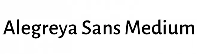
( Copyright 2013 The Alegreya Sans Project Authors (https://github.com/huertatipografica/Alegreya-Sans) )
A modern sans-serif font with medium weight and rounded characters.
![Alegreya Sans Medium font caratteri gratis]() Scaricare 955 Downloads@WebFont
Scaricare 955 Downloads@WebFont -
![Timeline Regular font caratteri gratis]() Scaricare 955 Downloads@WebFont
Scaricare 955 Downloads@WebFont -
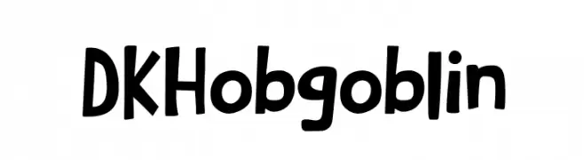
![DKHobgoblin font caratteri gratis]() Scaricare 955 Downloads@WebFont
Scaricare 955 Downloads@WebFont -
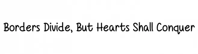
![Borders Divide, But Hearts Shall Conquer font caratteri gratis]() Scaricare 955 Downloads@WebFont
Scaricare 955 Downloads@WebFont -
( Fonts by Alex Tomlinson - Skyhaven Fonts - shfonts.com )
A playful, hand-drawn style with elongated, irregular letterforms.
![HillsideVista-Regular font caratteri gratis]() Scaricare 955 Downloads@WebFont
Scaricare 955 Downloads@WebFont -
( Copyright (c) 2011 by Sorkin Type Co (www.sorkintype.com) )
A bold slab serif font with strong, block-like serifs and excellent readability.
![Wellfleet font caratteri gratis]() Scaricare 955 Downloads@WebFont
Scaricare 955 Downloads@WebFont -
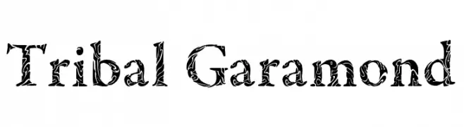
![Tribal Garamond font caratteri gratis]() Scaricare 955 Downloads@WebFont
Scaricare 955 Downloads@WebFont -
( Fonts by www.blambot.com )
A bold, handwritten font with a playful and dynamic style.
![SmackAttackBB-Bold font caratteri gratis]() Scaricare 955 Downloads@WebFont
Scaricare 955 Downloads@WebFont -
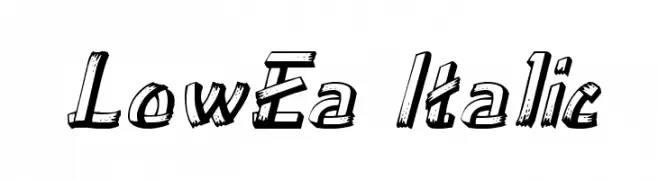
( Fonts by David Rakowski )
A bold, italic, hand-drawn font with dynamic strokes and a playful style.
![LowEa Italic font caratteri gratis]() Scaricare 955 Downloads@WebFont
Scaricare 955 Downloads@WebFont -
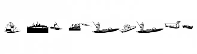
( Fonts by Manfred Klein. Free for private and charity use. Free for commercial with donation to organizations )
Illustrative maritime-themed display font with boat and ship drawings.
![I Am Sailing font caratteri gratis]() Scaricare 955 Downloads@WebFont
Scaricare 955 Downloads@WebFont


Quali sono i font più popolari adesso?
Poppins, Roboto, Montserrat, Open Sans e Lato sono molto usati per le forme pulite e l'ampia applicabilità — dall'identità di marca alle landing page e ai poster.
Quali font si usano spesso nei loghi?
Le sans serif geometriche (es. Poppins, famiglie in stile Gotham) sono scelte comuni per un branding pulito e scalabile. Per un tocco personale restano valide script e stili manoscritti. Abbina un display deciso per i titoli a un corpo testo neutro per riconoscibilità ed equilibrio.
Ogni quanto si aggiorna la lista?
Con regolarità, in base ai download e all'attività reale. Torna spesso per scoprire in anticipo le nuove preferite.
💡 Consiglio: aggiungi ai preferiti — le tendenze cambiano in fretta e i font top di oggi possono ispirare il rebranding di domani.