Benvenuto nelle Font Più Popolari — dove popolarità e qualità si incontrano. Qui trovi i font più scaricati e usati dell'anno. Se cerchi scelte sicure per logo, web o social, inizia da qui.
Ogni font top si distingue per equilibrio, leggibilità e versatilità. Troverai sans serif moderne, script eleganti, serif vintage e display minimalisti.
-
( Fonts by Fernando PJ )
A bold, playful font with rounded strokes and a dynamic slant.
 Scaricare 948 Downloads@WebFont
 -
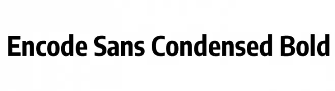
( Copyright 2012 The Encode Project Authors (impallari@gmail.com), with Reserved Font Name "Encode Sansâ€. )
A bold, condensed sans-serif font with a modern and clean design.
![Encode Sans Condensed Bold font caratteri gratis]() Scaricare 948 Downloads@WebFont
Scaricare 948 Downloads@WebFont -
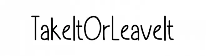
( Free for personal use - https://www.behance.net/refineedge )
A playful, whimsical font with tall, narrow letters and rounded edges.
![TakeItOrLeaveIt font caratteri gratis]() Scaricare 948 Downloads@WebFont
Scaricare 948 Downloads@WebFont -
![JD Carnival Black font caratteri gratis]() Scaricare 948 Downloads@WebFont
Scaricare 948 Downloads@WebFont -
![Hand Printing Press Meshed_demo font caratteri gratis]() Scaricare 948 Downloads@WebFont
Scaricare 948 Downloads@WebFont -
-
( Fonts by Daniel Zadorozny - www.iconian.com )
A bold, italicized font with an expanded width and modern, angular design.
![Soldier Expanded Italic font caratteri gratis]() Scaricare 948 Downloads@WebFont
Scaricare 948 Downloads@WebFont -
( Fonts by Fizzetica DepokAsiana TypeFoundry - fizzeticatypefoundry.tumblr.com )
A decorative font with leaf and vine embellishments, offering a whimsical, organic style.
![FTF Leafy Lopstonesia font caratteri gratis]() Scaricare 948 Downloads@WebFont
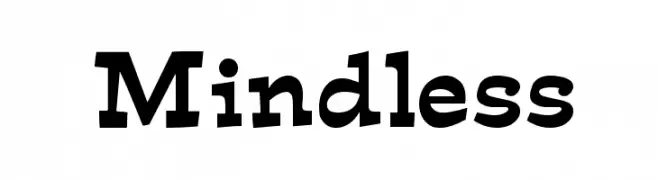
Scaricare 948 Downloads@WebFont -
![Mindless font caratteri gratis]() Scaricare 948 Downloads
Scaricare 948 Downloads -
( Fonts by Ward Zwart - wardzwart.blogspot.com - free for personal use only! )
A bold, distressed font with a textured, vintage appearance.
![Canard font caratteri gratis]() Scaricare 948 Downloads@WebFont
Scaricare 948 Downloads@WebFont -
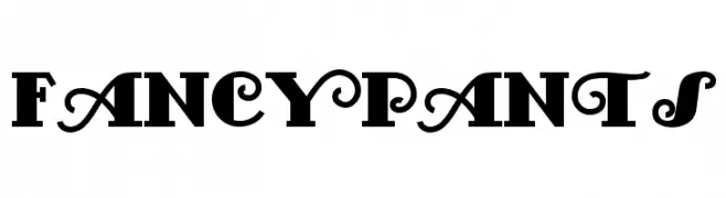
( Fonts by Nick Curtis - www.nicksfonts.com )
A bold, decorative font with ornate swirls and high contrast.
![FancyPants font caratteri gratis]() Scaricare 948 Downloads@WebFont
Scaricare 948 Downloads@WebFont -
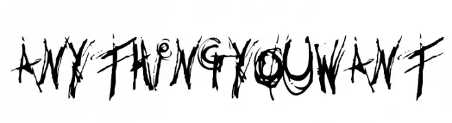
( Fonts by or from www.graffitifonts.net )
A chaotic, distressed font with jagged, uneven strokes for a grunge aesthetic.
![Anythingyouwant font caratteri gratis]() Scaricare 948 Downloads@WebFont
Scaricare 948 Downloads@WebFont -
( Fonts by Mr.Soon Design )
A playful, bold font with a rounded, hand-drawn style.
![Twin Bee font caratteri gratis]() Scaricare 947 Downloads@WebFont
Scaricare 947 Downloads@WebFont -
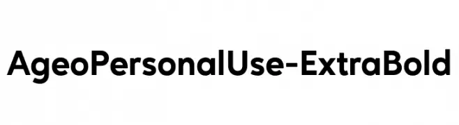
( Fonts by Eko Bimantara - Personal-use only. For commercial use please contact owner. )
A bold, modern sans-serif font with a geometric structure.
![AgeoPersonalUse-ExtraBold font caratteri gratis]() Scaricare 947 Downloads@WebFont
Scaricare 947 Downloads@WebFont -
( Fonts by Syaf Rizal - www.creativefabrica.com/ref/53/ - Personal-use only. For commercial use please contact owner. )
A bold, handwritten-style font with expressive, dynamic curves.
![Sugiono font caratteri gratis]() Scaricare 947 Downloads@WebFont
Scaricare 947 Downloads@WebFont -
![Angelic Child font caratteri gratis]() Scaricare 947 Downloads@WebFont
Scaricare 947 Downloads@WebFont -
( Michael D. Adams - www.triskele.com/roadgeek-fonts/ )
A modern, geometric sans-serif font with clean lines and excellent legibility.
![Roadgeek 2000 Series F font caratteri gratis]() Scaricare 947 Downloads@WebFont
Scaricare 947 Downloads@WebFont -
( motitta - motitta corp - www.nubedetrapo.com )
A playful, handwritten font with rounded edges and a casual style.
![littera font caratteri gratis]() Scaricare 947 Downloads@WebFont
Scaricare 947 Downloads@WebFont -
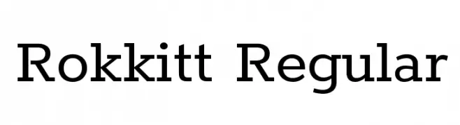
( Copyright 2016 The Rokkit Project Authors (contact@sansoxygen.com) )
A robust slab serif typeface with balanced spacing and clear readability.
![Rokkitt Regular font caratteri gratis]() Scaricare 947 Downloads@WebFont
Scaricare 947 Downloads@WebFont -
( Fonts by www.woodcutter.es - woodcutter Manero - Personal-use only. For commercial use please contact owner. )
Bold, playful summer-themed icon set with solid silhouettes.
![Summer Icons font caratteri gratis]() Scaricare 947 Downloads@WebFont
Scaricare 947 Downloads@WebFont -
( Fonts by CloutierFontes )
A modern, rounded sans-serif font with a friendly and approachable style.
![CF Second Son PERSONAL Regular font caratteri gratis]() Scaricare 947 Downloads@WebFont
Scaricare 947 Downloads@WebFont -
![Chams font caratteri gratis]() Scaricare 947 Downloads@WebFont
Scaricare 947 Downloads@WebFont -
( Fonts by Misti's Fonts )
A playful, handwritten cursive font with a whimsical and friendly style.
![Mf I Love Glitter font caratteri gratis]() Scaricare 947 Downloads@WebFont
Scaricare 947 Downloads@WebFont -
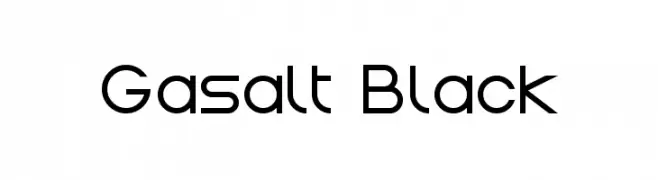
( Fonts by Remi Lagast. Personal-use only. For commercial use please contact owner. )
A modern, geometric font with clean lines and balanced characters.
![Gasalt Black font caratteri gratis]() Scaricare 947 Downloads@WebFont
Scaricare 947 Downloads@WebFont -
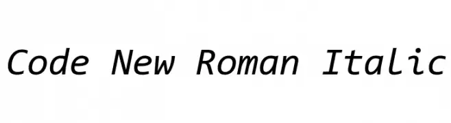
( Fonts by Sam Radian )
A modern, italicized font with clean lines and excellent legibility.
![Code New Roman Italic font caratteri gratis]() Scaricare 947 Downloads@WebFont
Scaricare 947 Downloads@WebFont -
( Fonts by Castcraft Software - opti.netii.net - check the website before use )
A bold, serif font with strong vertical emphasis and sharp serifs.
![OPTICorvinus-Bold font caratteri gratis]() Scaricare 947 Downloads@WebFont
Scaricare 947 Downloads@WebFont -
( Fonts by Castcraft Software - opti.netii.net - check the website before use )
A bold, geometric typeface with strong, uniform strokes and a modern aesthetic.
![OPTIBernhardGothic-XHeavy font caratteri gratis]() Scaricare 947 Downloads@WebFont
Scaricare 947 Downloads@WebFont -
( Fonts by www.kimberlygeswein.com - Kimberly Geswein )
A playful, elongated font with rounded edges and uniform stroke width.
![KG How Many Times font caratteri gratis]() Scaricare 947 Downloads@WebFont
Scaricare 947 Downloads@WebFont -
![Anthro font caratteri gratis]() Scaricare 947 Downloads@WebFont
Scaricare 947 Downloads@WebFont -
![Ghost Theory 2 font caratteri gratis]() Scaricare 947 Downloads@WebFont
Scaricare 947 Downloads@WebFont -
![Complete Plain font caratteri gratis]() Scaricare 947 Downloads@WebFont
Scaricare 947 Downloads@WebFont -
![Almost Sanskrit taj font caratteri gratis]() Scaricare 947 Downloads@WebFont
Scaricare 947 Downloads@WebFont -
![Union Agrochem Charkrapetch font caratteri gratis]() Scaricare 947 Downloads@WebFont
Scaricare 947 Downloads@WebFont -
( Fonts by Graham Meade - GemFonts )
A dramatic, edgy font with sharp serifs and a distressed, dripping appearance.
![Buffied font caratteri gratis]() Scaricare 947 Downloads@WebFont
Scaricare 947 Downloads@WebFont -
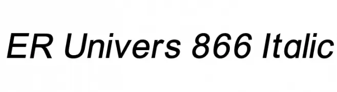
![ER Univers 866 Italic font caratteri gratis]() Scaricare 947 Downloads@WebFont
Scaricare 947 Downloads@WebFont -
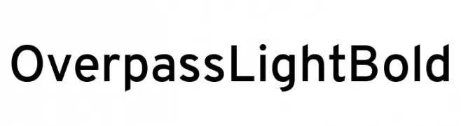
( Fonts by Red Hat )
A modern, geometric sans-serif font with uniform strokes and clear characters.
![Overpass Light Bold font caratteri gratis]() Scaricare 946 Downloads@WebFont
Scaricare 946 Downloads@WebFont


Quali sono i font più popolari adesso?
Poppins, Roboto, Montserrat, Open Sans e Lato sono molto usati per le forme pulite e l'ampia applicabilità — dall'identità di marca alle landing page e ai poster.
Quali font si usano spesso nei loghi?
Le sans serif geometriche (es. Poppins, famiglie in stile Gotham) sono scelte comuni per un branding pulito e scalabile. Per un tocco personale restano valide script e stili manoscritti. Abbina un display deciso per i titoli a un corpo testo neutro per riconoscibilità ed equilibrio.
Ogni quanto si aggiorna la lista?
Con regolarità, in base ai download e all'attività reale. Torna spesso per scoprire in anticipo le nuove preferite.
💡 Consiglio: aggiungi ai preferiti — le tendenze cambiano in fretta e i font top di oggi possono ispirare il rebranding di domani.