Benvenuto nelle Font Più Popolari — dove popolarità e qualità si incontrano. Qui trovi i font più scaricati e usati dell'anno. Se cerchi scelte sicure per logo, web o social, inizia da qui.
Ogni font top si distingue per equilibrio, leggibilità e versatilità. Troverai sans serif moderne, script eleganti, serif vintage e display minimalisti.
-
( Fonts by www.kimberlygeswein.com - Kimberly Geswein )
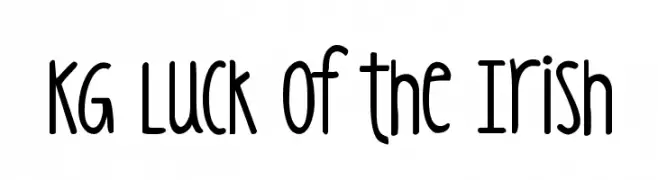
A playful, hand-drawn font with tall, narrow letters and rounded edges.
 Scaricare 942 Downloads@WebFont
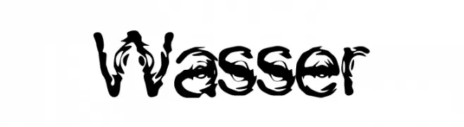
 -
![Wasser font caratteri gratis]() Scaricare 942 Downloads@WebFont
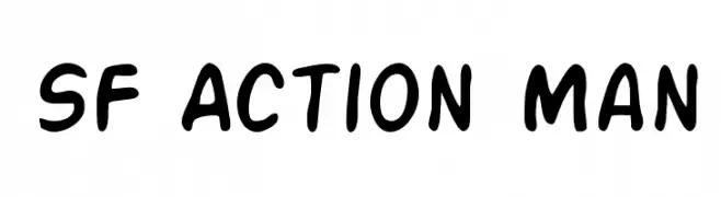
Scaricare 942 Downloads@WebFont -
![SF Action Man font caratteri gratis]() Scaricare 942 Downloads@WebFont
Scaricare 942 Downloads@WebFont -
( Fonts by Have Fun with Fonts )
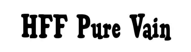
A bold, decorative font with rounded characters and a playful style.
![HFF Pure Vain font caratteri gratis]() Scaricare 942 Downloads@WebFont
Scaricare 942 Downloads@WebFont -
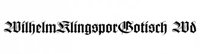
![WilhelmKlingsporGotisch Wd font caratteri gratis]() Scaricare 942 Downloads@WebFont
Scaricare 942 Downloads@WebFont -
-
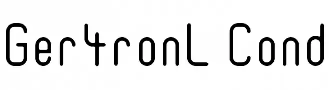
![Ger4ronL Cond font caratteri gratis]() Scaricare 942 Downloads@WebFont
Scaricare 942 Downloads@WebFont -
( Fonts by Manfred Klein - manfred-klein.ina-mar.com )
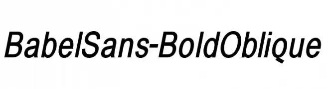
A bold, oblique sans-serif font with a modern and dynamic style.
![BabelSans-BoldOblique font caratteri gratis]() Scaricare 942 Downloads@WebFont
Scaricare 942 Downloads@WebFont -
![Bionic Comic font caratteri gratis]() Scaricare 942 Downloads
Scaricare 942 Downloads -
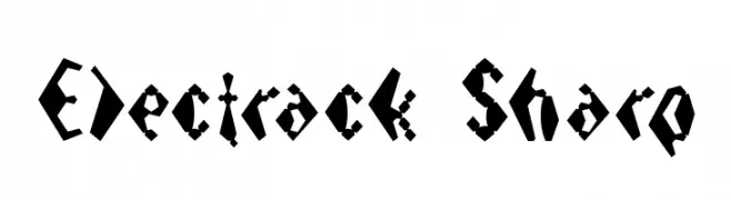
![Electrack Sharp font caratteri gratis]() Scaricare 942 Downloads@WebFont
Scaricare 942 Downloads@WebFont -
![04b_09 font caratteri gratis]() Scaricare 942 Downloads@WebFont
Scaricare 942 Downloads@WebFont -
![2TheLeft Dingbats font caratteri gratis]() Scaricare 942 Downloads@WebFont
Scaricare 942 Downloads@WebFont -
( Fonts by Dibujado )
A playful, bold font with rounded edges and a bubbly appearance.
![Unocide font caratteri gratis]() Scaricare 942 Downloads@WebFont
Scaricare 942 Downloads@WebFont -
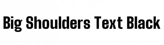
( Copyright 2019 The Big Shoulders Project Authors (https://github.com/xotypeco/big_shoulders) )
A bold, geometric typeface with a strong, modern presence.
![Big Shoulders Text Black font caratteri gratis]() Scaricare 941 Downloads@WebFont
Scaricare 941 Downloads@WebFont -
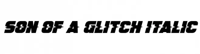
![Son Of A Glitch Italic font caratteri gratis]() Scaricare 941 Downloads@WebFont
Scaricare 941 Downloads@WebFont -
( Fonts by Graphicfresh )
A playful handwritten font with tall, narrow letters and a casual style.
![Our Hand font caratteri gratis]() Scaricare 941 Downloads@WebFont
Scaricare 941 Downloads@WebFont -
( Fonts by arwah12 - Personal-use only. For commercial use please contact owner. )
An elegant script font with decorative loops and swashes.
![Hatachi font caratteri gratis]() Scaricare 941 Downloads@WebFont
Scaricare 941 Downloads@WebFont -
( Copyright (c) 2007-2008, The C&MA Guinea Fulbe Team; )
A clean, modern sans-serif font with excellent readability.
![Harmattan Regular font caratteri gratis]() Scaricare 941 Downloads@WebFont
Scaricare 941 Downloads@WebFont -
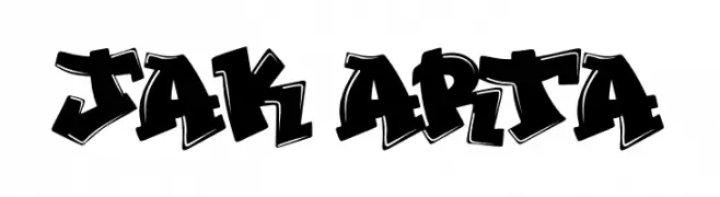
( Fonts by Docallisme HAS )
A bold, graffiti-style font with a dynamic, urban aesthetic.
![JAK ARTA font caratteri gratis]() Scaricare 941 Downloads@WebFont
Scaricare 941 Downloads@WebFont -
( Fonts by Jovanny Lemonad - typetype.ru - Personal-use only. For commercial use please contact owner. )
A modern, geometric typeface with clean lines and uniform structure.
![Accuratist font caratteri gratis]() Scaricare 941 Downloads@WebFont
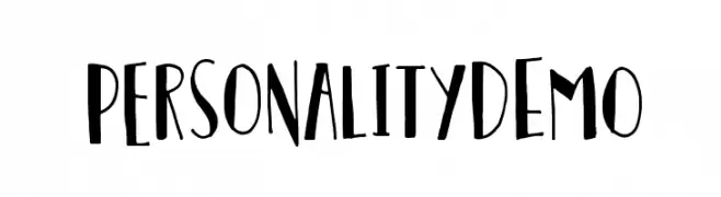
Scaricare 941 Downloads@WebFont -
![PersonalityDEMO font caratteri gratis]() Scaricare 941 Downloads@WebFont
Scaricare 941 Downloads@WebFont -
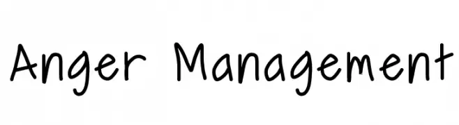
( Fonts by Geronimo Fonts - Personal-use only. For commercial use please contact owner. )
A playful, informal handwritten font with rounded edges and consistent strokes.
![Anger Management font caratteri gratis]() Scaricare 941 Downloads@WebFont
Scaricare 941 Downloads@WebFont -
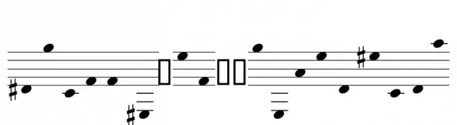
( Fonts by www.hindson.com.au )
A clear, educational music notation font with bold noteheads and simplified symbols.
![StaffClefPitchesEasy font caratteri gratis]() Scaricare 941 Downloads@WebFont
Scaricare 941 Downloads@WebFont -
![JD Talk Regular font caratteri gratis]() Scaricare 941 Downloads@WebFont
Scaricare 941 Downloads@WebFont -
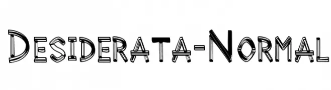
![Desiderata-Normal font caratteri gratis]() Scaricare 941 Downloads@WebFont
Scaricare 941 Downloads@WebFont -
( Fonts by www.gust.org.pl )
A modern, sans-serif typeface with clean lines and balanced proportions.
![LMSans9-Regular font caratteri gratis]() Scaricare 941 Downloads@WebFont
Scaricare 941 Downloads@WebFont -
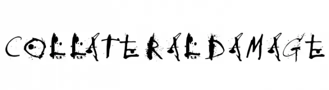
![CollateralDamage font caratteri gratis]() Scaricare 941 Downloads@WebFont
Scaricare 941 Downloads@WebFont -
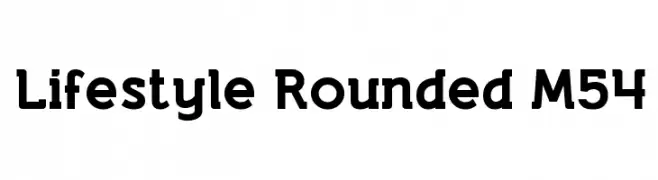
( Fonts by Mohammed Rahman )
A rounded, bold font with a modern and approachable style.
![Lifestyle Rounded M54 font caratteri gratis]() Scaricare 941 Downloads@WebFont
Scaricare 941 Downloads@WebFont -
( Fonts by Gyom Seguin - last-soundtrack.daportfolio.com )
A modern, geometric font with clean lines and a minimalist style.
![THE MAPLE ORIGINS font caratteri gratis]() Scaricare 941 Downloads@WebFont
Scaricare 941 Downloads@WebFont -
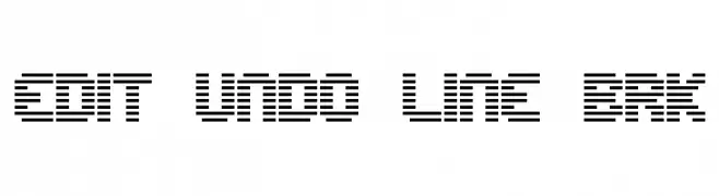
( Fonts by www.aenigmafonts.com )
A modern, segmented line font with a digital, futuristic style.
![Edit Undo Line BRK font caratteri gratis]() Scaricare 941 Downloads@WebFont
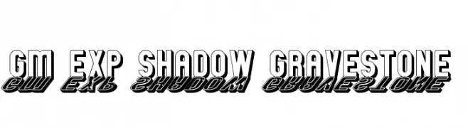
Scaricare 941 Downloads@WebFont -
![GM Exp Shadow Gravestone font caratteri gratis]() Scaricare 941 Downloads@WebFont
Scaricare 941 Downloads@WebFont -
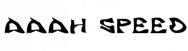
( Fonts by RudynFluffy )
A dynamic, angular font with a sense of speed and movement.
![Aaah Speed font caratteri gratis]() Scaricare 941 Downloads@WebFont
Scaricare 941 Downloads@WebFont -
( Fonts by Bree Gorton )
A decorative serif font with floral patterns in uppercase letters.
![FLOWER GARDEN font caratteri gratis]() Scaricare 941 Downloads@WebFont
Scaricare 941 Downloads@WebFont -
( Fonts by Mr Fisk - Mike Larsson - fontorama.net )
A distressed, melting-style font with jagged outlines and intense visual impact.
![Angry bitch font caratteri gratis]() Scaricare 941 Downloads@WebFont
Scaricare 941 Downloads@WebFont -
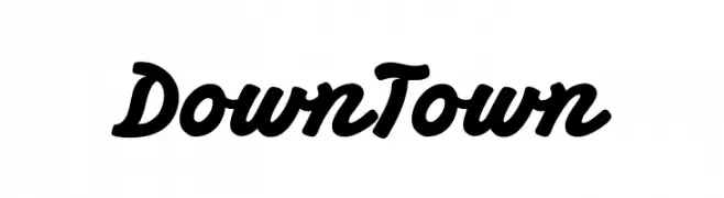
( Fonts by BLKBK Fonts - www.blkbk.shop - Personal-use only. For commercial use please contact owner. Commerciali Caratteri )
A bold, cursive font with smooth, flowing lines and connected characters.
![Down Town font caratteri gratis]() Scaricare 940 Downloads
Scaricare 940 Downloads -
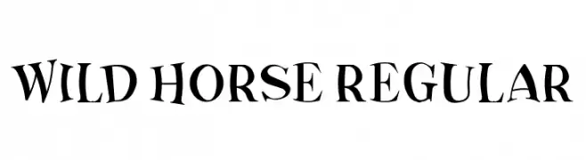
( Fonts by Vladimir Nikolic )
A dynamic and playful font with varying stroke widths and a whimsical style.
![Wild Horse Regular font caratteri gratis]() Scaricare 940 Downloads@WebFont
Scaricare 940 Downloads@WebFont


Quali sono i font più popolari adesso?
Poppins, Roboto, Montserrat, Open Sans e Lato sono molto usati per le forme pulite e l'ampia applicabilità — dall'identità di marca alle landing page e ai poster.
Quali font si usano spesso nei loghi?
Le sans serif geometriche (es. Poppins, famiglie in stile Gotham) sono scelte comuni per un branding pulito e scalabile. Per un tocco personale restano valide script e stili manoscritti. Abbina un display deciso per i titoli a un corpo testo neutro per riconoscibilità ed equilibrio.
Ogni quanto si aggiorna la lista?
Con regolarità, in base ai download e all'attività reale. Torna spesso per scoprire in anticipo le nuove preferite.
💡 Consiglio: aggiungi ai preferiti — le tendenze cambiano in fretta e i font top di oggi possono ispirare il rebranding di domani.