Benvenuto nelle Font Più Popolari — dove popolarità e qualità si incontrano. Qui trovi i font più scaricati e usati dell'anno. Se cerchi scelte sicure per logo, web o social, inizia da qui.
Ogni font top si distingue per equilibrio, leggibilità e versatilità. Troverai sans serif moderne, script eleganti, serif vintage e display minimalisti.
-
( Fonts by Billy Argel )
A bold, textured font with a vintage, distressed style.
 Scaricare 233 Downloads@WebFont
 -
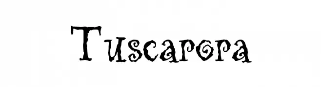
( Fonts by The Scriptorium - Dave Nalle )
A whimsical, decorative font with artistic swirls and embellishments.
![Tuscarora font caratteri gratis]() Scaricare 233 Downloads@WebFont
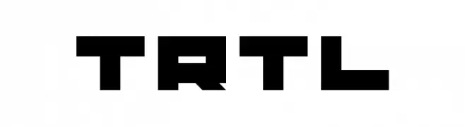
Scaricare 233 Downloads@WebFont -
![TRTL font caratteri gratis]() Scaricare 233 Downloads@WebFont
Scaricare 233 Downloads@WebFont -
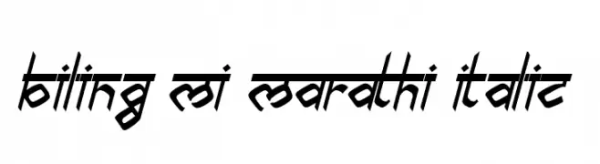
( Rajendra Bitling - www.rbitling.com )
A dynamic, angular italic font with interconnected strokes and a bold presence.
![biling mi marathi Italic font caratteri gratis]() Scaricare 233 Downloads@WebFont
Scaricare 233 Downloads@WebFont -
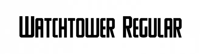
( Fonts by Daniel Zadorozny - www.iconian.com - Free for personal use )
A bold, geometric font with strong, angular lines and uniform stroke widths.
![Watchtower Regular font caratteri gratis]() Scaricare 233 Downloads@WebFont
Scaricare 233 Downloads@WebFont -
-
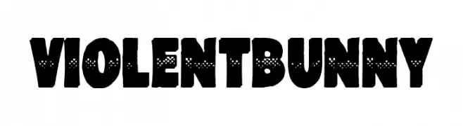
( Fonts by Woodcutter )
A bold, playful font with a textured, dotted design and a hand-drawn aesthetic.
![Violent Bunny font caratteri gratis]() Scaricare 233 Downloads@WebFont
Scaricare 233 Downloads@WebFont -
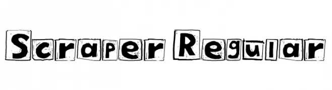
( Fonts by Tamasin Collins )
A bold, hand-drawn font with characters enclosed in rough squares, offering a playful and artistic style.
![Scraper Regular font caratteri gratis]() Scaricare 233 Downloads@WebFont
Scaricare 233 Downloads@WebFont -
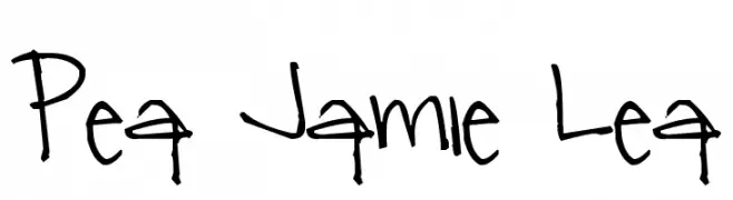
( Free for a personal use. For a commercial use please visit www.kevinandamanda.com )
A playful, handwritten font with bold, expressive strokes and a casual style.
![Pea Jamie Lea font caratteri gratis]() Scaricare 233 Downloads@WebFont
Scaricare 233 Downloads@WebFont -
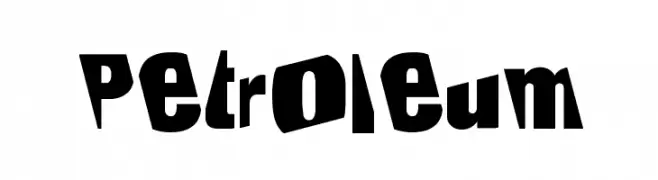
( Fonts by Jenna Mahaffy )
A bold, irregular, and playful font with dynamic character shapes.
![Petroleum font caratteri gratis]() Scaricare 233 Downloads@WebFont
Scaricare 233 Downloads@WebFont -
![Swerve Bold font caratteri gratis]() Scaricare 233 Downloads@WebFont
Scaricare 233 Downloads@WebFont
Quali sono i font più popolari adesso?
Poppins, Roboto, Montserrat, Open Sans e Lato sono molto usati per le forme pulite e l'ampia applicabilità — dall'identità di marca alle landing page e ai poster.
Quali font si usano spesso nei loghi?
Le sans serif geometriche (es. Poppins, famiglie in stile Gotham) sono scelte comuni per un branding pulito e scalabile. Per un tocco personale restano valide script e stili manoscritti. Abbina un display deciso per i titoli a un corpo testo neutro per riconoscibilità ed equilibrio.
Ogni quanto si aggiorna la lista?
Con regolarità, in base ai download e all'attività reale. Torna spesso per scoprire in anticipo le nuove preferite.
💡 Consiglio: aggiungi ai preferiti — le tendenze cambiano in fretta e i font top di oggi possono ispirare il rebranding di domani.