Benvenuto nelle Font Più Popolari — dove popolarità e qualità si incontrano. Qui trovi i font più scaricati e usati dell'anno. Se cerchi scelte sicure per logo, web o social, inizia da qui.
Ogni font top si distingue per equilibrio, leggibilità e versatilità. Troverai sans serif moderne, script eleganti, serif vintage e display minimalisti.
-
 Scaricare 233 Downloads@WebFont
 -
( Fonts by Mabhal Studio )
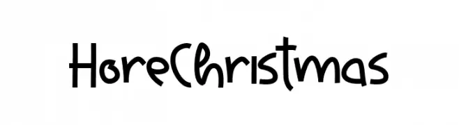
A playful, hand-drawn font with bold, whimsical characters.
![Hore Christmas font caratteri gratis]() Scaricare 233 Downloads@WebFont
Scaricare 233 Downloads@WebFont -
( Fonts by Balpirick Studio )
Playful handwritten font with a casual style.
![Creamy Bubble font caratteri gratis]() Scaricare 233 Downloads@WebFont
Scaricare 233 Downloads@WebFont -
( Fonts by Christopher Andy )
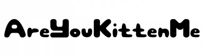
A playful, bold font with rounded, bubble-like characters.
![Are You Kitten Me font caratteri gratis]() Scaricare 233 Downloads@WebFont
Scaricare 233 Downloads@WebFont -
( Fonts by www.aenigmafonts.com )
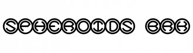
A bold, geometric font with characters enclosed in circles, offering a modern and decorative style.
![Spheroids BRK font caratteri gratis]() Scaricare 233 Downloads@WebFont
Scaricare 233 Downloads@WebFont -
-
( Fonts by Kat`s Fun Fonts - Personal-use only. For commercial use please contact owner. )
A decorative font featuring ornate astrological symbols within framed squares.
![KR Astro 1 font caratteri gratis]() Scaricare 233 Downloads@WebFont
Scaricare 233 Downloads@WebFont -
( Fonts by Khurasan™ )
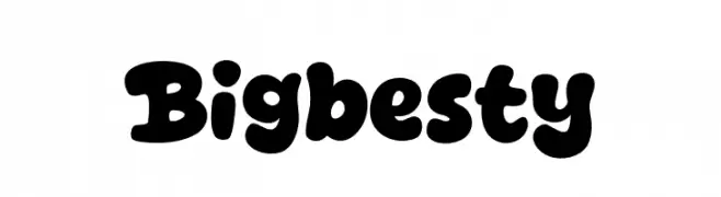
Bold and playful rounded font.
![Bigbesty font caratteri gratis]() Scaricare 233 Downloads@WebFont
Scaricare 233 Downloads@WebFont -
( Fonts by Przemyslaw Hoffer )
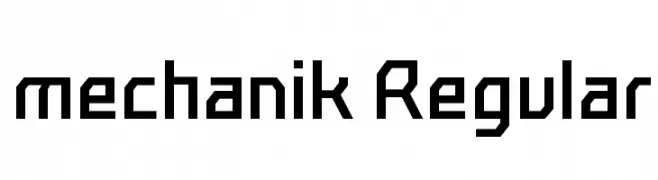
A geometric, angular font with a mechanical and industrial style.
![mechanik Regular font caratteri gratis]() Scaricare 233 Downloads@WebFont
Scaricare 233 Downloads@WebFont -
( Fonts by Daniel Zadorozny - www.iconian.com - Free for personal use )
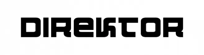
A bold, geometric font with a modern, futuristic style.
![Direktor font caratteri gratis]() Scaricare 233 Downloads@WebFont
Scaricare 233 Downloads@WebFont -
( Fonts by Good Java Studio - www.creativefabrica.com/designer/goodjavastudio/ref/236564 - Personal-use only. For commercial use please contact owner. )
A playful, handwritten font with smooth, flowing lines and rounded edges.
![Buttercake font caratteri gratis]() Scaricare 233 Downloads@WebFont
Scaricare 233 Downloads@WebFont


Quali sono i font più popolari adesso?
Poppins, Roboto, Montserrat, Open Sans e Lato sono molto usati per le forme pulite e l'ampia applicabilità — dall'identità di marca alle landing page e ai poster.
Quali font si usano spesso nei loghi?
Le sans serif geometriche (es. Poppins, famiglie in stile Gotham) sono scelte comuni per un branding pulito e scalabile. Per un tocco personale restano valide script e stili manoscritti. Abbina un display deciso per i titoli a un corpo testo neutro per riconoscibilità ed equilibrio.
Ogni quanto si aggiorna la lista?
Con regolarità, in base ai download e all'attività reale. Torna spesso per scoprire in anticipo le nuove preferite.
💡 Consiglio: aggiungi ai preferiti — le tendenze cambiano in fretta e i font top di oggi possono ispirare il rebranding di domani.