Benvenuto nelle Font Più Popolari — dove popolarità e qualità si incontrano. Qui trovi i font più scaricati e usati dell'anno. Se cerchi scelte sicure per logo, web o social, inizia da qui.
Ogni font top si distingue per equilibrio, leggibilità e versatilità. Troverai sans serif moderne, script eleganti, serif vintage e display minimalisti.
-
 Scaricare 232 Downloads@WebFont
 -
( Fonts by ingoFonts - Ingo Zimmermann - Personal-use only. For commercial use please contact owner. )
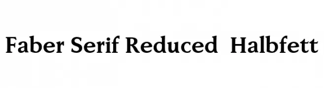
A classic serif font with strong, elegant characters and sharp serifs.
![Faber Serif Reduced 75 Halbfett font caratteri gratis]() Scaricare 232 Downloads@WebFont
Scaricare 232 Downloads@WebFont -
( Fonts by Daniel Zadorozny - www.iconian.com - Free for personal use )
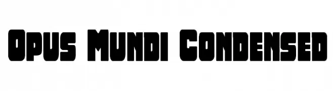
A bold, condensed font with rounded edges for a strong, modern look.
![Opus Mundi Condensed font caratteri gratis]() Scaricare 232 Downloads@WebFont
Scaricare 232 Downloads@WebFont -
( Fonts by imagex )
A playful, bold typeface with chunky, rounded characters and a whimsical style.
![Kid Games font caratteri gratis]() Scaricare 232 Downloads@WebFont
Scaricare 232 Downloads@WebFont -
( Fonts by AEnigma - www.aenigmafonts.com )
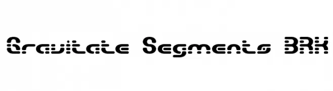
A bold, segmented font with a futuristic and digital aesthetic.
![Gravitate Segments BRK font caratteri gratis]() Scaricare 232 Downloads@WebFont
Scaricare 232 Downloads@WebFont -
-
( Fonts by Apostrophic Lab )
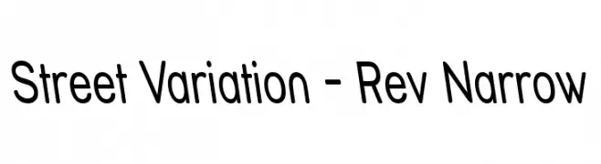
A modern, narrow sans-serif font with uniform stroke width and clear legibility.
![Street Variation - Rev Narrow font caratteri gratis]() Scaricare 232 Downloads@WebFont
Scaricare 232 Downloads@WebFont -
( Fonts by Syaf Rizal - Khurasan - Personal-use only. For commercial use please contact owner. )
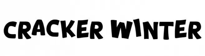
A bold, playful font with a whimsical, cartoon-like style.
![Cracker Winter font caratteri gratis]() Scaricare 232 Downloads@WebFont
Scaricare 232 Downloads@WebFont -
( Fonts by Levi Halmos )
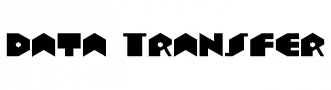
A bold, geometric font with a futuristic and modern design.
![Data Transfer font caratteri gratis]() Scaricare 232 Downloads@WebFont
Scaricare 232 Downloads@WebFont -
( Fonts by Google - Personal-use only. For commercial use please contact owner. )
A bold, italicized sans-serif font with a modern and dynamic style.
![Roberto Sans Bold Italic font caratteri gratis]() Scaricare 232 Downloads@WebFont
Scaricare 232 Downloads@WebFont -
( DJB Fonts - Darcy Baldwin - darcybaldwin.com )
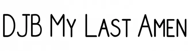
A clean, modern font with rounded edges and uniform stroke width.
![DJB My Last Amen font caratteri gratis]() Scaricare 232 Downloads@WebFont
Scaricare 232 Downloads@WebFont


Quali sono i font più popolari adesso?
Poppins, Roboto, Montserrat, Open Sans e Lato sono molto usati per le forme pulite e l'ampia applicabilità — dall'identità di marca alle landing page e ai poster.
Quali font si usano spesso nei loghi?
Le sans serif geometriche (es. Poppins, famiglie in stile Gotham) sono scelte comuni per un branding pulito e scalabile. Per un tocco personale restano valide script e stili manoscritti. Abbina un display deciso per i titoli a un corpo testo neutro per riconoscibilità ed equilibrio.
Ogni quanto si aggiorna la lista?
Con regolarità, in base ai download e all'attività reale. Torna spesso per scoprire in anticipo le nuove preferite.
💡 Consiglio: aggiungi ai preferiti — le tendenze cambiano in fretta e i font top di oggi possono ispirare il rebranding di domani.