Benvenuto nelle Font Più Popolari — dove popolarità e qualità si incontrano. Qui trovi i font più scaricati e usati dell'anno. Se cerchi scelte sicure per logo, web o social, inizia da qui.
Ogni font top si distingue per equilibrio, leggibilità e versatilità. Troverai sans serif moderne, script eleganti, serif vintage e display minimalisti.
-
( Fonts by Zanatlija - Personal-use only. For commercial use please contact owner. )
A modern, geometric font with bold lines and a futuristic style.
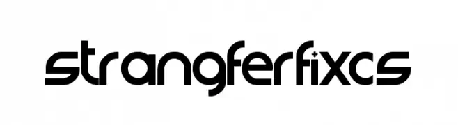 Scaricare 232 Downloads@WebFont
 -
( Fonts by Vigilante Typeface Corporation Larry Yerkes. Personal-use only. For commercial use please contact owner. )
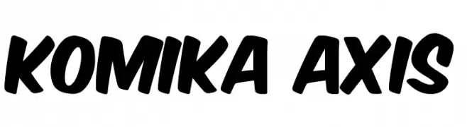
A bold, playful font with rounded, slanted letterforms.
![Komika Axis font caratteri gratis]() Scaricare 232 Downloads@WebFont
Scaricare 232 Downloads@WebFont -
( Fonts by Manfred Klein - manfred-klein.ina-mar.com )
A hand-drawn, jagged font with an organic and artistic style.
![AnAlphaBetIsm font caratteri gratis]() Scaricare 232 Downloads@WebFont
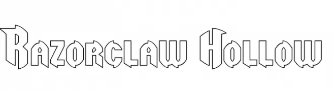
Scaricare 232 Downloads@WebFont -
![Razorclaw Hollow font caratteri gratis]() Scaricare 232 Downloads@WebFont
Scaricare 232 Downloads@WebFont -
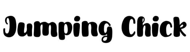
( Fonts by Khurasan )
A playful, bold font with rounded, bubbly characters and a hand-drawn feel.
![Jumping Chick font caratteri gratis]() Scaricare 232 Downloads@WebFont
Scaricare 232 Downloads@WebFont -
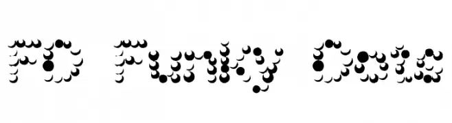
-
![FD Funky Dots font caratteri gratis]() Scaricare 232 Downloads@WebFont
Scaricare 232 Downloads@WebFont -
![F1rca font caratteri gratis]() Scaricare 232 Downloads@WebFont
Scaricare 232 Downloads@WebFont -
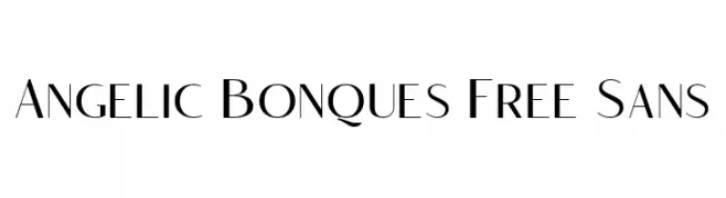
( Fonts by Craft Supply Co - Personal-use only. For commercial use please contact owner. )
A modern, elegant font with geometric shapes and consistent stroke width.
![Angelic Bonques Free Sans font caratteri gratis]() Scaricare 232 Downloads@WebFont
Scaricare 232 Downloads@WebFont -
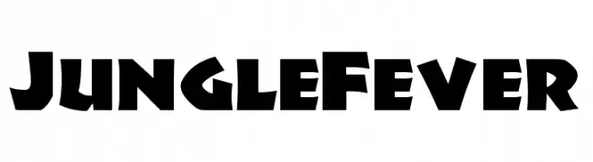
( Fonts by Nick's Fonts )
A bold, angular font with a playful, adventurous style.
![JungleFever font caratteri gratis]() Scaricare 232 Downloads@WebFont
Scaricare 232 Downloads@WebFont -
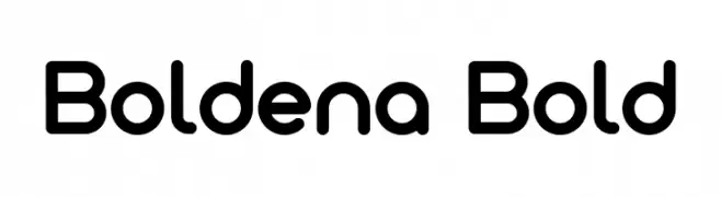
( Fonts by Mukhlis Muhammad - variatype.com - Personal-use only. For commercial use please contact owner. )
A bold, rounded sans-serif font with smooth curves and a modern look.
![Boldena Bold font caratteri gratis]() Scaricare 232 Downloads@WebFont
Scaricare 232 Downloads@WebFont


Quali sono i font più popolari adesso?
Poppins, Roboto, Montserrat, Open Sans e Lato sono molto usati per le forme pulite e l'ampia applicabilità — dall'identità di marca alle landing page e ai poster.
Quali font si usano spesso nei loghi?
Le sans serif geometriche (es. Poppins, famiglie in stile Gotham) sono scelte comuni per un branding pulito e scalabile. Per un tocco personale restano valide script e stili manoscritti. Abbina un display deciso per i titoli a un corpo testo neutro per riconoscibilità ed equilibrio.
Ogni quanto si aggiorna la lista?
Con regolarità, in base ai download e all'attività reale. Torna spesso per scoprire in anticipo le nuove preferite.
💡 Consiglio: aggiungi ai preferiti — le tendenze cambiano in fretta e i font top di oggi possono ispirare il rebranding di domani.