Benvenuto nelle Font Più Popolari — dove popolarità e qualità si incontrano. Qui trovi i font più scaricati e usati dell'anno. Se cerchi scelte sicure per logo, web o social, inizia da qui.
Ogni font top si distingue per equilibrio, leggibilità e versatilità. Troverai sans serif moderne, script eleganti, serif vintage e display minimalisti.
-
( Font by Jayvee D. Enaguas - grandchaos9000.deviantart.com )
A bold, playful font with a cartoon-like, hand-drawn style.
 Scaricare 228 Downloads@WebFont
 -
![Delphinium Pro font caratteri gratis]() Scaricare 228 Downloads@WebFont
Scaricare 228 Downloads@WebFont -
![Count and Spell font caratteri gratis]() Scaricare 228 Downloads@WebFont
Scaricare 228 Downloads@WebFont -
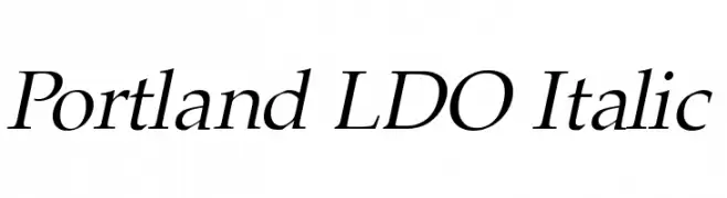
( Fonts by Luke Owens - Personal-use only. For commercial use please contact owner. )
An elegant italic serif font with a classic and sophisticated style.
![Portland LDO Italic font caratteri gratis]() Scaricare 228 Downloads@WebFont
Scaricare 228 Downloads@WebFont -
( Fonts by Dav studio - Dimas Aji Virgiawan - Personal-use only. For commercial use please contact owner. )
A modern, elegant script font with flowing curves and decorative swashes.
![Suneater font caratteri gratis]() Scaricare 228 Downloads@WebFont
Scaricare 228 Downloads@WebFont -
-
![SF-Barbara font caratteri gratis]() Scaricare 228 Downloads@WebFont
Scaricare 228 Downloads@WebFont -
( Fonts by Situjuh Nazara - 7ntypes.com - Personal-use only. For commercial use please contact owner. )
A playful, handwritten font with smooth curves and a friendly appearance.
![Beelova font caratteri gratis]() Scaricare 228 Downloads@WebFont
Scaricare 228 Downloads@WebFont -
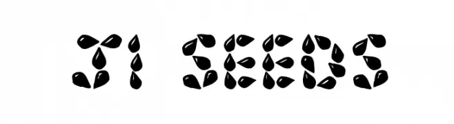
( Fonts by Jeri Ingalls - littlehouse.homestead.com )
A decorative font with characters formed by seed-like shapes, offering a playful and organic look.
![JI Seeds font caratteri gratis]() Scaricare 228 Downloads@WebFont
Scaricare 228 Downloads@WebFont -
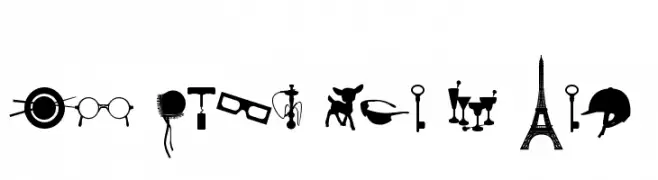
( Fonts by Christophe Feray - www.wcfonts.com )
A pictogram dingbat font featuring diverse object silhouettes.
![WC Sold Out A Bta font caratteri gratis]() Scaricare 228 Downloads@WebFont
Scaricare 228 Downloads@WebFont -
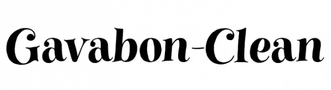
( Fonts by Youssef Habchi - youssef-habchi.com - Personal-use only. For commercial use please contact owner. )
A bold and expressive serif font with dramatic curves and modern flair.
![Gavabon-Clean font caratteri gratis]() Scaricare 228 Downloads@WebFont
Scaricare 228 Downloads@WebFont


Quali sono i font più popolari adesso?
Poppins, Roboto, Montserrat, Open Sans e Lato sono molto usati per le forme pulite e l'ampia applicabilità — dall'identità di marca alle landing page e ai poster.
Quali font si usano spesso nei loghi?
Le sans serif geometriche (es. Poppins, famiglie in stile Gotham) sono scelte comuni per un branding pulito e scalabile. Per un tocco personale restano valide script e stili manoscritti. Abbina un display deciso per i titoli a un corpo testo neutro per riconoscibilità ed equilibrio.
Ogni quanto si aggiorna la lista?
Con regolarità, in base ai download e all'attività reale. Torna spesso per scoprire in anticipo le nuove preferite.
💡 Consiglio: aggiungi ai preferiti — le tendenze cambiano in fretta e i font top di oggi possono ispirare il rebranding di domani.