Benvenuto nelle Font Più Popolari — dove popolarità e qualità si incontrano. Qui trovi i font più scaricati e usati dell'anno. Se cerchi scelte sicure per logo, web o social, inizia da qui.
Ogni font top si distingue per equilibrio, leggibilità e versatilità. Troverai sans serif moderne, script eleganti, serif vintage e display minimalisti.
-
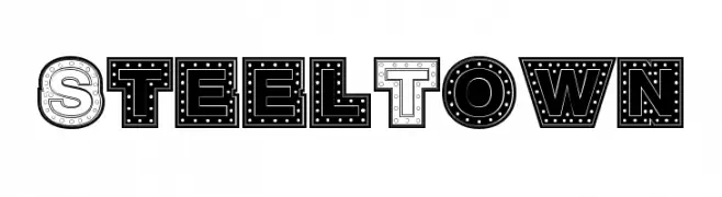
( Fonts by Daniel Gauthier )
A bold, industrial-style font with a 3D effect and rivet details.
 Scaricare 228 Downloads@WebFont
 -
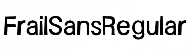
![FrailSansRegular font caratteri gratis]() Scaricare 228 Downloads@WebFont
Scaricare 228 Downloads@WebFont -
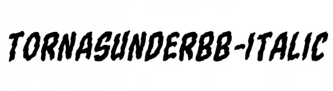
( Fonts by Blambot Comic Fonts - Personal-use only. For commercial use please contact owner. )
A bold, italicized font with a rugged, distressed appearance.
![TornAsunderBB-Italic font caratteri gratis]() Scaricare 228 Downloads@WebFont
Scaricare 228 Downloads@WebFont -
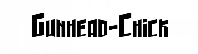
![Gunhead-Chick font caratteri gratis]() Scaricare 228 Downloads@WebFont
Scaricare 228 Downloads@WebFont -
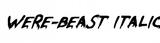
( Fonts by Daniel Zadorozny - www.iconian.com )
A bold, italic font with a wild, brush-like appearance.
![Were-Beast Italic font caratteri gratis]() Scaricare 228 Downloads@WebFont
Scaricare 228 Downloads@WebFont -
-
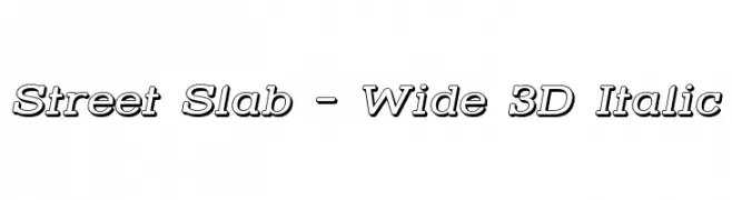
( Fonts by Apostrophic Lab )
A bold, 3D slab serif font with italicized, wide characters and medium contrast.
![Street Slab - Wide 3D Italic font caratteri gratis]() Scaricare 228 Downloads@WebFont
Scaricare 228 Downloads@WebFont -
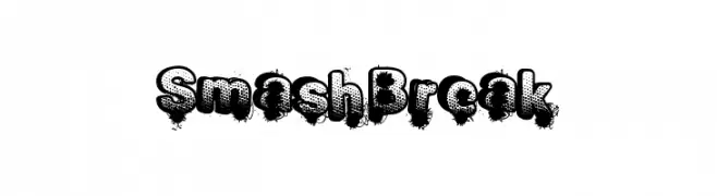
( Fonts by a Max Infeld - XEROGRAPHER FONTS - xerographer.blogspot.com . Personal-use only. For commercial use please contact owner. )
A bold, distressed font with a comic book and graffiti-inspired style.
![SmashBreak font caratteri gratis]() Scaricare 228 Downloads@WebFont
Scaricare 228 Downloads@WebFont -
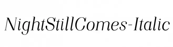
![NightStillComes-Italic font caratteri gratis]() Scaricare 228 Downloads@WebFont
Scaricare 228 Downloads@WebFont -
Caratteri di HeroglyphsStudio. For commercial use please contact the owner.
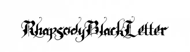
( Thank you for downloading this font This font is free for PERSONAL USE ONLY! Commercial license for this font can be purchased at: http://bit.ly/2xZcUEH )
An ornate Blackletter font with intricate details and dramatic flourishes.
![RhapsodyBlackLetter font caratteri gratis]() Scaricare 228 Downloads@WebFont
Scaricare 228 Downloads@WebFont -
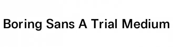
( Fonts by Zetafonts - Personal-use only. For commercial use please contact owner. )
A clean and modern sans-serif font with consistent stroke width and balanced spacing.
![Boring Sans A Trial Medium font caratteri gratis]() Scaricare 228 Downloads@WebFont
Scaricare 228 Downloads@WebFont
Quali sono i font più popolari adesso?
Poppins, Roboto, Montserrat, Open Sans e Lato sono molto usati per le forme pulite e l'ampia applicabilità — dall'identità di marca alle landing page e ai poster.
Quali font si usano spesso nei loghi?
Le sans serif geometriche (es. Poppins, famiglie in stile Gotham) sono scelte comuni per un branding pulito e scalabile. Per un tocco personale restano valide script e stili manoscritti. Abbina un display deciso per i titoli a un corpo testo neutro per riconoscibilità ed equilibrio.
Ogni quanto si aggiorna la lista?
Con regolarità, in base ai download e all'attività reale. Torna spesso per scoprire in anticipo le nuove preferite.
💡 Consiglio: aggiungi ai preferiti — le tendenze cambiano in fretta e i font top di oggi possono ispirare il rebranding di domani.