Benvenuto nelle Font Più Popolari — dove popolarità e qualità si incontrano. Qui trovi i font più scaricati e usati dell'anno. Se cerchi scelte sicure per logo, web o social, inizia da qui.
Ogni font top si distingue per equilibrio, leggibilità e versatilità. Troverai sans serif moderne, script eleganti, serif vintage e display minimalisti.
-
( Fonts by Nick Curtis - www.nicksfonts.com )
A playful and whimsical collection of bold, graphic symbols.
 Scaricare 227 Downloads
 -
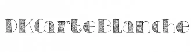
( Fonts by David Kerkhoff - www.hanodedphotography.com )
A whimsical, hand-drawn font with decorative swirls and textured hatching.
![DKCarteBlanche font caratteri gratis]() Scaricare 227 Downloads@WebFont
Scaricare 227 Downloads@WebFont -
( Fonts by a Des Gomez. Personal-use only. For commercial use please contact owner. )
A playful, handwritten font with heart-adorned letters and a casual style.
![Flyknit font caratteri gratis]() Scaricare 227 Downloads@WebFont
Scaricare 227 Downloads@WebFont -
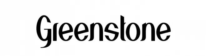
( Fonts by a Alberto Villanueva - www.av.nixiweb.com. Personal-use only. For commercial use please contact owner. )
A modern-vintage font with tall, narrow letterforms and distinct curves.
![Greenstone font caratteri gratis]() Scaricare 227 Downloads@WebFont
Scaricare 227 Downloads@WebFont -
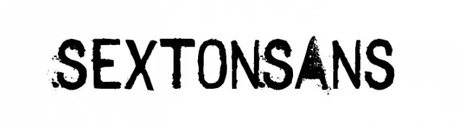
![SextonSans font caratteri gratis]() Scaricare 227 Downloads@WebFont
Scaricare 227 Downloads@WebFont -
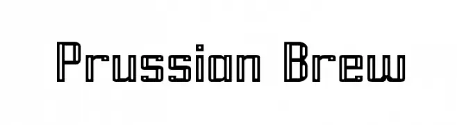
( Fonts by Apostrophic Lab )
A geometric, modern font with consistent line weight and an industrial feel.
![Prussian Brew font caratteri gratis]() Scaricare 227 Downloads@WebFont
Scaricare 227 Downloads@WebFont -
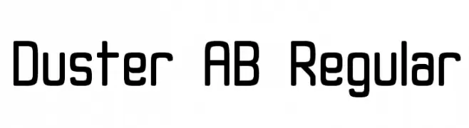
( Alex Banks - www.alex-banks.com )
A modern, rounded font with a clean and approachable design.
![Duster AB Regular font caratteri gratis]() Scaricare 227 Downloads@WebFont
Scaricare 227 Downloads@WebFont -
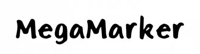
( Fonts by Renian Type Co. )
A playful, handwritten-style font with bold, rounded characters.
![Mega Marker font caratteri gratis]() Scaricare 227 Downloads@WebFont
Scaricare 227 Downloads@WebFont -
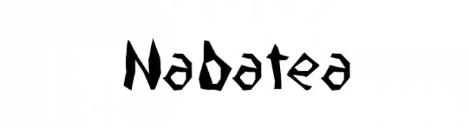
( Fonts by Fernando Haro - defharo.com )
A bold, angular font with a hand-carved, edgy aesthetic.
![Nabatea font caratteri gratis]() Scaricare 227 Downloads@WebFont
Scaricare 227 Downloads@WebFont -
( Fonts by weknow - Wino S Kadir )
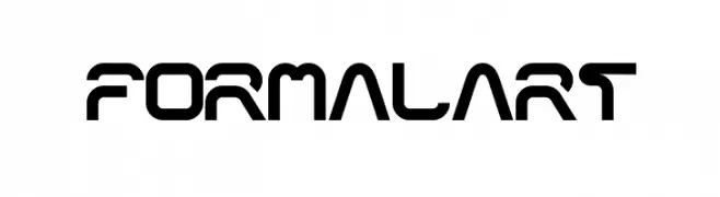
A futuristic, geometric font with bold, angular shapes and consistent line thickness.
![formalart font caratteri gratis]() Scaricare 227 Downloads@WebFont
Scaricare 227 Downloads@WebFont

Quali sono i font più popolari adesso?
Poppins, Roboto, Montserrat, Open Sans e Lato sono molto usati per le forme pulite e l'ampia applicabilità — dall'identità di marca alle landing page e ai poster.
Quali font si usano spesso nei loghi?
Le sans serif geometriche (es. Poppins, famiglie in stile Gotham) sono scelte comuni per un branding pulito e scalabile. Per un tocco personale restano valide script e stili manoscritti. Abbina un display deciso per i titoli a un corpo testo neutro per riconoscibilità ed equilibrio.
Ogni quanto si aggiorna la lista?
Con regolarità, in base ai download e all'attività reale. Torna spesso per scoprire in anticipo le nuove preferite.
💡 Consiglio: aggiungi ai preferiti — le tendenze cambiano in fretta e i font top di oggi possono ispirare il rebranding di domani.