Benvenuto nelle Font Più Popolari — dove popolarità e qualità si incontrano. Qui trovi i font più scaricati e usati dell'anno. Se cerchi scelte sicure per logo, web o social, inizia da qui.
Ogni font top si distingue per equilibrio, leggibilità e versatilità. Troverai sans serif moderne, script eleganti, serif vintage e display minimalisti.
-
( Fonts by www.dcoxy.com )
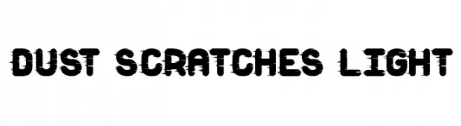
A bold, distressed font with a scratchy, grunge aesthetic.
 Scaricare 225 Downloads@WebFont
 -
( Copyright 2018 The KoHo Project Authors (https://github.com/cadsondemak/Koho) )
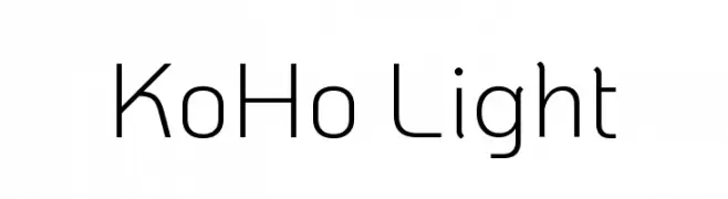
A modern, light sans-serif font with clean lines and low contrast.
![KoHo Light font caratteri gratis]() Scaricare 225 Downloads@WebFont
Scaricare 225 Downloads@WebFont -
( Fonts by Manfred Klein - manfred-klein.ina-mar.com )
A modern serif font with geometric shapes and high contrast.
![Fragmenta font caratteri gratis]() Scaricare 225 Downloads@WebFont
Scaricare 225 Downloads@WebFont -
![Boluge font caratteri gratis]() Scaricare 225 Downloads@WebFont
Scaricare 225 Downloads@WebFont -
( Fonts by Daniel Zadorozny - www.iconian.com - Free for personal use )
A modern, italicized font with a sleek and dynamic design.
![Postmaster Expanded font caratteri gratis]() Scaricare 225 Downloads@WebFont
Scaricare 225 Downloads@WebFont -
-
( Fonts by a Neale Davidson - www.pixelsagas.com. Personal-use only. For commercial use please contact owner. )
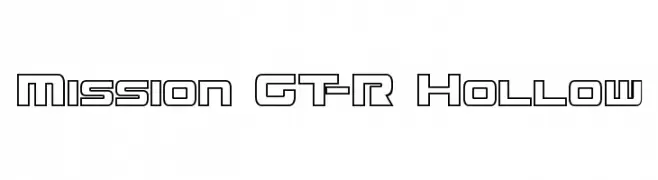
A modern, geometric hollow font with a futuristic and technical design.
![Mission GT-R Hollow font caratteri gratis]() Scaricare 225 Downloads@WebFont
Scaricare 225 Downloads@WebFont -
( Fonts by Nirmala Creative - Personal-use only. For commercial use please contact owner. )
Playful and casual handwritten font.
![My Love font caratteri gratis]() Scaricare 225 Downloads@WebFont
Scaricare 225 Downloads@WebFont -
![Greenman font caratteri gratis]() Scaricare 225 Downloads@WebFont
Scaricare 225 Downloads@WebFont -
( Fonts by Alex Slobzheninov - Personal-use only. For commercial use please contact owner. )
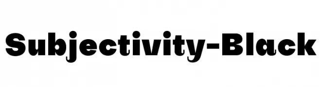
A bold and impactful font with thick, uniform strokes.
![Subjectivity-Black font caratteri gratis]() Scaricare 225 Downloads@WebFont
Scaricare 225 Downloads@WebFont -
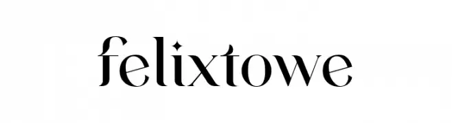
( Fonts by VampStudio - Personal-use only. For commercial use please contact owner. )
A high-contrast, elegant serif font with sharp serifs and refined curves.
![felixtowe font caratteri gratis]() Scaricare 225 Downloads@WebFont
Scaricare 225 Downloads@WebFont


Quali sono i font più popolari adesso?
Poppins, Roboto, Montserrat, Open Sans e Lato sono molto usati per le forme pulite e l'ampia applicabilità — dall'identità di marca alle landing page e ai poster.
Quali font si usano spesso nei loghi?
Le sans serif geometriche (es. Poppins, famiglie in stile Gotham) sono scelte comuni per un branding pulito e scalabile. Per un tocco personale restano valide script e stili manoscritti. Abbina un display deciso per i titoli a un corpo testo neutro per riconoscibilità ed equilibrio.
Ogni quanto si aggiorna la lista?
Con regolarità, in base ai download e all'attività reale. Torna spesso per scoprire in anticipo le nuove preferite.
💡 Consiglio: aggiungi ai preferiti — le tendenze cambiano in fretta e i font top di oggi possono ispirare il rebranding di domani.