Benvenuto nelle Font Più Popolari — dove popolarità e qualità si incontrano. Qui trovi i font più scaricati e usati dell'anno. Se cerchi scelte sicure per logo, web o social, inizia da qui.
Ogni font top si distingue per equilibrio, leggibilità e versatilità. Troverai sans serif moderne, script eleganti, serif vintage e display minimalisti.
-
( Fonts by Almarkhatype - Abdul Malik Wisnu - Personal-use only. For commercial use please contact owner. )
A bold, condensed font with a modern and impactful style.
 Scaricare 220 Downloads@WebFont
 -
( Fonts by Manfred Klein. Free for private and charity use. Free for commercial with donation to organizations )
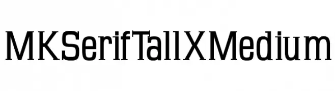
A tall, elegant serif font with medium weight and subtle serifs.
![MKSerifTallXMedium font caratteri gratis]() Scaricare 220 Downloads@WebFont
Scaricare 220 Downloads@WebFont -
( Dom )
A modern, light slab serif font with a clean and elegant design.
![Twentytwelve Slab Light font caratteri gratis]() Scaricare 220 Downloads@WebFont
Scaricare 220 Downloads@WebFont -
( Fonts by Apostrophic Lab )
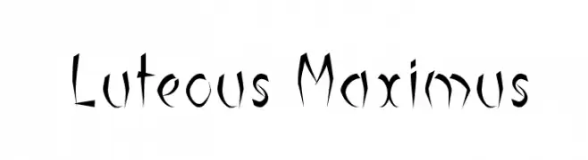
A sharp, edgy font with angular strokes and dynamic energy.
![Luteous Maximus font caratteri gratis]() Scaricare 220 Downloads@WebFont
Scaricare 220 Downloads@WebFont -
( Fonts by MJType )
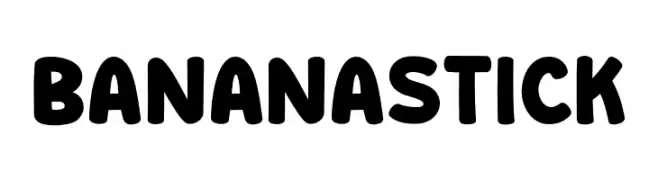
A playful, bold font with rounded, thick strokes and a friendly appearance.
![Banana Stick font caratteri gratis]() Scaricare 220 Downloads@WebFont
Scaricare 220 Downloads@WebFont -
-
( Fonts by Typesgal - Personal-use only. For commercial use please contact owner. )
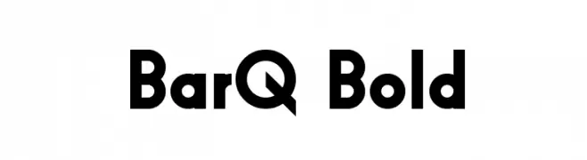
A bold, geometric font with strong, clean lines and excellent legibility.
![BarQ Bold font caratteri gratis]() Scaricare 220 Downloads@WebFont
Scaricare 220 Downloads@WebFont -
![Wanax Demo font caratteri gratis]() Scaricare 220 Downloads@WebFont
Scaricare 220 Downloads@WebFont -
( Fonts by or from www.graffitifonts.net )
A chaotic, vine-like decorative font with an edgy, artistic flair.
![Hypertension Regular font caratteri gratis]() Scaricare 220 Downloads@WebFont
Scaricare 220 Downloads@WebFont -
( Fonts by www.blambot.com )
A bold, futuristic font with angular, geometric shapes.
![Antigrav BB font caratteri gratis]() Scaricare 220 Downloads@WebFont
Scaricare 220 Downloads@WebFont -
( Fonts by Scratchones )
A playful, handwritten font with an elegant and whimsical style.
![Spring Handmade font caratteri gratis]() Scaricare 220 Downloads@WebFont
Scaricare 220 Downloads@WebFont

Quali sono i font più popolari adesso?
Poppins, Roboto, Montserrat, Open Sans e Lato sono molto usati per le forme pulite e l'ampia applicabilità — dall'identità di marca alle landing page e ai poster.
Quali font si usano spesso nei loghi?
Le sans serif geometriche (es. Poppins, famiglie in stile Gotham) sono scelte comuni per un branding pulito e scalabile. Per un tocco personale restano valide script e stili manoscritti. Abbina un display deciso per i titoli a un corpo testo neutro per riconoscibilità ed equilibrio.
Ogni quanto si aggiorna la lista?
Con regolarità, in base ai download e all'attività reale. Torna spesso per scoprire in anticipo le nuove preferite.
💡 Consiglio: aggiungi ai preferiti — le tendenze cambiano in fretta e i font top di oggi possono ispirare il rebranding di domani.