Benvenuto nelle Font Più Popolari — dove popolarità e qualità si incontrano. Qui trovi i font più scaricati e usati dell'anno. Se cerchi scelte sicure per logo, web o social, inizia da qui.
Ogni font top si distingue per equilibrio, leggibilità e versatilità. Troverai sans serif moderne, script eleganti, serif vintage e display minimalisti.
-
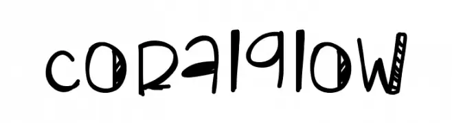
( Fonts by Des Gomez )
A playful, handwritten font with quirky and artistic letterforms.
 Scaricare 221 Downloads@WebFont
 -
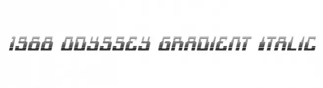
( Fonts by Iconian Fonts )
A futuristic, italicized font with gradient-like horizontal lines for a dynamic look.
![1968 Odyssey Gradient Italic font caratteri gratis]() Scaricare 221 Downloads@WebFont
Scaricare 221 Downloads@WebFont -
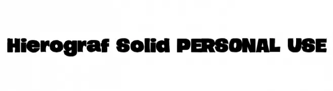
( Måns Grebäck - www.mansgreback.com )
A bold, blocky font with thick strokes and rounded edges.
![Hierograf Solid PERSONAL USE font caratteri gratis]() Scaricare 221 Downloads@WebFont
Scaricare 221 Downloads@WebFont -
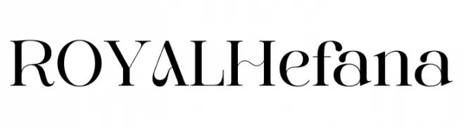
( Fonts by ToniStudio )
A refined serif font with high contrast and elegant serifs.
![ROYAL Hefana font caratteri gratis]() Scaricare 221 Downloads@WebFont
Scaricare 221 Downloads@WebFont -
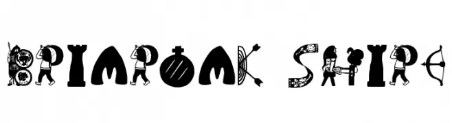
( Fonts by uatype.faithweb.com - UnAuthorized Type )
A decorative font with medieval and fantasy-inspired elements.
![Briaroak Shire font caratteri gratis]() Scaricare 221 Downloads@WebFont
Scaricare 221 Downloads@WebFont -
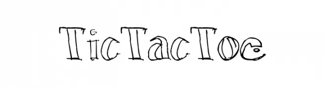
-
![TicTacToe font caratteri gratis]() Scaricare 221 Downloads@WebFont
Scaricare 221 Downloads@WebFont -
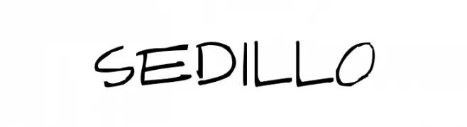
( Fonts by Apostrophic Lab )
A bold, expressive handwritten font with dynamic strokes and a playful appearance.
![Sedillo font caratteri gratis]() Scaricare 221 Downloads@WebFont
Scaricare 221 Downloads@WebFont -
( Fonts by 611 Studio - Rijal Muttaqin - Personal-use only. For commercial use please contact owner. )
A modern, rounded sans-serif font with a friendly and approachable style.
![Bertina font caratteri gratis]() Scaricare 221 Downloads@WebFont
Scaricare 221 Downloads@WebFont -
( Fonts by ShyFonts )
A bold, shaded oblique font with a dynamic, three-dimensional style.
![SF Junk Culture Shaded Oblique font caratteri gratis]() Scaricare 221 Downloads@WebFont
Scaricare 221 Downloads@WebFont -
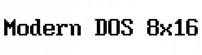
( Jayvee Enaguas )
A pixelated, monospaced font with a retro digital aesthetic.
![Modern DOS 8x16 font caratteri gratis]() Scaricare 221 Downloads@WebFont
Scaricare 221 Downloads@WebFont


Quali sono i font più popolari adesso?
Poppins, Roboto, Montserrat, Open Sans e Lato sono molto usati per le forme pulite e l'ampia applicabilità — dall'identità di marca alle landing page e ai poster.
Quali font si usano spesso nei loghi?
Le sans serif geometriche (es. Poppins, famiglie in stile Gotham) sono scelte comuni per un branding pulito e scalabile. Per un tocco personale restano valide script e stili manoscritti. Abbina un display deciso per i titoli a un corpo testo neutro per riconoscibilità ed equilibrio.
Ogni quanto si aggiorna la lista?
Con regolarità, in base ai download e all'attività reale. Torna spesso per scoprire in anticipo le nuove preferite.
💡 Consiglio: aggiungi ai preferiti — le tendenze cambiano in fretta e i font top di oggi possono ispirare il rebranding di domani.