Benvenuto nelle Font Più Popolari — dove popolarità e qualità si incontrano. Qui trovi i font più scaricati e usati dell'anno. Se cerchi scelte sicure per logo, web o social, inizia da qui.
Ogni font top si distingue per equilibrio, leggibilità e versatilità. Troverai sans serif moderne, script eleganti, serif vintage e display minimalisti.
-
( Fonts by www.gliphmaker.com. Personal-use only. For commercial use please contact owner. )
A decorative font with intricate swirls and artistic embellishments.
 Scaricare 214 Downloads@WebFont
 -
( Fonts by Jacob Fisher - www.pizzadude.dk )
A bold, textured font with a distressed, grunge style.
![Desperation font caratteri gratis]() Scaricare 214 Downloads@WebFont
Scaricare 214 Downloads@WebFont -
( Genilson L. Santos )
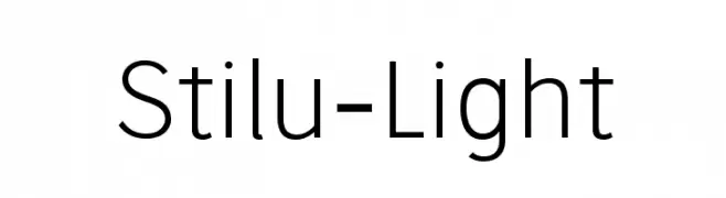
A modern, light sans-serif font with clean lines and balanced spacing.
![Stilu-Light font caratteri gratis]() Scaricare 214 Downloads@WebFont
Scaricare 214 Downloads@WebFont -
( Fonts by Daxad - Adrien Daxhelet - Personal-use only. For commercial use please contact owner. )
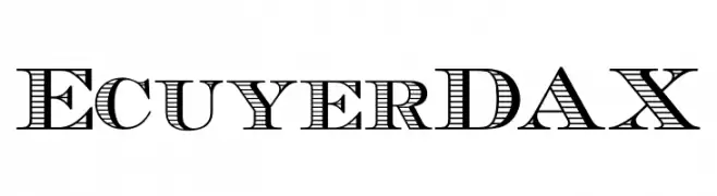
A decorative serif font with bold, striped characters.
![EcuyerDAX font caratteri gratis]() Scaricare 214 Downloads@WebFont
Scaricare 214 Downloads@WebFont -
![Sugar Lite font caratteri gratis]() Scaricare 214 Downloads@WebFont
Scaricare 214 Downloads@WebFont -
-
![The Royal Wedding Medium font caratteri gratis]() Scaricare 214 Downloads@WebFont
Scaricare 214 Downloads@WebFont -
( Fonts by MuraKnockout Media + Design - muraknockout.com. Personal-use only. For commercial use please contact owner. )
A modern, geometric font with thin, uniform strokes and a minimalist design.
![Espacio font caratteri gratis]() Scaricare 214 Downloads@WebFont
Scaricare 214 Downloads@WebFont -
( Copyright 2016 The Nunito Project Authors (contact@sansoxygen.com) )
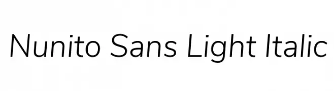
A modern, light, and italic sans-serif font with excellent legibility.
![Nunito Sans Light Italic font caratteri gratis]() Scaricare 214 Downloads@WebFont
Scaricare 214 Downloads@WebFont -
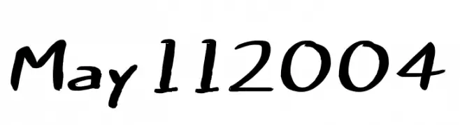
Caratteri di danny91194. For commercial use please contact the owner.
( mm )
A playful, hand-drawn font with a whimsical and artistic style.
![may112004 font caratteri gratis]() Scaricare 214 Downloads@WebFont
Scaricare 214 Downloads@WebFont -
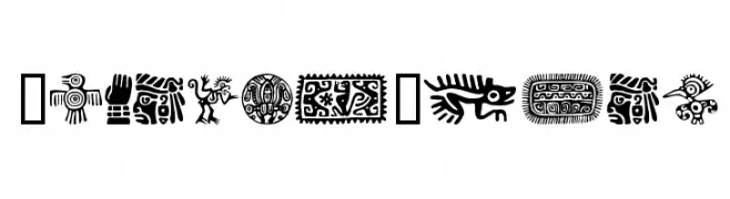
( Fonts by www.houseoflime.com )
Intricate and bold motifs inspired by traditional Mexican art, featuring detailed cultural symbols.
![MexicanMotif font caratteri gratis]() Scaricare 214 Downloads@WebFont
Scaricare 214 Downloads@WebFont


Quali sono i font più popolari adesso?
Poppins, Roboto, Montserrat, Open Sans e Lato sono molto usati per le forme pulite e l'ampia applicabilità — dall'identità di marca alle landing page e ai poster.
Quali font si usano spesso nei loghi?
Le sans serif geometriche (es. Poppins, famiglie in stile Gotham) sono scelte comuni per un branding pulito e scalabile. Per un tocco personale restano valide script e stili manoscritti. Abbina un display deciso per i titoli a un corpo testo neutro per riconoscibilità ed equilibrio.
Ogni quanto si aggiorna la lista?
Con regolarità, in base ai download e all'attività reale. Torna spesso per scoprire in anticipo le nuove preferite.
💡 Consiglio: aggiungi ai preferiti — le tendenze cambiano in fretta e i font top di oggi possono ispirare il rebranding di domani.