Benvenuto nelle Font Più Popolari — dove popolarità e qualità si incontrano. Qui trovi i font più scaricati e usati dell'anno. Se cerchi scelte sicure per logo, web o social, inizia da qui.
Ogni font top si distingue per equilibrio, leggibilità e versatilità. Troverai sans serif moderne, script eleganti, serif vintage e display minimalisti.
-
( Noto is a trademark of Google Inc. Noto fonts are open source. All Noto fonts are published under the SIL Open Font License, Version 1.1 )
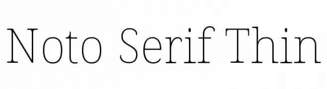
A refined serif typeface with thin, elegant strokes and a modern aesthetic.
 Scaricare 214 Downloads@WebFont
 -
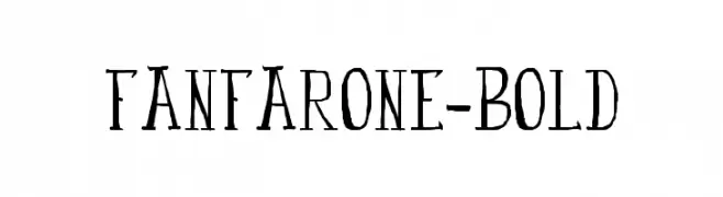
![fanfarone-bold font caratteri gratis]() Scaricare 214 Downloads@WebFont
Scaricare 214 Downloads@WebFont -
( Fonts by Muthia Fajrijannah )
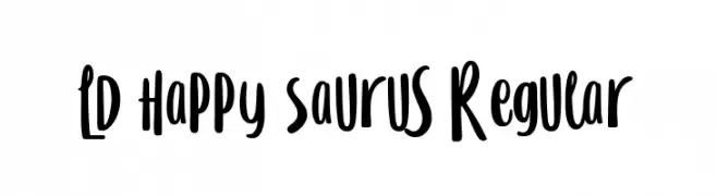
A playful, handwritten font with bold, rounded strokes and a whimsical style.
![LD Happy Saurus Regular font caratteri gratis]() Scaricare 214 Downloads@WebFont
Scaricare 214 Downloads@WebFont -
( Fonts by Vladimir Nikolic - www.creativefabrica.com/designer/vladimirnikolic/ - Personal-use only. For commercial use please contact owner. )
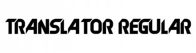
A bold, geometric font with a futuristic and angular design.
![Translator Regular font caratteri gratis]() Scaricare 214 Downloads@WebFont
Scaricare 214 Downloads@WebFont -
( Fonts by Manuel Ramos - www.infinitismo.com - Personal-use only. For commercial use please contact owner. )
An ultra-thin, elegant font with elongated ascenders and a modern, minimalistic style.
![Fantastica font caratteri gratis]() Scaricare 214 Downloads@WebFont
Scaricare 214 Downloads@WebFont -
-
( Rahsia Design )
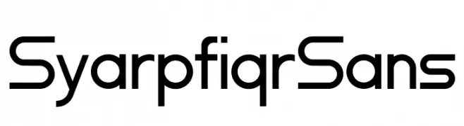
A modern, geometric sans-serif font with clean lines and uniform strokes.
![Syarpfiqr Sans font caratteri gratis]() Scaricare 214 Downloads@WebFont
Scaricare 214 Downloads@WebFont -
( Fonts by Kristy Hatswell )
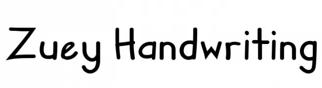
A playful, casual handwritten font with smooth, rounded edges and a friendly appearance.
![Zuey Handwriting font caratteri gratis]() Scaricare 214 Downloads@WebFont
Scaricare 214 Downloads@WebFont -
( Fonts by Ryoichi Tsunekawa - www.dharmatype.com )
A futuristic, monospaced font with geometric, mechanical design.
![Plamo font caratteri gratis]() Scaricare 214 Downloads@WebFont
Scaricare 214 Downloads@WebFont -
![TPF Ubiquitous font caratteri gratis]() Scaricare 214 Downloads@WebFont
Scaricare 214 Downloads@WebFont -
![Rena Version2000 font caratteri gratis]() Scaricare 214 Downloads@WebFont
Scaricare 214 Downloads@WebFont


Quali sono i font più popolari adesso?
Poppins, Roboto, Montserrat, Open Sans e Lato sono molto usati per le forme pulite e l'ampia applicabilità — dall'identità di marca alle landing page e ai poster.
Quali font si usano spesso nei loghi?
Le sans serif geometriche (es. Poppins, famiglie in stile Gotham) sono scelte comuni per un branding pulito e scalabile. Per un tocco personale restano valide script e stili manoscritti. Abbina un display deciso per i titoli a un corpo testo neutro per riconoscibilità ed equilibrio.
Ogni quanto si aggiorna la lista?
Con regolarità, in base ai download e all'attività reale. Torna spesso per scoprire in anticipo le nuove preferite.
💡 Consiglio: aggiungi ai preferiti — le tendenze cambiano in fretta e i font top di oggi possono ispirare il rebranding di domani.