Benvenuto nelle Font Più Popolari — dove popolarità e qualità si incontrano. Qui trovi i font più scaricati e usati dell'anno. Se cerchi scelte sicure per logo, web o social, inizia da qui.
Ogni font top si distingue per equilibrio, leggibilità e versatilità. Troverai sans serif moderne, script eleganti, serif vintage e display minimalisti.
-
( Fonts by Eva Barabas - www.etsy.com/ie/shop/digitaltypefaces - Personal-use only. For commercial use please contact owner. )
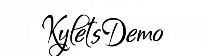
An elegant and flowing script font with intricate curves and classic calligraphic style.
 Scaricare 881 Downloads@WebFont
 -
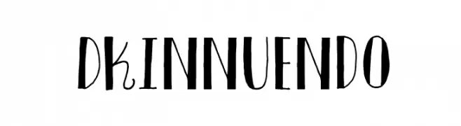
![DKInnuendo font caratteri gratis]() Scaricare 881 Downloads@WebFont
Scaricare 881 Downloads@WebFont -
( Fonts by weknow - Wino S Kadir )
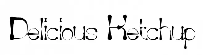
A playful, bold font with a whimsical, liquid-like design.
![Delicious Ketchup font caratteri gratis]() Scaricare 881 Downloads@WebFont
Scaricare 881 Downloads@WebFont -
( Fonts by Apostrophic Lab )
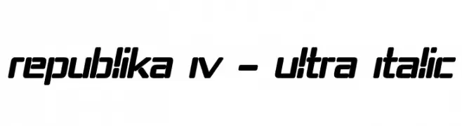
A bold, italicized font with a modern, futuristic look and consistent stroke thickness.
![Republika IV - Ultra Italic font caratteri gratis]() Scaricare 881 Downloads@WebFont
Scaricare 881 Downloads@WebFont -
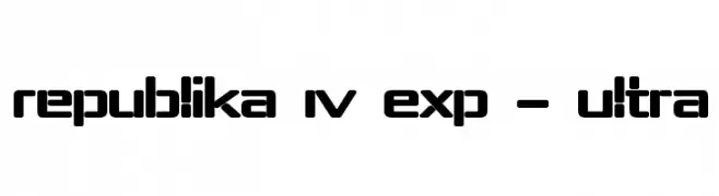
( Fonts by Apostrophic Lab )
A bold, geometric font with a futuristic and modern design.
![Republika IV Exp - Ultra font caratteri gratis]() Scaricare 881 Downloads@WebFont
Scaricare 881 Downloads@WebFont -
-
( Fonts by Dieter Steffmann )
A bold, cursive script font with a shadow effect for a 3D look.
![Marketing Script Shadow font caratteri gratis]() Scaricare 881 Downloads@WebFont
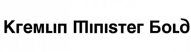
Scaricare 881 Downloads@WebFont -
![Kremlin Minister Bold font caratteri gratis]() Scaricare 881 Downloads@WebFont
Scaricare 881 Downloads@WebFont -
( Fonts by Kreative Korporation - www.kreativekorp.com )
A playful, hand-drawn font with a bold and quirky design.
![Plastic font caratteri gratis]() Scaricare 881 Downloads@WebFont
Scaricare 881 Downloads@WebFont -
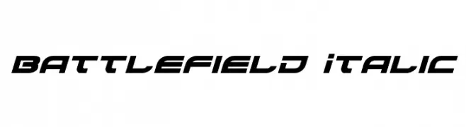
( Fonts by Daniel Zadorozny - www.iconian.com - Free for personal use )
A bold, italicized font with a futuristic and dynamic style.
![Battlefield Italic font caratteri gratis]() Scaricare 881 Downloads@WebFont
Scaricare 881 Downloads@WebFont -
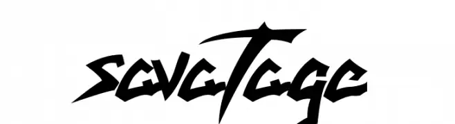
( Fonts by Gilberto Bressan Junior )
A bold, edgy font with sharp, angular lines and high contrast, ideal for dynamic designs.
![savatage font caratteri gratis]() Scaricare 881 Downloads@WebFont
Scaricare 881 Downloads@WebFont -
( Fonts by RaisProject )
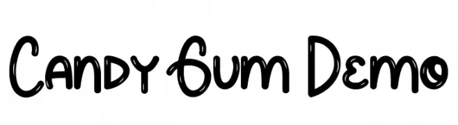
A playful, bubble-like font with rounded characters and a whimsical style.
![Candy Gum Demo font caratteri gratis]() Scaricare 880 Downloads@WebFont
Scaricare 880 Downloads@WebFont -
( Fonts by Fikryal studio )
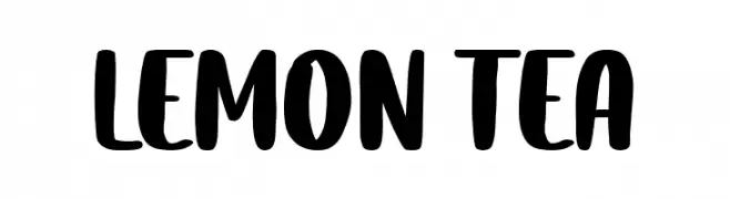
A bold, playful handwritten font with thick strokes and rounded edges.
![Lemon Tea font caratteri gratis]() Scaricare 880 Downloads@WebFont
Scaricare 880 Downloads@WebFont -
( Fonts by Kong Font )
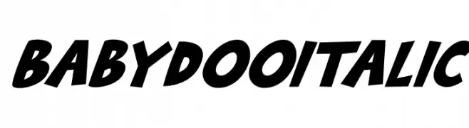
A bold, italic font with playful, rounded characters and a dynamic style.
![Babydoo Italic font caratteri gratis]() Scaricare 880 Downloads@WebFont
Scaricare 880 Downloads@WebFont -
( Fonts by Accademia di Belle Arti di Urbino and others - Personal-use only. For commercial use please contact owner. )
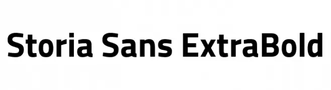
A bold, modern sans-serif font with strong geometric shapes.
![Storia Sans ExtraBold font caratteri gratis]() Scaricare 880 Downloads@WebFont
Scaricare 880 Downloads@WebFont -
( Fonts by Hubert & Fischer - Personal-use only. For commercial use please contact owner. )
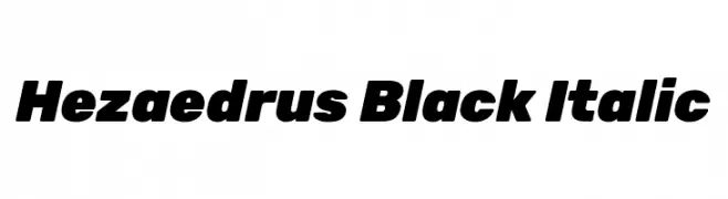
A bold, italicized font with strong, dynamic characters.
![Hezaedrus Black Italic font caratteri gratis]() Scaricare 880 Downloads@WebFont
Scaricare 880 Downloads@WebFont -
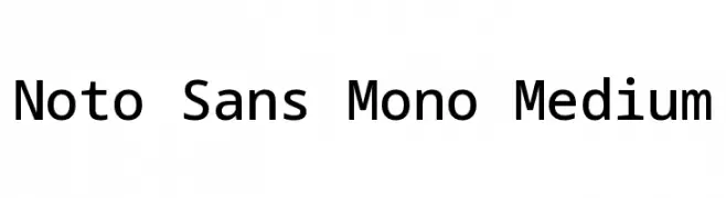
( Noto is a trademark of Google Inc. Noto fonts are open source. All Noto fonts are published under the SIL Open Font License, Version 1.1 )
A monospaced sans-serif font with a clean, modern design and medium weight.
![Noto Sans Mono Medium font caratteri gratis]() Scaricare 880 Downloads@WebFont
Scaricare 880 Downloads@WebFont -
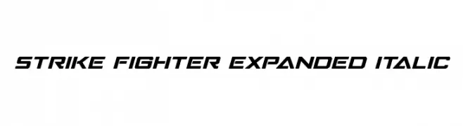
( Fonts by Iconian Fonts )
A bold, italicized, and expanded font with a futuristic and dynamic style.
![Strike Fighter Expanded Italic font caratteri gratis]() Scaricare 880 Downloads@WebFont
Scaricare 880 Downloads@WebFont -
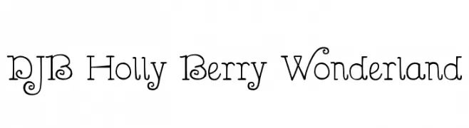
( Fonts by Darcy Baldwin - darcybaldwin.com. Free for personal use only )
A whimsical, decorative font with playful curls and loops.
![DJB Holly Berry Wonderland font caratteri gratis]() Scaricare 880 Downloads@WebFont
Scaricare 880 Downloads@WebFont -
( Fonts by Vanessa Bays - bythebutterfly.com )
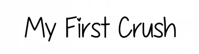
A playful, handwritten font with a casual and friendly style.
![My First Crush font caratteri gratis]() Scaricare 880 Downloads@WebFont
Scaricare 880 Downloads@WebFont -
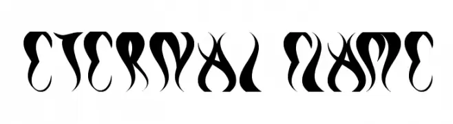
( Fonts by weknow - Wino S Kadir )
A bold, flame-inspired font with sharp, dynamic curves and edges.
![eternal flame font caratteri gratis]() Scaricare 880 Downloads@WebFont
Scaricare 880 Downloads@WebFont -
( Fonts by a Nick Polyarush - alteran-x.deviantart.com . Personal-use only. For commercial use please contact owner. )
An intricate and decorative font with geometric and mystical designs.
![Vulcan Script font caratteri gratis]() Scaricare 880 Downloads@WebFont
Scaricare 880 Downloads@WebFont -
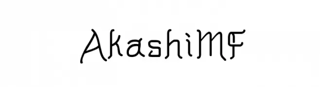
( Fonts by Rick Mueller )
A modern-vintage font with unique curves and angular details.
![AkashiMF font caratteri gratis]() Scaricare 880 Downloads@WebFont
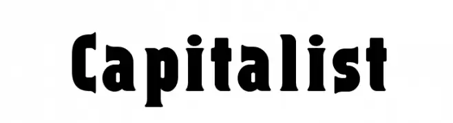
Scaricare 880 Downloads@WebFont -
![Capitalist font caratteri gratis]() Scaricare 880 Downloads@WebFont
Scaricare 880 Downloads@WebFont -
( Fonts by Manfred Klein - manfred-klein.ina-mar.com )
A bold, decorative font with multiple strokes creating a layered effect.
![Multistrokes font caratteri gratis]() Scaricare 880 Downloads@WebFont
Scaricare 880 Downloads@WebFont -
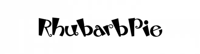
( Fonts by Nick Curtis - www.nicksfonts.com )
A playful, whimsical font with bold, curvy characters and decorative elements.
![RhubarbPie font caratteri gratis]() Scaricare 880 Downloads
Scaricare 880 Downloads -
![Chopin-Bold font caratteri gratis]() Scaricare 880 Downloads
Scaricare 880 Downloads -
![Kims Handwriting font caratteri gratis]() Scaricare 880 Downloads@WebFont
Scaricare 880 Downloads@WebFont -
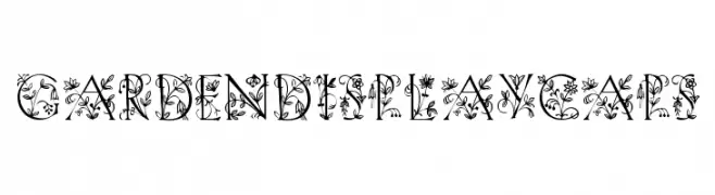
![GardenDisplayCaps font caratteri gratis]() Scaricare 880 Downloads@WebFont
Scaricare 880 Downloads@WebFont -
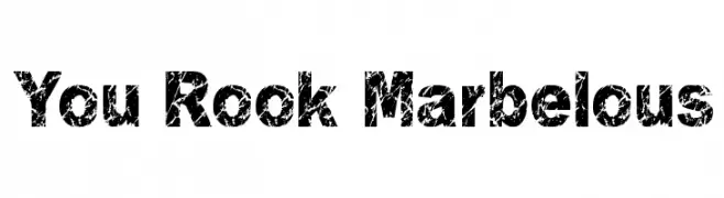
( Fonts by Rich Gast - www.greywolfwebworks.com Commerciali Caratteri )
A bold, distressed font with a textured, rugged appearance.
![You Rook Marbelous font caratteri gratis]() Scaricare 880 Downloads
Scaricare 880 Downloads -
![Heidelbe-Light font caratteri gratis]() Scaricare 880 Downloads
Scaricare 880 Downloads -
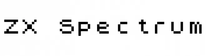
( Fonts by Paul Reid - tracertong.co.uk )
A pixelated, retro font inspired by early digital graphics.
![ZX Spectrum font caratteri gratis]() Scaricare 880 Downloads
Scaricare 880 Downloads -
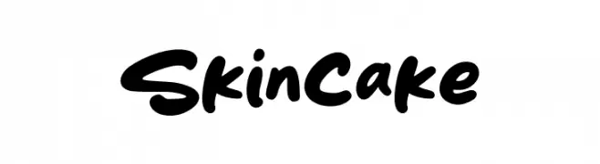
( Fonts by Khurasan )
A bold, playful handwritten font with rounded edges and a dynamic slant.
![Skincake font caratteri gratis]() Scaricare 879 Downloads@WebFont
Scaricare 879 Downloads@WebFont -
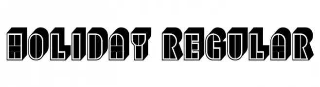
( Fonts by Vladimir Nikolic - www.creativefabrica.com/designer/vladimirnikolic/ - Personal-use only. For commercial use please contact owner. )
A bold, decorative font with a three-dimensional effect and geometric patterns.
![Holiday Regular font caratteri gratis]() Scaricare 879 Downloads@WebFont
Scaricare 879 Downloads@WebFont -
( Fonts by Khurasan )
A playful, rounded font with bold, smooth curves and a friendly style.
![Hansip font caratteri gratis]() Scaricare 879 Downloads@WebFont
Scaricare 879 Downloads@WebFont -
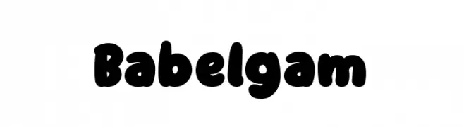
( Fonts by Staircase Studio )
A playful, bold typeface with rounded, bubble-like characters.
![Babelgam font caratteri gratis]() Scaricare 879 Downloads@WebFont
Scaricare 879 Downloads@WebFont


Quali sono i font più popolari adesso?
Poppins, Roboto, Montserrat, Open Sans e Lato sono molto usati per le forme pulite e l'ampia applicabilità — dall'identità di marca alle landing page e ai poster.
Quali font si usano spesso nei loghi?
Le sans serif geometriche (es. Poppins, famiglie in stile Gotham) sono scelte comuni per un branding pulito e scalabile. Per un tocco personale restano valide script e stili manoscritti. Abbina un display deciso per i titoli a un corpo testo neutro per riconoscibilità ed equilibrio.
Ogni quanto si aggiorna la lista?
Con regolarità, in base ai download e all'attività reale. Torna spesso per scoprire in anticipo le nuove preferite.
💡 Consiglio: aggiungi ai preferiti — le tendenze cambiano in fretta e i font top di oggi possono ispirare il rebranding di domani.