Benvenuto nelle Font Più Popolari — dove popolarità e qualità si incontrano. Qui trovi i font più scaricati e usati dell'anno. Se cerchi scelte sicure per logo, web o social, inizia da qui.
Ogni font top si distingue per equilibrio, leggibilità e versatilità. Troverai sans serif moderne, script eleganti, serif vintage e display minimalisti.
-
( Fonts by Daniel Zadorozny - www.iconian.com - Free for personal use )
A bold, decorative font with a gradient effect and horizontal stripe pattern.
 Scaricare 859 Downloads@WebFont
 -
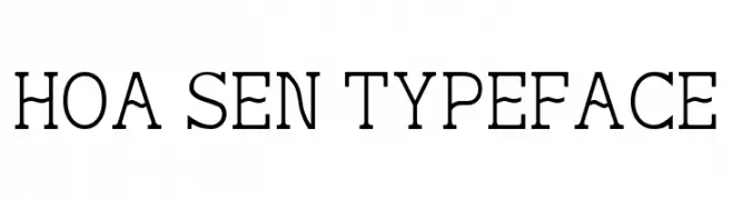
( Fonts by Truong Nguyen Huy - Personal-use only. For commercial use please contact owner. )
A classic serif typeface with elegant strokes and moderate contrast.
![Hoa Sen Typeface font caratteri gratis]() Scaricare 858 Downloads@WebFont
Scaricare 858 Downloads@WebFont -
( Fonts by Alit Design )
A playful, handwritten font with elongated, curly characters.
![Mattdoy Regular font caratteri gratis]() Scaricare 858 Downloads@WebFont
Scaricare 858 Downloads@WebFont -
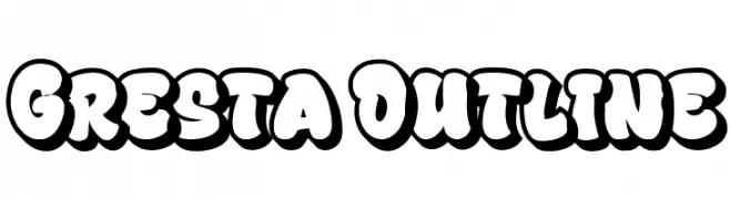
( Fonts by Bangkit Tri Setiadi )
A bold, outlined, and playful font with a cartoonish style.
![Gresta Outline font caratteri gratis]() Scaricare 858 Downloads@WebFont
Scaricare 858 Downloads@WebFont -
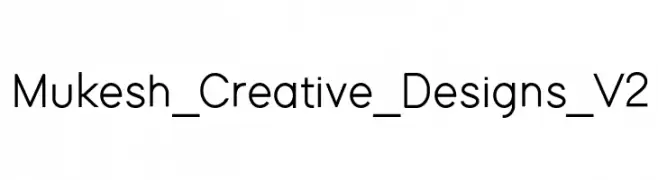
( AMC Creative Designs - amukeshchandra.wordpress.com )
A clean, modern sans-serif font with uniform stroke width and excellent readability.
![Mukesh_Creative_Designs_V2 font caratteri gratis]() Scaricare 858 Downloads@WebFont
Scaricare 858 Downloads@WebFont -
-
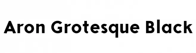
( Monofonts - www.monofonts.com )
A bold, modern sans-serif font with clean, geometric lines.
![Aron Grotesque Black font caratteri gratis]() Scaricare 858 Downloads@WebFont
Scaricare 858 Downloads@WebFont -
( JOEBOB graphics - Joe vanderHam - www.joebob.nl )
A lively, handwritten font with smooth, flowing strokes and a dynamic style.
![Manus Smooth_TRIAL font caratteri gratis]() Scaricare 858 Downloads@WebFont
Scaricare 858 Downloads@WebFont -
( Fonts by Iconian Fonts )
A bold, futuristic font with geometric and technological design elements.
![Beam Weapon font caratteri gratis]() Scaricare 858 Downloads@WebFont
Scaricare 858 Downloads@WebFont -
( Fonts by Situjuh Nazara - 7ntypes.com - Personal-use only. For commercial use please contact owner. )
An elegant script font with flowing, cursive letters and intricate swashes.
![Aulyars font caratteri gratis]() Scaricare 858 Downloads@WebFont
Scaricare 858 Downloads@WebFont -
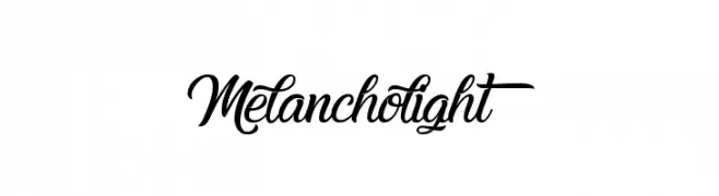
( Fonts by Octotype - www.foundmyfont.com - Personal-use only. For commercial use please contact owner. )
An elegant script font with flowing, decorative strokes.
![Melancholight font caratteri gratis]() Scaricare 858 Downloads@WebFont
Scaricare 858 Downloads@WebFont -
( Fonts by Leonard Posavec - leosupply.co - Personal-use only. For commercial use please contact owner. )
Bold, block-style font with a three-dimensional effect and thick outlines.
![Campus A Bold font caratteri gratis]() Scaricare 858 Downloads@WebFont
Scaricare 858 Downloads@WebFont -
( Fonts by skomii - Personal-use only. For commercial use please contact owner. )
A playful, handwritten font with tall, narrow letters and a casual style.
![AlwaysTogether font caratteri gratis]() Scaricare 858 Downloads@WebFont
Scaricare 858 Downloads@WebFont -
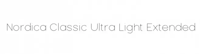
![Nordica Classic Ultra Light Extended font caratteri gratis]() Scaricare 858 Downloads@WebFont
Scaricare 858 Downloads@WebFont -
( Fonts by a Jayvee Enaguas - harvettfox96.deviantart.com. Personal-use only. For commercial use please contact owner. )
A bold, pixelated font with a retro, digital aesthetic.
![Pixel Operator SC Bold font caratteri gratis]() Scaricare 858 Downloads@WebFont
Scaricare 858 Downloads@WebFont -
( Fonts by Castcraft Software - opti.netii.net - check the website before use )
A classic calligraphic font with elegant, flowing strokes and refined serifs.
![AuthorCalligraphyOpti-Regular font caratteri gratis]() Scaricare 858 Downloads@WebFont
Scaricare 858 Downloads@WebFont -
( Fonts by a Nick Polyarush - alteran-x.deviantart.com . Personal-use only. For commercial use please contact owner. )
An artistic and abstract representation of Braille with decorative elements.
![Nox font caratteri gratis]() Scaricare 858 Downloads@WebFont
Scaricare 858 Downloads@WebFont -
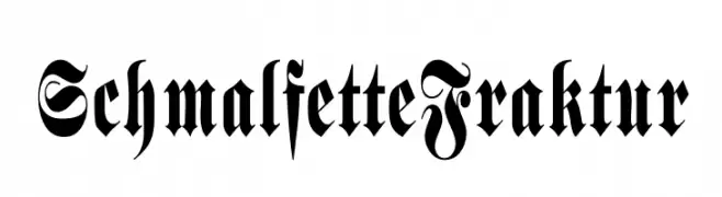
( Fonts by Dieter Steffmann )
A bold, intricate Blackletter typeface with dramatic curves and sharp angles.
![SchmalfetteFraktur font caratteri gratis]() Scaricare 858 Downloads@WebFont
Scaricare 858 Downloads@WebFont -
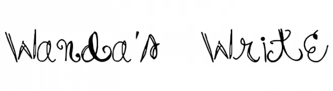
( Free for a personal use. For a commercial use please visit www.kevinandamanda.com )
A whimsical and playful font with curly, decorative letterforms.
![Wanda's Write font caratteri gratis]() Scaricare 858 Downloads@WebFont
Scaricare 858 Downloads@WebFont -
![AI kelso I font caratteri gratis]() Scaricare 858 Downloads@WebFont
Scaricare 858 Downloads@WebFont -
![ST Moviehead Ultra-condensed Bold font caratteri gratis]() Scaricare 858 Downloads@WebFont
Scaricare 858 Downloads@WebFont -
![DF Temple Heavy font caratteri gratis]() Scaricare 858 Downloads@WebFont
Scaricare 858 Downloads@WebFont -
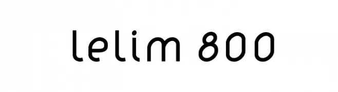
( Fonts by www.artill.de - Lukas Bischoff )
A modern geometric sans-serif font with clean lines and balanced proportions.
![lelim 800 font caratteri gratis]() Scaricare 858 Downloads@WebFont
Scaricare 858 Downloads@WebFont -
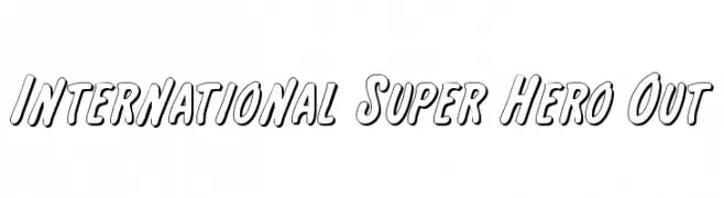
( Fonts by Daniel Zadorozny - www.iconian.com - Free for personal use )
A bold, outlined font with a playful, comic book style.
![International Super Hero Out font caratteri gratis]() Scaricare 858 Downloads@WebFont
Scaricare 858 Downloads@WebFont -
![BMUGAsianFont font caratteri gratis]() Scaricare 858 Downloads@WebFont
Scaricare 858 Downloads@WebFont -
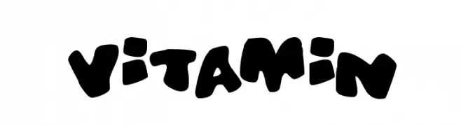
( Fonts by Jacob Fisher - www.pizzadude.dk )
A bold, playful font with chunky, rounded letters and a whimsical style.
![Vitamin font caratteri gratis]() Scaricare 858 Downloads@WebFont
Scaricare 858 Downloads@WebFont -
( Fonts by imagex - Personal-use only. For commercial use please contact owner. )
A bold, geometric typeface with a modern and assertive style.
![Boldfinger font caratteri gratis]() Scaricare 857 Downloads@WebFont
Scaricare 857 Downloads@WebFont -
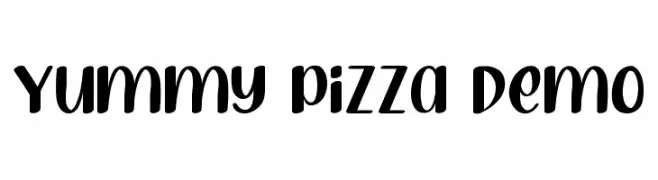
( Fonts by RaisProject )
A playful, bold font with rounded strokes and whimsical curves.
![Yummy Pizza Demo font caratteri gratis]() Scaricare 857 Downloads@WebFont
Scaricare 857 Downloads@WebFont -
( Fonts by Cristhian Gomez )
A sleek, modern, and slightly italic font with uniform stroke width.
![Tecnico Fino Inclinado font caratteri gratis]() Scaricare 857 Downloads@WebFont
Scaricare 857 Downloads@WebFont -
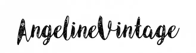
( Burntilldead Typefoundry - Eric Kurniawan - www.burntilldead.com/ )
A vintage script font with distressed texture and elegant cursive style.
![Angeline Vintage font caratteri gratis]() Scaricare 857 Downloads@WebFont
Scaricare 857 Downloads@WebFont -
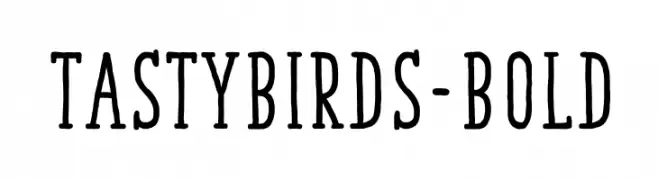
( Fonts by youssef-habchi.com - Personal-use only. For commercial use please contact owner. )
A playful, hand-drawn font with tall, narrow characters and a whimsical style.
![TastyBirds-Bold font caratteri gratis]() Scaricare 857 Downloads@WebFont
Scaricare 857 Downloads@WebFont -
![LEGEND OF THE WHITE LION font caratteri gratis]() Scaricare 857 Downloads@WebFont
Scaricare 857 Downloads@WebFont -
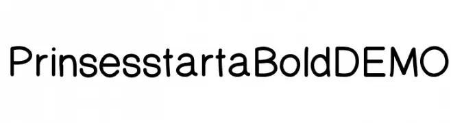
( Fonts by Shara Weber )
A modern, rounded sans-serif font with excellent readability.
![PrinsesstartaBoldDEMO font caratteri gratis]() Scaricare 857 Downloads@WebFont
Scaricare 857 Downloads@WebFont -
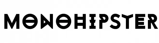
( Fonts by www.monofonts.com. Personal-use only. For commercial use please contact owner. )
A bold, geometric font with a modern and edgy style.
![Monohipster font caratteri gratis]() Scaricare 857 Downloads@WebFont
Scaricare 857 Downloads@WebFont -
( Fonts by Castcraft Software - opti.netii.net - check the website before use )
A classic serif font with elegant strokes and balanced proportions.
![OPTIDeligne-Normal font caratteri gratis]() Scaricare 857 Downloads@WebFont
Scaricare 857 Downloads@WebFont -
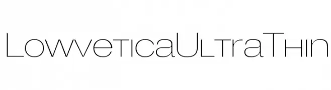
( Fonts by Mario Arturo - marioarturo.com. Personal-use only. For commercial use please contact owner. Contact the owner for a donation. )
A sleek, ultra-thin font with a modern and minimalist design.
![LowveticaUltraThin font caratteri gratis]() Scaricare 857 Downloads@WebFont
Scaricare 857 Downloads@WebFont


Quali sono i font più popolari adesso?
Poppins, Roboto, Montserrat, Open Sans e Lato sono molto usati per le forme pulite e l'ampia applicabilità — dall'identità di marca alle landing page e ai poster.
Quali font si usano spesso nei loghi?
Le sans serif geometriche (es. Poppins, famiglie in stile Gotham) sono scelte comuni per un branding pulito e scalabile. Per un tocco personale restano valide script e stili manoscritti. Abbina un display deciso per i titoli a un corpo testo neutro per riconoscibilità ed equilibrio.
Ogni quanto si aggiorna la lista?
Con regolarità, in base ai download e all'attività reale. Torna spesso per scoprire in anticipo le nuove preferite.
💡 Consiglio: aggiungi ai preferiti — le tendenze cambiano in fretta e i font top di oggi possono ispirare il rebranding di domani.