Benvenuto nelle Font Più Popolari — dove popolarità e qualità si incontrano. Qui trovi i font più scaricati e usati dell'anno. Se cerchi scelte sicure per logo, web o social, inizia da qui.
Ogni font top si distingue per equilibrio, leggibilità e versatilità. Troverai sans serif moderne, script eleganti, serif vintage e display minimalisti.
-
 Scaricare 840 Downloads@WebFont
 -
![advent Extra Light font caratteri gratis]() Scaricare 840 Downloads@WebFont
Scaricare 840 Downloads@WebFont -
( Fonts by www.peter-wiegel.de. Personal-use only. For commercial use please contact owner. )
A bold, calligraphic script font with dynamic strokes and angular edges.
![Avocado font caratteri gratis]() Scaricare 840 Downloads@WebFont
Scaricare 840 Downloads@WebFont -
![VKB KonQa Bold font caratteri gratis]() Scaricare 840 Downloads@WebFont
Scaricare 840 Downloads@WebFont -
( Fonts by bridgeco.jp )
A bold, geometric font with rounded edges and a modern style.
![disc_black font caratteri gratis]() Scaricare 840 Downloads@WebFont
Scaricare 840 Downloads@WebFont -
-
( Fonts by Nick Curtis - www.nicksfonts.com )
A bold, geometric font with Art Deco influences, ideal for impactful designs.
![ChippewaFallsNF font caratteri gratis]() Scaricare 840 Downloads@WebFont
Scaricare 840 Downloads@WebFont -
![Baveuse 3D font caratteri gratis]() Scaricare 840 Downloads@WebFont
Scaricare 840 Downloads@WebFont -
![AC1 Holly font caratteri gratis]() Scaricare 840 Downloads
Scaricare 840 Downloads -
![KaBlam! font caratteri gratis]() Scaricare 840 Downloads@WebFont
Scaricare 840 Downloads@WebFont -
( Fonts by Kong Font )
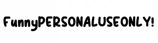
A playful, bold font with rounded, thick strokes and a whimsical, casual style.
![Funny PERSONAL USE ONLY! font caratteri gratis]() Scaricare 839 Downloads@WebFont
Scaricare 839 Downloads@WebFont -
( Fonts by Misti Hammers - mistifonts.com - Personal-use only. For commercial use please contact owner. )
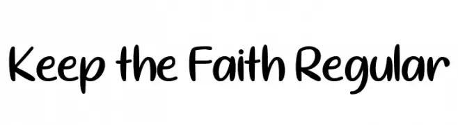
A playful, casual handwritten font with smooth, rounded edges.
![Keep the Faith Regular font caratteri gratis]() Scaricare 839 Downloads@WebFont
Scaricare 839 Downloads@WebFont -
( Fonts by Mia Cinelli - miacinelli.com - Personal-use only. For commercial use please contact owner. )
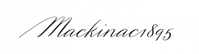
A sophisticated script font with fluid, cursive strokes and elegant flourishes.
![Mackinac 1895 font caratteri gratis]() Scaricare 839 Downloads@WebFont
Scaricare 839 Downloads@WebFont -
( Fonts by Yves Michel )
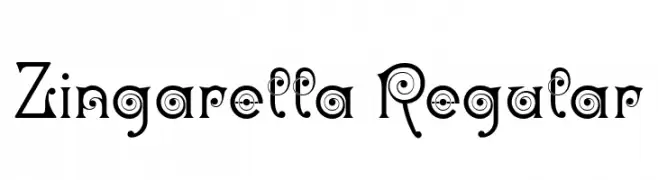
A whimsical, decorative font with spiral and swirl elements in each character.
![Zingarella Regular font caratteri gratis]() Scaricare 839 Downloads@WebFont
Scaricare 839 Downloads@WebFont -
( Fonts by Ivan Petrov - Personal-use only. For commercial use please contact owner. )
A refined serif typeface with high contrast and sharp serifs.
![Prata Regular font caratteri gratis]() Scaricare 839 Downloads@WebFont
Scaricare 839 Downloads@WebFont -
![King Lionel - Personal Use font caratteri gratis]() Scaricare 839 Downloads@WebFont
Scaricare 839 Downloads@WebFont -
( groenstudio - Ay Terry - creativemarket.com/groens )
An elegant script font with decorative swirls and modern flair.
![WolfBanePro font caratteri gratis]() Scaricare 839 Downloads@WebFont
Scaricare 839 Downloads@WebFont -
( Lettersiro Studio - Muhammad Sirojuddin - creativemarket.com/Lettersiro )
A bold, flowing script font with elegant, connected strokes.
![Mentega font caratteri gratis]() Scaricare 839 Downloads@WebFont
Scaricare 839 Downloads@WebFont -
![Sztylet Bold Oblique font caratteri gratis]() Scaricare 839 Downloads@WebFont
Scaricare 839 Downloads@WebFont -
( Fonts by MuraKnockout Media + Design - muraknockout.com. Personal-use only. For commercial use please contact owner. )
A bold, distressed font with a rugged, textured appearance.
![Tranquila DEMO font caratteri gratis]() Scaricare 839 Downloads@WebFont
Scaricare 839 Downloads@WebFont -
( Fonts by Castcraft Software - opti.netii.net - check the website before use )
An elegant, Art Deco-inspired font with geometric shapes and clean lines.
![OPTIDelphian font caratteri gratis]() Scaricare 839 Downloads@WebFont
Scaricare 839 Downloads@WebFont -
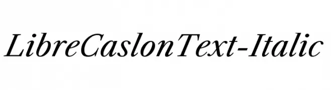
( Copyright (c) 2012, Pablo Impallari (www.impallari.com|impallari@gmail.com), Rodrigo Fuenzalida (www.rfuenzalida.com|hello@rfuenzalida.com), with Reserved Font Name Libre Caslon. )
A classic and elegant italic serif font with moderate contrast and refined serifs.
![LibreCaslonText-Italic font caratteri gratis]() Scaricare 839 Downloads@WebFont
Scaricare 839 Downloads@WebFont -
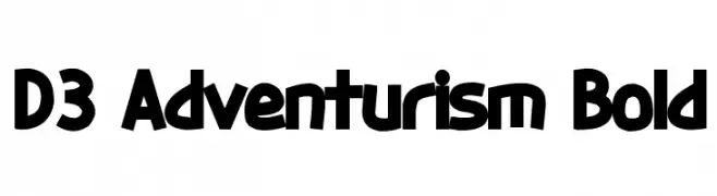
( Fonts by www.DigitalDreamDesign.net )
A bold, dynamic font with a playful and adventurous style.
![D3 Adventurism Bold font caratteri gratis]() Scaricare 839 Downloads@WebFont
Scaricare 839 Downloads@WebFont -
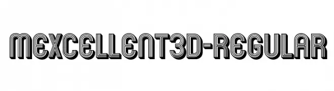
( Fonts by www.typodermicfonts.com - Ray Larabie )
A bold, three-dimensional font with a layered, geometric design.
![Mexcellent3D-Regular font caratteri gratis]() Scaricare 839 Downloads@WebFont
Scaricare 839 Downloads@WebFont -
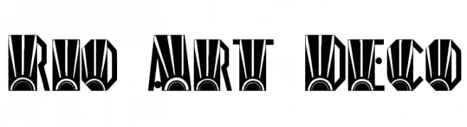
( Fonts by Renn Crump - http://moorstation.org/typoasis/designers/renncrump/ )
A bold, geometric Art Deco font with intricate detailing and strong vertical lines.
![Rio Art Deco font caratteri gratis]() Scaricare 839 Downloads
Scaricare 839 Downloads -
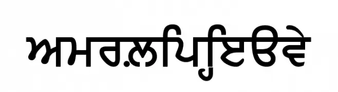
![AmrLipiHeavy font caratteri gratis]() Scaricare 839 Downloads@WebFont
Scaricare 839 Downloads@WebFont -
Caratteri di stamba. For commercial use please contact the owner.
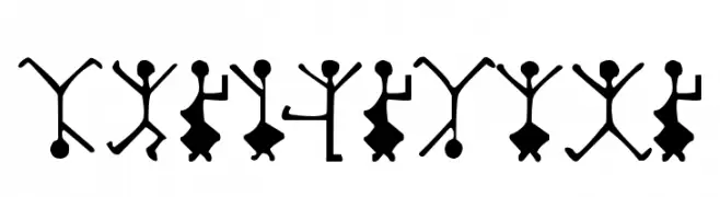
![DancingMen font caratteri gratis]() Scaricare 839 Downloads@WebFont
Scaricare 839 Downloads@WebFont -
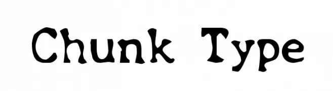
![Chunk Type font caratteri gratis]() Scaricare 839 Downloads@WebFont
Scaricare 839 Downloads@WebFont -
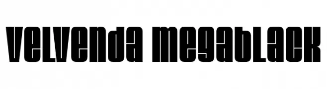
![Velvenda Megablack font caratteri gratis]() Scaricare 839 Downloads@WebFont
Scaricare 839 Downloads@WebFont -
![Supra Genius Curves BRK font caratteri gratis]() Scaricare 839 Downloads@WebFont
Scaricare 839 Downloads@WebFont -
( Fonts by Perspectype Studio - Letterena.com - Personal-use only. For commercial use please contact owner. )
A flowing, elegant handwritten font with a modern yet classic appeal.
![Beautiful Gelista font caratteri gratis]() Scaricare 838 Downloads@WebFont
Scaricare 838 Downloads@WebFont -
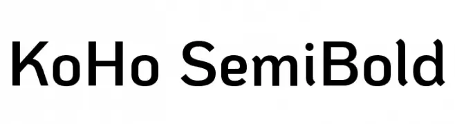
( Copyright 2018 The KoHo Project Authors (https://github.com/cadsondemak/Koho) )
A modern, semi-bold font with a clean, geometric design.
![KoHo SemiBold font caratteri gratis]() Scaricare 838 Downloads@WebFont
Scaricare 838 Downloads@WebFont -
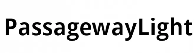
( Fonts by CannotIntoSpaceFonts - KineticPlasma Fonts - Personal-use only. For commercial use please contact owner. )
A clean, modern sans-serif font with geometric letterforms and uniform stroke width.
![Passageway Light font caratteri gratis]() Scaricare 838 Downloads@WebFont
Scaricare 838 Downloads@WebFont -
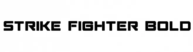
( Fonts by Iconian Fonts )
A bold, geometric font with a futuristic and industrial design.
![Strike Fighter Bold font caratteri gratis]() Scaricare 838 Downloads@WebFont
Scaricare 838 Downloads@WebFont -
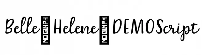
![Belle-Helene-DEMO Script font caratteri gratis]() Scaricare 838 Downloads@WebFont
Scaricare 838 Downloads@WebFont -
( Fonts by imagex )
A bold, textured font with a playful, hand-drawn style.
![Strange Tales font caratteri gratis]() Scaricare 838 Downloads@WebFont
Scaricare 838 Downloads@WebFont


Quali sono i font più popolari adesso?
Poppins, Roboto, Montserrat, Open Sans e Lato sono molto usati per le forme pulite e l'ampia applicabilità — dall'identità di marca alle landing page e ai poster.
Quali font si usano spesso nei loghi?
Le sans serif geometriche (es. Poppins, famiglie in stile Gotham) sono scelte comuni per un branding pulito e scalabile. Per un tocco personale restano valide script e stili manoscritti. Abbina un display deciso per i titoli a un corpo testo neutro per riconoscibilità ed equilibrio.
Ogni quanto si aggiorna la lista?
Con regolarità, in base ai download e all'attività reale. Torna spesso per scoprire in anticipo le nuove preferite.
💡 Consiglio: aggiungi ai preferiti — le tendenze cambiano in fretta e i font top di oggi possono ispirare il rebranding di domani.