Benvenuto nelle Font Più Popolari — dove popolarità e qualità si incontrano. Qui trovi i font più scaricati e usati dell'anno. Se cerchi scelte sicure per logo, web o social, inizia da qui.
Ogni font top si distingue per equilibrio, leggibilità e versatilità. Troverai sans serif moderne, script eleganti, serif vintage e display minimalisti.
-
( Copyright 2016 The Saira Project Authors (omnibus.type@gmail.com), with reserved font name "Saira". )
A bold, extra condensed font with high contrast and minimal spacing.
 Scaricare 835 Downloads@WebFont
 -
( Fonts by www.gliphmaker.com. Personal-use only. For commercial use please contact owner. )
A decorative and artistic font with intricate swirls and flourishes.
![Edisson font caratteri gratis]() Scaricare 835 Downloads@WebFont
Scaricare 835 Downloads@WebFont -
( Fonts by Maelle.K - Thomas Boucherie )
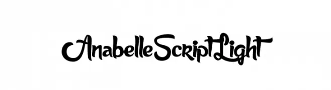
An elegant and flowing script font with smooth, continuous strokes.
![AnabelleScriptLight font caratteri gratis]() Scaricare 835 Downloads@WebFont
Scaricare 835 Downloads@WebFont -
( www.leodsen.com )
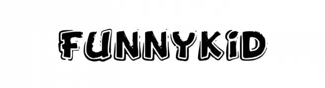
A playful, bold font with a cartoonish style and shadow effect.
![FunnyKid font caratteri gratis]() Scaricare 835 Downloads@WebFont
Scaricare 835 Downloads@WebFont -
( Fonts by developer.android.com )
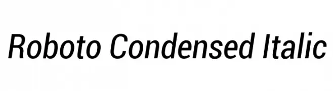
A modern, condensed sans-serif typeface with an italic style, offering clarity and efficiency.
![Roboto Condensed Italic font caratteri gratis]() Scaricare 835 Downloads@WebFont
Scaricare 835 Downloads@WebFont -
-
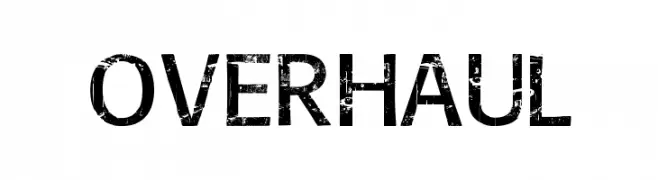
![Overhaul font caratteri gratis]() Scaricare 835 Downloads@WebFont
Scaricare 835 Downloads@WebFont -
( Fonts by weknow - Wino S Kadir )
A sleek, modern font with rounded, slanted characters.
![my font font caratteri gratis]() Scaricare 835 Downloads@WebFont
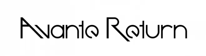
Scaricare 835 Downloads@WebFont -
![Avante Return font caratteri gratis]() Scaricare 835 Downloads@WebFont
Scaricare 835 Downloads@WebFont -
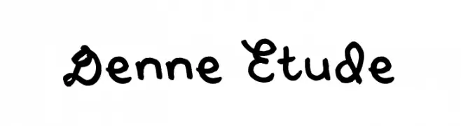
( Fonts by Denise Bentulan - douxiegirl.com. Personal-use only. For commercial use please contact owner. )
A playful, handwritten font with smooth curves and consistent thickness.
![Denne Etude font caratteri gratis]() Scaricare 835 Downloads@WebFont
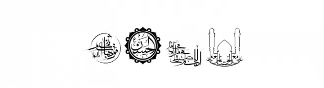
Scaricare 835 Downloads@WebFont -
![SHia font caratteri gratis]() Scaricare 835 Downloads@WebFont
Scaricare 835 Downloads@WebFont -
![Cosmoscandy font caratteri gratis]() Scaricare 835 Downloads@WebFont
Scaricare 835 Downloads@WebFont -
![Jandles font caratteri gratis]() Scaricare 835 Downloads@WebFont
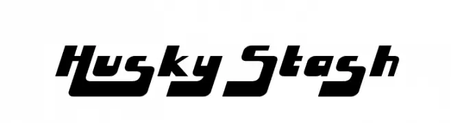
Scaricare 835 Downloads@WebFont -
![Husky Stash font caratteri gratis]() Scaricare 835 Downloads@WebFont
Scaricare 835 Downloads@WebFont -
( Fonts by huawei.com - Personal-use only. For commercial use please contact owner. )
A modern, geometric sans-serif font with balanced proportions and clear readability.
![HarmonyOS Sans SC Medium font caratteri gratis]() Scaricare 834 Downloads@WebFont
Scaricare 834 Downloads@WebFont -
( Fonts by Guaraldo Fonts - Personal-use only. For commercial use please contact owner. )
A bold, distressed font with a vintage, textured appearance.
![She Rocks Personal Use font caratteri gratis]() Scaricare 834 Downloads@WebFont
Scaricare 834 Downloads@WebFont -
( Fonts by www.movefont .com - Personal-use only. For commercial use please contact owner. )
An elegant script font with flowing, cursive letterforms and ornate details.
![Agradian Demo font caratteri gratis]() Scaricare 834 Downloads@WebFont
Scaricare 834 Downloads@WebFont -
( Fonts by DigitypeStudio - Personal-use only. For commercial use please contact owner. )
An elegant serif typeface with refined strokes and high contrast, perfect for sophisticated designs.
![Maginia-Regular font caratteri gratis]() Scaricare 834 Downloads@WebFont
Scaricare 834 Downloads@WebFont -
( Fonts by share font )
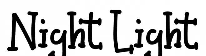
A playful, hand-drawn font with a whimsical and dynamic style.
![Night Light font caratteri gratis]() Scaricare 834 Downloads@WebFont
Scaricare 834 Downloads@WebFont -
( Copyright 2018 The K2D Project Authors (https://github.com/cadsondemak/K2D) )
A bold, modern sans-serif font with rounded, geometric characters.
![K2D Bold font caratteri gratis]() Scaricare 834 Downloads@WebFont
Scaricare 834 Downloads@WebFont -
( Fonts by Typographer Mediengestaltung - Personal-use only. For commercial use please contact owner. )
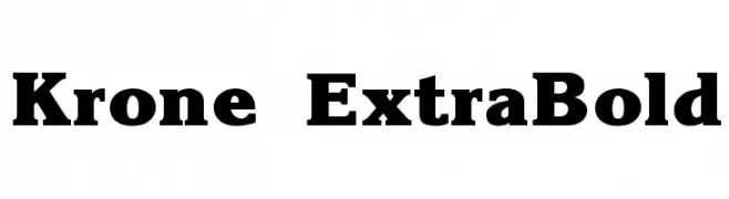
A bold, robust serif font with a strong, authoritative presence.
![Krone ExtraBold font caratteri gratis]() Scaricare 834 Downloads@WebFont
Scaricare 834 Downloads@WebFont -
( Fonts by Matt Bailey - Personal-use only. For commercial use please contact owner. )
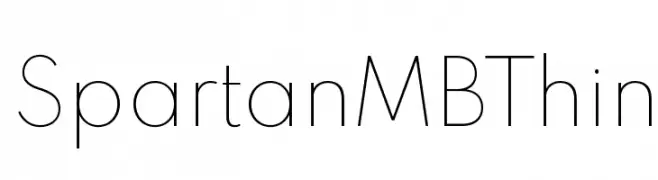
A thin, minimalist font with clean lines and balanced spacing.
![Spartan MB Thin font caratteri gratis]() Scaricare 834 Downloads@WebFont
Scaricare 834 Downloads@WebFont -
( Fonts by typedepot - Personal-use only. For commercial use please contact owner. )
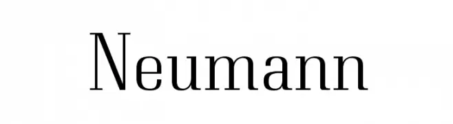
A modern serif font with elegant letterforms and medium contrast.
![Neumann font caratteri gratis]() Scaricare 834 Downloads@WebFont
Scaricare 834 Downloads@WebFont -
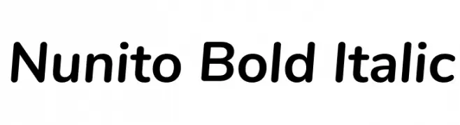
( Copyright 2014 The Nunito Project Authors (contact@sansoxygen.com) )
A bold, italic, modern sans-serif font with smooth curves and medium contrast.
![Nunito Bold Italic font caratteri gratis]() Scaricare 834 Downloads@WebFont
Scaricare 834 Downloads@WebFont -
![anthem font caratteri gratis]() Scaricare 834 Downloads@WebFont
Scaricare 834 Downloads@WebFont -
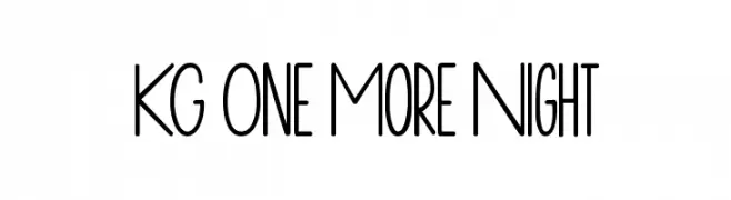
( Fonts by www.kimberlygeswein.com - Kimberly Geswein )
A playful, hand-drawn font with tall, narrow letters and a whimsical style.
![KG One More Night font caratteri gratis]() Scaricare 834 Downloads@WebFont
Scaricare 834 Downloads@WebFont -
( Fonts by Style-7 - www.styleseven.com - Personal-use only. For commercial use please contact owner. )
A pixelated, retro-style font inspired by early digital graphics.
![Computer Pixel-7 font caratteri gratis]() Scaricare 834 Downloads@WebFont
Scaricare 834 Downloads@WebFont -
( Fonts by Daniel Zadorozny - www.iconian.com - Free for personal use )
A bold, 3D italic font with outlined characters and a dynamic style.
![G.I. Incognito 3D Italic font caratteri gratis]() Scaricare 834 Downloads@WebFont
Scaricare 834 Downloads@WebFont -
( Fonts by Arkandis Digital Foundry )
A bold, italic serif font with classic elegance and dynamic style.
![VenturisADFCd-BoldItalic font caratteri gratis]() Scaricare 834 Downloads@WebFont
Scaricare 834 Downloads@WebFont -
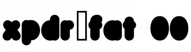
( Fonts by www.tipografea.com )
A bold, playful font with rounded, bubble-like characters.
![xpdr_fat 00 font caratteri gratis]() Scaricare 834 Downloads@WebFont
Scaricare 834 Downloads@WebFont -
![Cee's Hand font caratteri gratis]() Scaricare 834 Downloads@WebFont
Scaricare 834 Downloads@WebFont -
( - www.matiescanalesgonzalez.com )
An organic, tree bark-inspired font with intricate, hand-carved details.
![Gill Tree font caratteri gratis]() Scaricare 834 Downloads@WebFont
Scaricare 834 Downloads@WebFont -
( Fonts by www.typodermicfonts.com - Ray Larabie )
A bold, blocky font with uniform width and tight spacing.
![VelvendaMegablack-Regular font caratteri gratis]() Scaricare 834 Downloads@WebFont
Scaricare 834 Downloads@WebFont -
( Fonts by Tobias Benjamin Kohler - www.uncia.de )
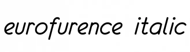
A sleek, italicized font with smooth curves and a modern aesthetic.
![eurofurence italic font caratteri gratis]() Scaricare 834 Downloads@WebFont
Scaricare 834 Downloads@WebFont -
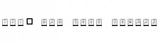
![101! Dad Goes Formal font caratteri gratis]() Scaricare 834 Downloads@WebFont
Scaricare 834 Downloads@WebFont -
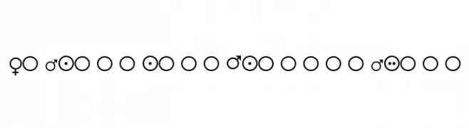
![Female-and-Male-Symbols font caratteri gratis]() Scaricare 834 Downloads@WebFont
Scaricare 834 Downloads@WebFont


Quali sono i font più popolari adesso?
Poppins, Roboto, Montserrat, Open Sans e Lato sono molto usati per le forme pulite e l'ampia applicabilità — dall'identità di marca alle landing page e ai poster.
Quali font si usano spesso nei loghi?
Le sans serif geometriche (es. Poppins, famiglie in stile Gotham) sono scelte comuni per un branding pulito e scalabile. Per un tocco personale restano valide script e stili manoscritti. Abbina un display deciso per i titoli a un corpo testo neutro per riconoscibilità ed equilibrio.
Ogni quanto si aggiorna la lista?
Con regolarità, in base ai download e all'attività reale. Torna spesso per scoprire in anticipo le nuove preferite.
💡 Consiglio: aggiungi ai preferiti — le tendenze cambiano in fretta e i font top di oggi possono ispirare il rebranding di domani.