Benvenuto nelle Font Più Popolari — dove popolarità e qualità si incontrano. Qui trovi i font più scaricati e usati dell'anno. Se cerchi scelte sicure per logo, web o social, inizia da qui.
Ogni font top si distingue per equilibrio, leggibilità e versatilità. Troverai sans serif moderne, script eleganti, serif vintage e display minimalisti.
-
 Scaricare 832 Downloads@WebFont
 -
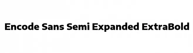
( Copyright 2012 The Encode Project Authors (impallari@gmail.com), with Reserved Font Name "Encode Sansâ€. )
A bold, semi-expanded sans-serif font with a modern and clean design.
![Encode Sans Semi Expanded ExtraBold font caratteri gratis]() Scaricare 832 Downloads@WebFont
Scaricare 832 Downloads@WebFont -
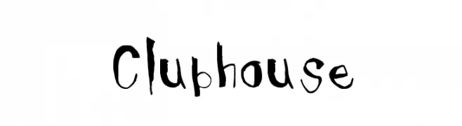
Caratteri di NicholasJudy456. For commercial use please contact the owner.
![Clubhouse font caratteri gratis]() Scaricare 832 Downloads@WebFont
Scaricare 832 Downloads@WebFont -
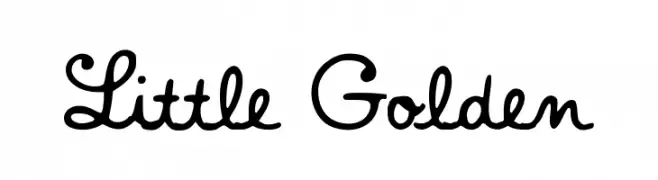
( Fonts by a fontgrill.com. Personal-use only. For commercial use please contact owner. )
A playful, hand-drawn script font with smooth curves and loops.
![Little Golden font caratteri gratis]() Scaricare 832 Downloads@WebFont
Scaricare 832 Downloads@WebFont -
( Fonts by Daniel Zadorozny - www.iconian.com )
A bold, jagged font with a hand-drawn, spooky aesthetic.
![Young Frankenstein Regular font caratteri gratis]() Scaricare 832 Downloads@WebFont
Scaricare 832 Downloads@WebFont -
( Fonts by Chris Vile - fontmonger.com - Personal-use only. For commercial use please contact owner. )
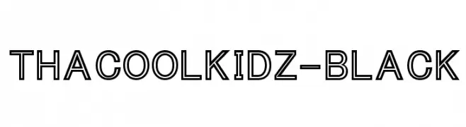
A bold, outlined font with a modern and geometric style.
![ThaCoolKidz-Black font caratteri gratis]() Scaricare 832 Downloads@WebFont
Scaricare 832 Downloads@WebFont -
( www.styleseven.com/ )
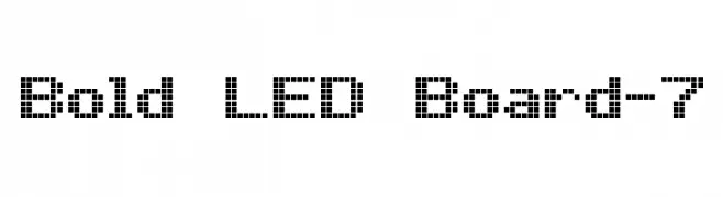
A pixelated, LED-inspired font with a retro digital aesthetic.
![Bold LED Board-7 font caratteri gratis]() Scaricare 832 Downloads@WebFont
Scaricare 832 Downloads@WebFont -
( Fonts by exe.vis.ne.jp )
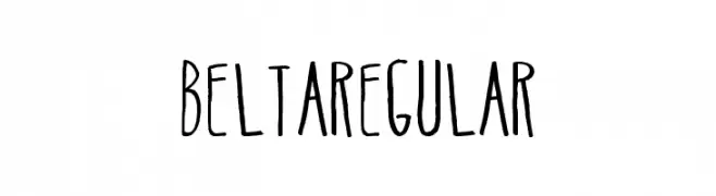
A playful, hand-drawn font with tall, narrow letterforms and a whimsical style.
![BeltaRegular font caratteri gratis]() Scaricare 832 Downloads@WebFont
Scaricare 832 Downloads@WebFont -
( Fonts by Grzegorz l - www.glukfonts.pl )
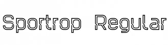
A modern, geometric font with a double-line, outlined style.
![Sportrop Regular font caratteri gratis]() Scaricare 832 Downloads@WebFont
Scaricare 832 Downloads@WebFont -
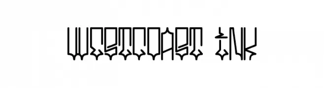
![westcoast ink font caratteri gratis]() Scaricare 832 Downloads@WebFont
Scaricare 832 Downloads@WebFont -
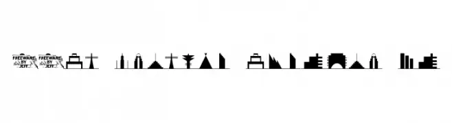
( Fonts by Jeff Levine. FREEWARE )
A font of modern skyline silhouettes with a futuristic touch.
![21st Century Skyline JL font caratteri gratis]() Scaricare 832 Downloads@WebFont
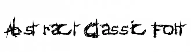
Scaricare 832 Downloads@WebFont -
![AbstractClassicFont font caratteri gratis]() Scaricare 832 Downloads@WebFont
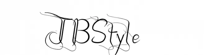
Scaricare 832 Downloads@WebFont -
![JBStyle font caratteri gratis]() Scaricare 832 Downloads@WebFont
Scaricare 832 Downloads@WebFont -
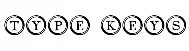
( Fonts by www.typadelic.com )
A vintage typewriter-inspired font with characters encased in circles, offering a bold and classic look.
![Type Keys font caratteri gratis]() Scaricare 832 Downloads@WebFont
Scaricare 832 Downloads@WebFont -
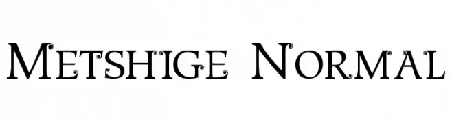
![Metshige Normal font caratteri gratis]() Scaricare 832 Downloads@WebFont
Scaricare 832 Downloads@WebFont -
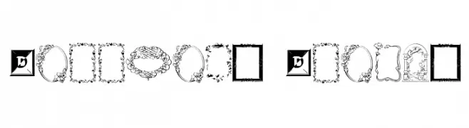
![Darrians Frames font caratteri gratis]() Scaricare 832 Downloads@WebFont
Scaricare 832 Downloads@WebFont -
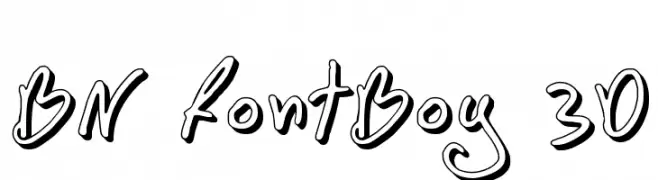
( Font by Ben Nathan - www.hafontia.com )
A playful, 3D-effect font with a hand-drawn, whimsical style.
![BN FontBoy 3D font caratteri gratis]() Scaricare 832 Downloads@WebFont
Scaricare 832 Downloads@WebFont -
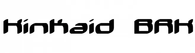
![Kinkaid BRK font caratteri gratis]() Scaricare 832 Downloads@WebFont
Scaricare 832 Downloads@WebFont -
( Fonts by www.houseoflime.com )
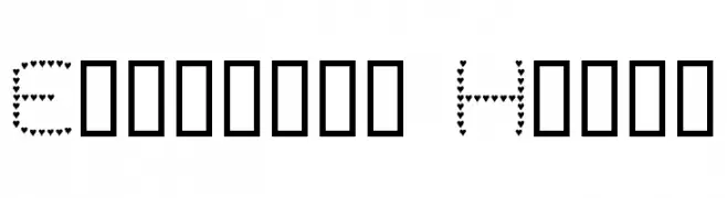
A playful font composed entirely of small heart shapes, perfect for romantic and whimsical designs.
![Evelyn's Heart font caratteri gratis]() Scaricare 832 Downloads@WebFont
Scaricare 832 Downloads@WebFont -
( Fonts by Fenotype - Emil Bertell - Personal-use only. For commercial use please contact owner. )
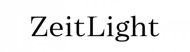
A refined serif font with elegant, thin strokes and high contrast.
![Zeit Light font caratteri gratis]() Scaricare 831 Downloads@WebFont
Scaricare 831 Downloads@WebFont -
( Fonts by Eko Bimantara - Personal-use only. For commercial use please contact owner. )
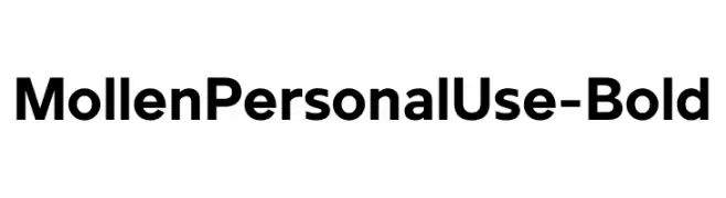
A bold, modern sans-serif font with clean, geometric lines.
![MollenPersonalUse-Bold font caratteri gratis]() Scaricare 831 Downloads@WebFont
Scaricare 831 Downloads@WebFont -
( Fonts by Woodcutter )
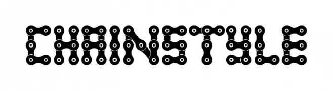
A decorative font styled like interconnected bicycle chains.
![Chain Style font caratteri gratis]() Scaricare 831 Downloads@WebFont
Scaricare 831 Downloads@WebFont -
( Casey Burns - caseyburns.com )
A bold, playful font with rounded, hand-drawn characters.
![Squa Tront! font caratteri gratis]() Scaricare 831 Downloads@WebFont
Scaricare 831 Downloads@WebFont -
( Fonts by Webcodesigns )
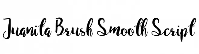
A smooth, brush-style script font with elegant, flowing characters.
![Juanita Brush Smooth Script font caratteri gratis]() Scaricare 831 Downloads@WebFont
Scaricare 831 Downloads@WebFont -
( Fonts by www.studiotypo.com - Personal-use only. For commercial use please contact owner. )
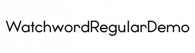
A modern sans-serif font with geometric structure and balanced appearance.
![Watchword Regular Demo font caratteri gratis]() Scaricare 831 Downloads@WebFont
Scaricare 831 Downloads@WebFont -
( Copyright (c) 2015, Cadson Demak (info@cadsondemak.com) )
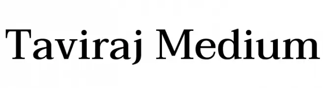
A classic serif font with medium weight and balanced readability.
![Taviraj Medium font caratteri gratis]() Scaricare 831 Downloads@WebFont
Scaricare 831 Downloads@WebFont -
( Fonts by Muskaters )
A bold, flowing script font with elegant curves and dynamic energy.
![Muskaters font caratteri gratis]() Scaricare 831 Downloads@WebFont
Scaricare 831 Downloads@WebFont -
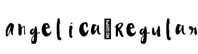
![Angelica-Regular font caratteri gratis]() Scaricare 831 Downloads@WebFont
Scaricare 831 Downloads@WebFont -
( Fonts by Style-7 - www.styleseven.com - Personal-use only. For commercial use please contact owner. )
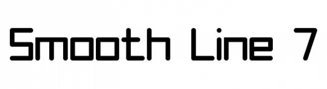
A modern, geometric font with rounded edges and a clean, uniform appearance.
![Smooth Line 7 font caratteri gratis]() Scaricare 831 Downloads@WebFont
Scaricare 831 Downloads@WebFont -
( گالری فانت فارسی پژوهش آريانا - only compatible with Farsi and Arabic )
A bold, elegant script font with a dynamic and sophisticated style.
![Lotus Bold font caratteri gratis]() Scaricare 831 Downloads@WebFont
Scaricare 831 Downloads@WebFont -
( Fonts by Press Gang Studios - Andeh Pinkard - www.pressgang-studios.com )
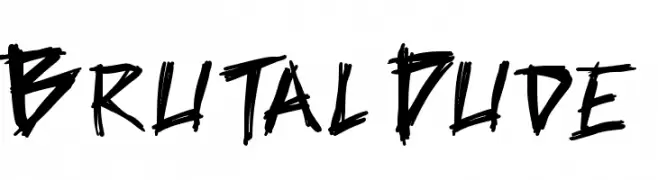
A bold, jagged, hand-drawn font with an edgy and energetic style.
![Brutal Dude font caratteri gratis]() Scaricare 831 Downloads@WebFont
Scaricare 831 Downloads@WebFont -
( Fonts by Rodrigo German - RASDESIGN )
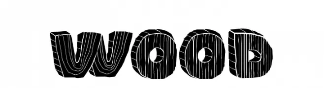
A bold, decorative font with a wood grain texture, ideal for rustic and organic designs.
![WOOD font caratteri gratis]() Scaricare 831 Downloads@WebFont
Scaricare 831 Downloads@WebFont -
( Fonts by Manfred Klein. Free for private and charity use. Free for commercial with donation to organizations )
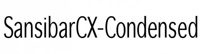
A modern, condensed sans-serif font with a clean and professional look.
![SansibarCX-Condensed font caratteri gratis]() Scaricare 831 Downloads@WebFont
Scaricare 831 Downloads@WebFont -
![Abe Regular font caratteri gratis]() Scaricare 831 Downloads@WebFont
Scaricare 831 Downloads@WebFont -
( Fonts by Altsys Metamorphosis )
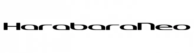
A modern, sleek font with a futuristic and geometric design.
![HarabaraNeo font caratteri gratis]() Scaricare 831 Downloads@WebFont
Scaricare 831 Downloads@WebFont


Quali sono i font più popolari adesso?
Poppins, Roboto, Montserrat, Open Sans e Lato sono molto usati per le forme pulite e l'ampia applicabilità — dall'identità di marca alle landing page e ai poster.
Quali font si usano spesso nei loghi?
Le sans serif geometriche (es. Poppins, famiglie in stile Gotham) sono scelte comuni per un branding pulito e scalabile. Per un tocco personale restano valide script e stili manoscritti. Abbina un display deciso per i titoli a un corpo testo neutro per riconoscibilità ed equilibrio.
Ogni quanto si aggiorna la lista?
Con regolarità, in base ai download e all'attività reale. Torna spesso per scoprire in anticipo le nuove preferite.
💡 Consiglio: aggiungi ai preferiti — le tendenze cambiano in fretta e i font top di oggi possono ispirare il rebranding di domani.