Benvenuto nelle Font Più Popolari — dove popolarità e qualità si incontrano. Qui trovi i font più scaricati e usati dell'anno. Se cerchi scelte sicure per logo, web o social, inizia da qui.
Ogni font top si distingue per equilibrio, leggibilità e versatilità. Troverai sans serif moderne, script eleganti, serif vintage e display minimalisti.
-
( Fonts by Alit Design - Alit Suarnegara - Personal-use only. For commercial use please contact owner. )
A bold, hand-drawn font with an expressive and dynamic style.
 Scaricare 185 Downloads@WebFont
 -
( Fonts by Apostrophic Lab )
A decorative font with medieval-inspired, ornate letterforms.
![Immortal - Alternates font caratteri gratis]() Scaricare 185 Downloads@WebFont
Scaricare 185 Downloads@WebFont -
( Fonts by weknow )
A bold, geometric font with angular and sharp edges, ideal for modern designs.
![HUMAN ALTER EGO font caratteri gratis]() Scaricare 185 Downloads@WebFont
Scaricare 185 Downloads@WebFont -
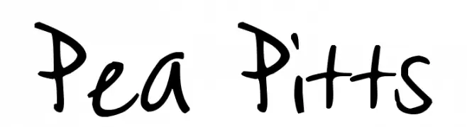
( Free for a personal use. For a commercial use please visit www.kevinandamanda.com )
A playful, handwritten font with bold, consistent strokes and a casual style.
![Pea Pitts font caratteri gratis]() Scaricare 185 Downloads@WebFont
Scaricare 185 Downloads@WebFont -
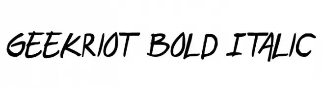
( Fonts by Press Gang Studios - Andeh Pinkard - www.pressgang-studios.com )
A bold, italic, handwritten font with dynamic and energetic style.
![geekriot Bold Italic font caratteri gratis]() Scaricare 185 Downloads@WebFont
Scaricare 185 Downloads@WebFont -
-
( Fonts by Shara Weber )
A playful, dot-accented font with bold, rounded characters.
![GelDotica font caratteri gratis]() Scaricare 185 Downloads@WebFont
Scaricare 185 Downloads@WebFont -
( memesbruh03 - Aaron D. Chand )
A pixelated, retro-style font with a digital, blocky appearance.
![2A03 font caratteri gratis]() Scaricare 185 Downloads@WebFont
Scaricare 185 Downloads@WebFont -
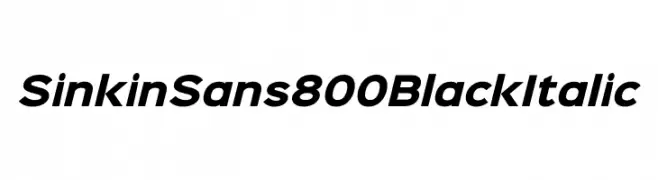
( K-Type - www.k-type.com )
A bold, italicized sans-serif font with a modern and assertive style.
![Sinkin Sans 800 Black Italic font caratteri gratis]() Scaricare 185 Downloads@WebFont
Scaricare 185 Downloads@WebFont -
( Fonts by Mikko Sumulong - Mix Fonts - mixfonts.com - Personal-use only. For commercial use please contact owner. )
A playful, bold font with rounded edges and a modern aesthetic.
![MixJib font caratteri gratis]() Scaricare 185 Downloads@WebFont
Scaricare 185 Downloads@WebFont -
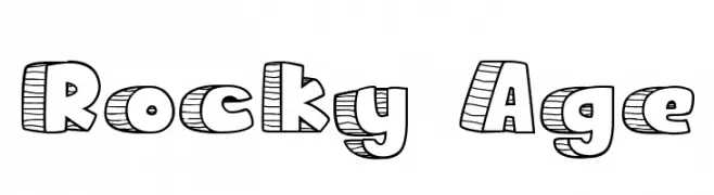
( Fonts by Tokokoo Studio )
A playful, hand-drawn font with a textured, rock-like appearance.
![Rocky Age font caratteri gratis]() Scaricare 185 Downloads@WebFont
Scaricare 185 Downloads@WebFont


Quali sono i font più popolari adesso?
Poppins, Roboto, Montserrat, Open Sans e Lato sono molto usati per le forme pulite e l'ampia applicabilità — dall'identità di marca alle landing page e ai poster.
Quali font si usano spesso nei loghi?
Le sans serif geometriche (es. Poppins, famiglie in stile Gotham) sono scelte comuni per un branding pulito e scalabile. Per un tocco personale restano valide script e stili manoscritti. Abbina un display deciso per i titoli a un corpo testo neutro per riconoscibilità ed equilibrio.
Ogni quanto si aggiorna la lista?
Con regolarità, in base ai download e all'attività reale. Torna spesso per scoprire in anticipo le nuove preferite.
💡 Consiglio: aggiungi ai preferiti — le tendenze cambiano in fretta e i font top di oggi possono ispirare il rebranding di domani.