Benvenuto nelle Font Più Popolari — dove popolarità e qualità si incontrano. Qui trovi i font più scaricati e usati dell'anno. Se cerchi scelte sicure per logo, web o social, inizia da qui.
Ogni font top si distingue per equilibrio, leggibilità e versatilità. Troverai sans serif moderne, script eleganti, serif vintage e display minimalisti.
-
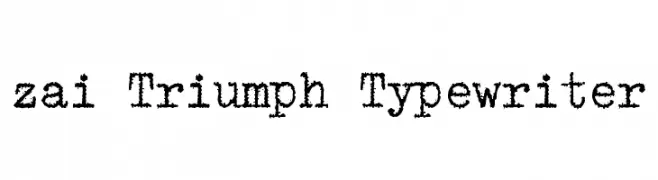
( Fonts by Tomasz Skowronski - Personal-use only. For commercial use please contact owner. )
A vintage, distressed typewriter-style font with a rugged, monospaced design.
 Scaricare 185 Downloads@WebFont
 -
( Fonts by ShyFonts )
A bold, playful font with a three-dimensional shadow effect.
![SF Hallucination Shadow font caratteri gratis]() Scaricare 185 Downloads@WebFont
Scaricare 185 Downloads@WebFont -
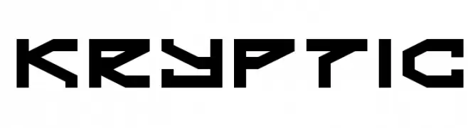
( Fonts by dustBUST - Andreas Nylin )
A bold, geometric font with a futuristic and angular design.
![Kryptic font caratteri gratis]() Scaricare 185 Downloads@WebFont
Scaricare 185 Downloads@WebFont -
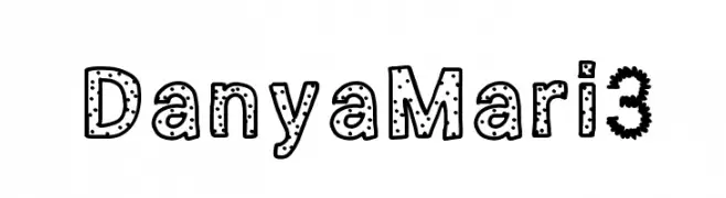
![DanyaMari3 font caratteri gratis]() Scaricare 185 Downloads@WebFont
Scaricare 185 Downloads@WebFont -
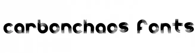
![carbonchaos fonts font caratteri gratis]() Scaricare 185 Downloads@WebFont
Scaricare 185 Downloads@WebFont -
-
![Cronus Italic font caratteri gratis]() Scaricare 185 Downloads@WebFont
Scaricare 185 Downloads@WebFont -
![Pedrosky Regular font caratteri gratis]() Scaricare 185 Downloads@WebFont
Scaricare 185 Downloads@WebFont -
( Fonts by www.chequered.ink - Chequered Ink - Personal-use only. For commercial use please contact owner. )
A bold, angular font with a strong, cohesive design.
![Scones and Crossbows Regular font caratteri gratis]() Scaricare 185 Downloads@WebFont
Scaricare 185 Downloads@WebFont -
( Free for a personal use. For a commercial use please visit www.kevinandamanda.com )
A playful, casual handwritten font with irregular strokes and a whimsical style.
![Pea Jokilyn font caratteri gratis]() Scaricare 185 Downloads@WebFont
Scaricare 185 Downloads@WebFont -
![Geddes Narrow Bold font caratteri gratis]() Scaricare 185 Downloads@WebFont
Scaricare 185 Downloads@WebFont


Quali sono i font più popolari adesso?
Poppins, Roboto, Montserrat, Open Sans e Lato sono molto usati per le forme pulite e l'ampia applicabilità — dall'identità di marca alle landing page e ai poster.
Quali font si usano spesso nei loghi?
Le sans serif geometriche (es. Poppins, famiglie in stile Gotham) sono scelte comuni per un branding pulito e scalabile. Per un tocco personale restano valide script e stili manoscritti. Abbina un display deciso per i titoli a un corpo testo neutro per riconoscibilità ed equilibrio.
Ogni quanto si aggiorna la lista?
Con regolarità, in base ai download e all'attività reale. Torna spesso per scoprire in anticipo le nuove preferite.
💡 Consiglio: aggiungi ai preferiti — le tendenze cambiano in fretta e i font top di oggi possono ispirare il rebranding di domani.