Benvenuto nelle Font Più Popolari — dove popolarità e qualità si incontrano. Qui trovi i font più scaricati e usati dell'anno. Se cerchi scelte sicure per logo, web o social, inizia da qui.
Ogni font top si distingue per equilibrio, leggibilità e versatilità. Troverai sans serif moderne, script eleganti, serif vintage e display minimalisti.
-
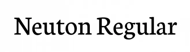
( Copyright 2010 The Neuton Project Authors (http://www.21326.info/), with Reserved Font Name "Neuton". )
A classic serif typeface with modern elegance and excellent readability.
 Scaricare 7427 Downloads@WebFont
 -
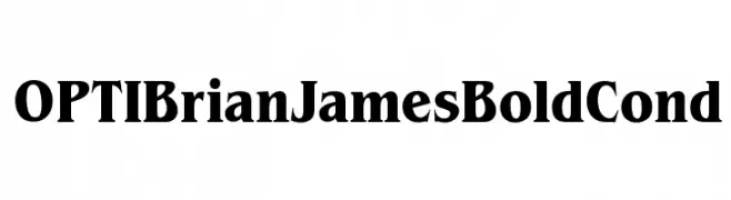
( Fonts by Castcraft Software - opti.netii.net - check the website before use )
A bold, high-contrast serif font with a classic and authoritative style.
![OPTIBrianJamesBoldCond font caratteri gratis]() Scaricare 7425 Downloads@WebFont
Scaricare 7425 Downloads@WebFont -
![Akhar font caratteri gratis]() Scaricare 7414 Downloads@WebFont
Scaricare 7414 Downloads@WebFont -
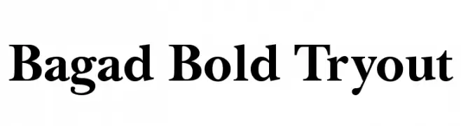
![Bagad Bold Tryout font caratteri gratis]() Scaricare 7412 Downloads@WebFont
Scaricare 7412 Downloads@WebFont -
( Fonts by Neale Davidson - www.pixelsagas.com )
A bold, geometric font with strong, modern letterforms.
![Artifact font caratteri gratis]() Scaricare 7406 Downloads@WebFont
Scaricare 7406 Downloads@WebFont -
-
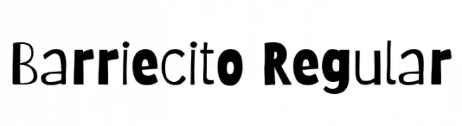
( Copyright 2018 The Barriecito Project Authors (https://github.com/Omnibus-Type/Barrio/Barriecito) )
A playful and quirky font with a hand-drawn feel and dynamic strokes.
![Barriecito Regular font caratteri gratis]() Scaricare 7403 Downloads@WebFont
Scaricare 7403 Downloads@WebFont -
( Fonts by David Rakowski )
An artistic and elegant font with elongated strokes and high contrast, ideal for decorative use.
![Benjamin Regular font caratteri gratis]() Scaricare 7402 Downloads@WebFont
Scaricare 7402 Downloads@WebFont -
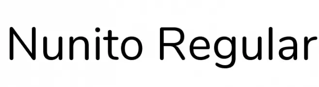
( Copyright 2014 The Nunito Project Authors (contact@sansoxygen.com) )
A modern, rounded sans-serif font with clean lines and balanced spacing.
![Nunito Regular font caratteri gratis]() Scaricare 7400 Downloads@WebFont
Scaricare 7400 Downloads@WebFont -
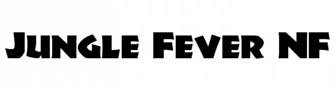
( Fonts by Nick Curtis - www.nicksfonts.com )
A bold, dynamic font with angular cuts and a playful, adventurous style.
![Jungle Fever NF font caratteri gratis]() Scaricare 7400 Downloads@WebFont
Scaricare 7400 Downloads@WebFont -
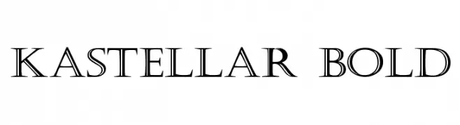
![Kastellar Bold font caratteri gratis]() Scaricare 7397 Downloads@WebFont
Scaricare 7397 Downloads@WebFont -
![Caramella font caratteri gratis]() Scaricare 7391 Downloads@WebFont
Scaricare 7391 Downloads@WebFont -
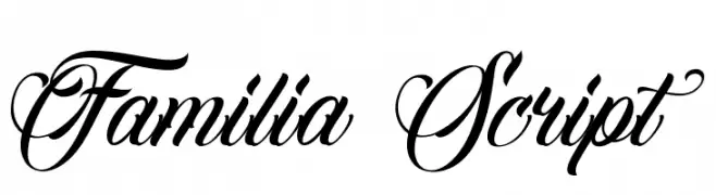
( Letrasupply Typefoundry - letrasupply.bigcartel.com )
An elegant and sophisticated script typeface with flowing, cursive letters and ornate uppercase characters.
![Familia Script font caratteri gratis]() Scaricare 7389 Downloads@WebFont
Scaricare 7389 Downloads@WebFont -
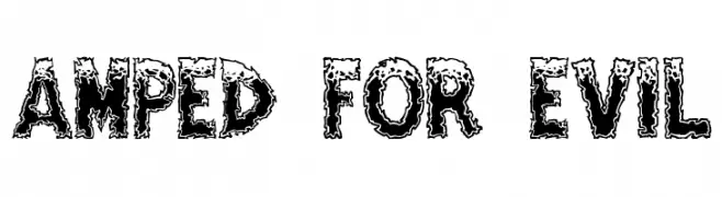
( Fonts by Ryan Splint )
A bold, distressed font with a rugged, grunge-like appearance.
![Amped For Evil font caratteri gratis]() Scaricare 7385 Downloads@WebFont
Scaricare 7385 Downloads@WebFont -
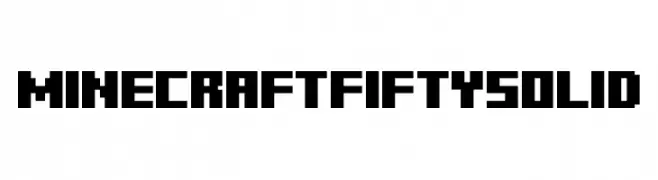
( Fonts by Fifty Walrus - Personal-use only. For commercial use please contact owner. )
A bold, pixelated font ideal for retro and digital-themed projects.
![Minecraft Fifty Solid font caratteri gratis]() Scaricare 7380 Downloads@WebFont
Scaricare 7380 Downloads@WebFont -
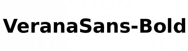
( Fonts by Arkandis Digital Foundry )
A bold, modern sans-serif font with strong, uniform strokes and excellent readability.
![VeranaSans-Bold font caratteri gratis]() Scaricare 7380 Downloads@WebFont
Scaricare 7380 Downloads@WebFont -
![Macarena font caratteri gratis]() Scaricare 7379 Downloads
Scaricare 7379 Downloads -
![Kyanna font caratteri gratis]() Scaricare 7377 Downloads@WebFont
Scaricare 7377 Downloads@WebFont -
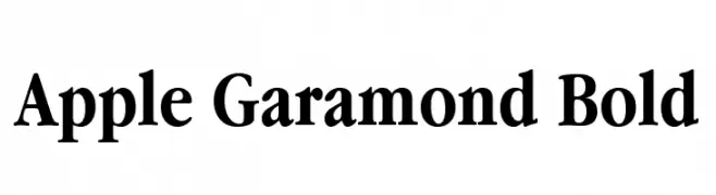
![Apple Garamond Bold font caratteri gratis]() Scaricare 7375 Downloads@WebFont
Scaricare 7375 Downloads@WebFont -
![Angostura font caratteri gratis]() Scaricare 7375 Downloads@WebFont
Scaricare 7375 Downloads@WebFont -
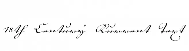
( Fonts by www.peter-wiegel.de. Personal-use only. For commercial use please contact owner. )
An elegant, flowing script with intricate flourishes, reminiscent of 18th-century handwriting.
![18th Century Kurrent Text font caratteri gratis]() Scaricare 7370 Downloads@WebFont
Scaricare 7370 Downloads@WebFont -
![Johnson font caratteri gratis]() Scaricare 7364 Downloads@WebFont
Scaricare 7364 Downloads@WebFont -
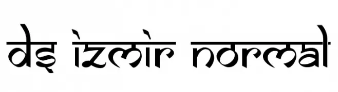
![DS Izmir Normal font caratteri gratis]() Scaricare 7364 Downloads@WebFont
Scaricare 7364 Downloads@WebFont -
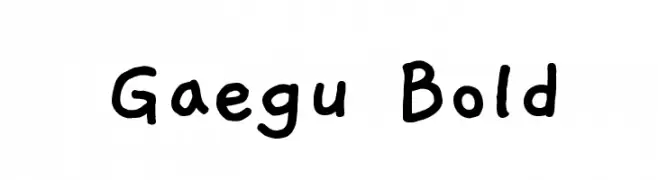
( Copyright 2018 The Gaegu Project Authors )
A playful, hand-drawn font with a whimsical and friendly style.
![Gaegu Bold font caratteri gratis]() Scaricare 7362 Downloads@WebFont
Scaricare 7362 Downloads@WebFont -
( Fonts by http://perso.calixo.net/~uzim/ )
A modern, geometric font with smooth, continuous lines and a minimalist design.
![1920 font caratteri gratis]() Scaricare 7361 Downloads@WebFont
Scaricare 7361 Downloads@WebFont -
![Warpaint font caratteri gratis]() Scaricare 7358 Downloads@WebFont
Scaricare 7358 Downloads@WebFont -
![Logobloqo2 font caratteri gratis]() Scaricare 7358 Downloads@WebFont
Scaricare 7358 Downloads@WebFont -
( Fonts by Castcraft Software - opti.netii.net - check the website before use )
A bold, cursive font with flowing, connected letterforms and decorative flair.
![GastonOpti font caratteri gratis]() Scaricare 7356 Downloads@WebFont
Scaricare 7356 Downloads@WebFont -
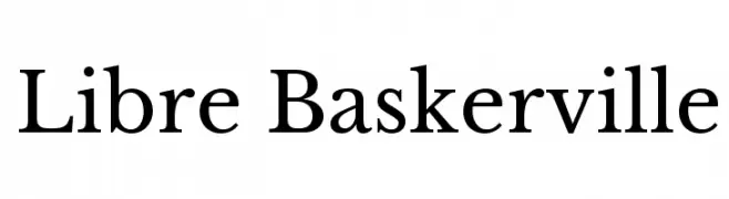
( Copyright (c) 2012, Pablo Impallari (www.impallari.com|impallari@gmail.com) )
A classic serif typeface with elegant serifs and balanced stroke contrast.
![Libre Baskerville font caratteri gratis]() Scaricare 7353 Downloads@WebFont
Scaricare 7353 Downloads@WebFont -
![Halimun font caratteri gratis]() Scaricare 7351 Downloads@WebFont
Scaricare 7351 Downloads@WebFont -
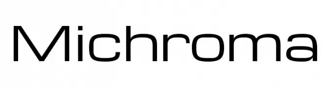
( Copyright (c) 2011, Vernon Adams (vern@newtypography.co.uk) )
A sleek, modern font with geometric lines and excellent readability.
![Michroma font caratteri gratis]() Scaricare 7350 Downloads@WebFont
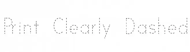
Scaricare 7350 Downloads@WebFont -
![Print Clearly Dashed font caratteri gratis]() Scaricare 7350 Downloads@WebFont
Scaricare 7350 Downloads@WebFont -
( Fonts by Alfredo Marco Pradil - Personal-use only. For commercial use please contact owner. )
A bold, modern sans-serif font with clean lines and strong presence.
![Open Sauce One Black font caratteri gratis]() Scaricare 7346 Downloads@WebFont
Scaricare 7346 Downloads@WebFont -
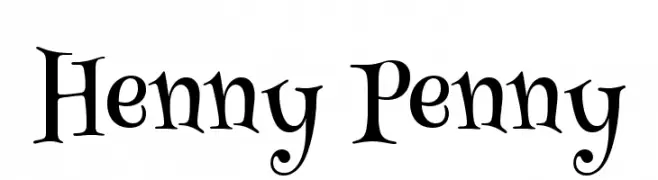
( Copyright (c) 2011, BrownFox (gayaneh.b@gmail.com|www.brownfox.org) )
A whimsical and playful font with exaggerated curves and unique serifs.
![Henny Penny font caratteri gratis]() Scaricare 7346 Downloads@WebFont
Scaricare 7346 Downloads@WebFont -
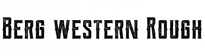
( Fonts by THE BROSNES Design Co - creativemarket.com/Brosnes - Personal-use only. For commercial use please contact owner. )
A bold, distressed slab serif font with a vintage Western aesthetic.
![Berg western Rough font caratteri gratis]() Scaricare 7345 Downloads@WebFont
Scaricare 7345 Downloads@WebFont -
( Fonts by Anke Arnold - www.anke-art.de )
A barcode-style font designed for encoding information with vertical lines.
![barcode font font caratteri gratis]() Scaricare 7342 Downloads@WebFont
Scaricare 7342 Downloads@WebFont


Quali sono i font più popolari adesso?
Poppins, Roboto, Montserrat, Open Sans e Lato sono molto usati per le forme pulite e l'ampia applicabilità — dall'identità di marca alle landing page e ai poster.
Quali font si usano spesso nei loghi?
Le sans serif geometriche (es. Poppins, famiglie in stile Gotham) sono scelte comuni per un branding pulito e scalabile. Per un tocco personale restano valide script e stili manoscritti. Abbina un display deciso per i titoli a un corpo testo neutro per riconoscibilità ed equilibrio.
Ogni quanto si aggiorna la lista?
Con regolarità, in base ai download e all'attività reale. Torna spesso per scoprire in anticipo le nuove preferite.
💡 Consiglio: aggiungi ai preferiti — le tendenze cambiano in fretta e i font top di oggi possono ispirare il rebranding di domani.